|
|
Critique By:
Derek Dixon (K:4948)
12/9/2005 11:08:09 AM
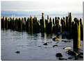
this is a beautiful image.
Myself though, I would have tried to single out the lonely righ hand post, maybe getting cloer to it, focus on it and playing with the DOF.
The seagul doesn't do anyting for me either, as it doesn't seem to be part of the image. Included more or scare it away. 
|
| Photo By: Alan Mead
(K:2020)
|
|
|
Critique By:
Derek Dixon (K:4948)
12/9/2005 11:02:14 AM
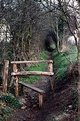
ahh.. stile... always brings me lovely memories of long walks in the forest...
nice compostion
|
| Photo By: Alan Mead
(K:2020)
|
|
|
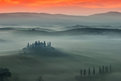
Critique By:
Derek Dixon (K:4948)
12/9/2005 10:58:11 AM
beautiful shot. So atmospheric. Thanks for your kind comments
|
| Photo By: Alan Mead
(K:2020)
|
|
|
Critique By:
Derek Dixon (K:4948)
12/8/2005 9:02:16 PM
impactante... muy bueno el titulo!
|
| Photo By: Jose Manuel Holguín
(K:318)
|
|
|
Critique By:
Derek Dixon (K:4948)
12/8/2005 9:00:01 PM
genial! talvez me gustaria un corte mas ajustado, digamos q la distancia q queda a la derecha podria ser igual arriba/izquierda. No se si esta un poco demasiado saturada en color tambien, creo q un sepia menos saturado...
en fin, pequeneces, me gusta mucho.
|
| Photo By: Jose Manuel Holguín
(K:318)
|
|
|
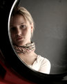
Critique By:
Derek Dixon (K:4948)
12/8/2005 8:35:07 PM
like this shot very much!
You gives us a really close up of your face, something that really should show who you are, and how we may see you trough your expression - but with this glasses you put a mysterious mask, something almost artistic, sugesting you see things in a different way...
|
Photo By: James Fraser
(K:944)

|
|
|
Critique By:
Derek Dixon (K:4948)
12/8/2005 8:27:31 PM
like the composition and the mood... a bit too dark though
|
| Photo By: helea pusta
(K:1660)
|
|
|
Critique By:
Derek Dixon (K:4948)
12/7/2005 8:20:42 PM
Excellent eye! it does look like a piano... wouldn't have seen it myself though... thanks for making us see things differently.
Even the 'nornally annoying' lamp post peering in doesn't disturb me... gives me scale of this huge musical building
|
| Photo By: Jeanette Hägglund
(K:59855)
|
|
|
Critique By:
Derek Dixon (K:4948)
12/7/2005 8:57:14 AM
excellent shot! love the whiteness
|
| Photo By: Roberto Arcari Farinetti
(K:209486)
|
|
|
Critique By:
Derek Dixon (K:4948)
12/6/2005 9:06:51 AM
from the 3 seires pictures this one is the one I prefer. Your expression is great! - enigmatic as anandaroop says - the half peering in, plus your genuine expression makes the viewer feel intriged by your presence, what are you thinking? what's behind that candid face...
trustworthy plus cryptic
|
| Photo By: t marie
(K:302)
|
|
|
Critique By:
Derek Dixon (K:4948)
12/3/2005 7:44:28 PM
 I like this! cool abstract I like this! cool abstract
|
| Photo By: Ina Nicolae
(K:44481)
|
|
|
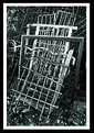
Critique By:
Derek Dixon (K:4948)
12/3/2005 7:39:30 PM
I do like the shot a lot. The mesh created my the lines is great... just I was thinking that a closer look/crop will have even more depth. Didn't think of the Twin towers, now I see it differently.
All the best,
|
| Photo By: Tony Smallman
(K:23858)
|
|
|
Critique By:
Derek Dixon (K:4948)
12/3/2005 7:31:31 PM
lovely shot, unique lighting
|
| Photo By: Petal Wijnen
(K:50989)
|
|
|
Critique By:
Derek Dixon (K:4948)
12/3/2005 7:22:30 PM
genial!
Con esta foto es la segunda vez q miro a traves de una camaraa de medio formato. gracias.
|
| Photo By: kike Calvo
(K:11291)
|
|
|
Critique By:
Derek Dixon (K:4948)
12/3/2005 7:18:32 PM
cool. Pick & mix
Nice textures... did you try to get close and personal with them? a shot between/inside them could have been interesting
|
| Photo By: Tony Smallman
(K:23858)
|
|
|
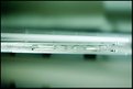
Critique By:
Derek Dixon (K:4948)
12/3/2005 7:15:43 PM
love the tones, very interesting view, surely i like it, but even though the center looks strait, the top railing doesn't, maybe because prespective, not completely looking 90 degrees down... also, lacks a bit of sharpness in railings...
|
| Photo By: D W
(K:2560)
|
|
|
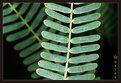
Critique By:
Derek Dixon (K:4948)
12/3/2005 7:10:27 PM
like this shot! specially because you have move leaf branches disappering in the background, aadding depth
|
| Photo By: majed ali
(K:315)
|
|
|
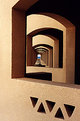
Critique By:
Derek Dixon (K:4948)
12/3/2005 7:08:45 PM
exellent shot - Strong but beautiful contrast 0- great architecture too, reminds me of the London city hall, a bit
|
| Photo By: Thilo Bayer
(K:50358)
|
|
|
Critique By:
Derek Dixon (K:4948)
12/3/2005 6:55:50 PM
what a excellent idea. very well executed too.
The expresion on the print is fun/full of character... the fact that you have some hair from the second shot in view helps to make the conexion is the same person.
well done - to my favs!
|
| Photo By: Patrick Jacobson
(K:29151)
|
|
|
Critique By:
Derek Dixon (K:4948)
12/3/2005 12:55:18 PM
beautiful shot! beautyful place too
|
| Photo By: Roberto Carli
(K:13689)
|
|
|
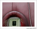
Critique By:
Derek Dixon (K:4948)
12/3/2005 12:52:45 PM
is it the entrance to a massive bouncy castle?
|
| Photo By: Jeanette Hägglund
(K:59855)
|
|
|
Critique By:
Derek Dixon (K:4948)
12/2/2005 2:20:45 PM
excellent prespective!
|
| Photo By: Reda Danaf
(K:14309)
|
|
|
Critique By:
Derek Dixon (K:4948)
12/2/2005 2:17:30 PM
very nice macro, though the right dark shadow I don't think does any good for the image.
|
| Photo By: jacques brisebois
(K:73883)
|
|
|
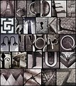
Critique By:
Derek Dixon (K:4948)
12/2/2005 2:08:36 PM
excellent! I remenber in art college we did a similar project... it took ages to find some characters!!! well done! a great eye to find them
|
| Photo By: ABBA RICHMAN
(K:220)
|
|
|
Critique By:
Derek Dixon (K:4948)
12/2/2005 1:59:02 PM
great! such a clever thought and shot
|
| Photo By: narabia
(K:9563)
|
|
|
Critique By:
Derek Dixon (K:4948)
12/2/2005 1:55:32 PM
excellent. Perfect lighting, charming composition and good use of DOF... congratulations on a great shot.
|
| Photo By: meewosh
(K:448)
|
|
|
Critique By:
Derek Dixon (K:4948)
12/2/2005 1:53:57 PM
lovely composition and tones!
|
| Photo By: giovanni guido marchi
(K:27040)
|
|
|
Critique By:
Derek Dixon (K:4948)
12/2/2005 1:52:54 PM
love it!!!
|
| Photo By: Robert Kocs
(K:89085)
|
|
|
Critique By:
Derek Dixon (K:4948)
12/2/2005 1:51:58 PM
great simplicity, and so powerful! just like your other handle series...
|
| Photo By: Robert Kocs
(K:89085)
|
|
|
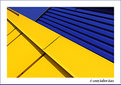
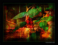
Critique By:
Derek Dixon (K:4948)
12/2/2005 1:50:13 PM
Interesting photoart. Like the composition, clours and textures, though IMO some of the textures are 'overdone'... in the leafs, parts of the berries i think will work better if the overall texture wasn't so strong.
The vigneting helps drawn you in the image, but I always prefer a round one, seem more natural.
Anyhow, great work!
|
| Photo By: Robert Kocs
(K:89085)
|
|