|
|
Critique By:
elizabeth thompson (K:258)
3/7/2009 3:40:36 PM
i like this image. personally, i would crop a bit off the top. it seems unbalanced. maybe bump the contrast...
|
| Photo By: Darek Krajewski
(K:857)
|
|
|
Critique By:
elizabeth thompson (K:258)
3/7/2009 3:39:18 PM
very pretty. love the brilliant color.
|
Photo By: Gene Zonis
(K:6937)

|
|
|
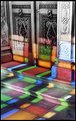
Critique By:
elizabeth thompson (K:258)
3/7/2009 3:38:03 PM
great image. love the variety of color.
|
| Photo By: txules .
(K:62768)
|
|
|
Critique By:
elizabeth thompson (K:258)
3/1/2009 7:07:39 PM
interesting study of motion. did you use an IR filter or did you do this in post processing? i think it could use a bit more contrast on the blurred side...more contrast would make the figure in the center stand out a bit more... but overall i like this.
|
| Photo By: Robert Staeck
(K:919)
|
|
|
Critique By:
elizabeth thompson (K:258)
3/1/2009 7:04:58 PM
interesting subject. very good in black and white.
|
| Photo By: Miladin Mare
(K:3384)
|
|
|
Critique By:
elizabeth thompson (K:258)
3/1/2009 6:48:44 PM
good dof and composition. i like this a lot.
|
| Photo By: abduallah alkhamees
(K:260)
|
|
|
Critique By:
elizabeth thompson (K:258)
3/1/2009 6:47:52 PM
classic with very nice effects.
|
| Photo By: nima ojani
(K:128)
|
|
|
Critique By:
elizabeth thompson (K:258)
3/1/2009 6:45:56 PM
amazing image. excellent composition. i would hang this on my wall.
|
| Photo By: giovanni guido marchi
(K:27040)
|
|
|
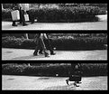
Critique By:
elizabeth thompson (K:258)
3/1/2009 6:44:49 PM
nice detail. this is very interesting to scroll up and down the photo and watch the movement.
|
| Photo By: Wolf Zorrito
(K:78768)
|
|
|
Critique By:
elizabeth thompson (K:258)
3/1/2009 6:41:37 PM
very good capture of light and scene. the contrast is just right.
|
| Photo By: Milena G
(K:1098)
|
|
|
Critique By:
elizabeth thompson (K:258)
3/1/2009 6:40:45 PM
great perspective and contrast.
|
| Photo By: Fulop Marta Eva
(K:105)
|
|
|
Critique By:
elizabeth thompson (K:258)
3/1/2009 6:40:12 PM
very mystical. nice image.
|
| Photo By: James Crotty
(K:2083)
|
|
|
Critique By:
elizabeth thompson (K:258)
3/1/2009 6:39:39 PM
love the light. there are so many interesting aspects of this setting i would love to explore!
|
| Photo By: Subhranil Das
(K:6869)
|
|
|
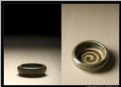
Critique By:
elizabeth thompson (K:258)
2/4/2007 6:09:59 AM
did you make the bowl as well as the photo? looks like a poster/postcard for an opening of a pottery show. i like the softnes of t he background and the contrast of the 2 images.
|
| Photo By: Johnny Kurtz
(K:893)
|
|
|
Critique By:
elizabeth thompson (K:258)
2/4/2007 6:00:43 AM
perfect schmerfect. this is fantastic. all your compositions with paper and with ribbons are very striking indeed. works of art in and of themselves.
|
| Photo By: Barry Walthall
(K:5312)
|
|
|
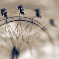
Critique By:
elizabeth thompson (K:258)
2/14/2006 3:44:50 PM
sorry for the late response....i havent been near this site for a while...
thanks for the comment. and no, this is the riggings for a curtain backstage of a theatre.
|
| Photo By: elizabeth thompson
(K:258)
|
|
|
Critique By:
elizabeth thompson (K:258)
5/4/2005 7:13:59 AM
ooooh, i want a lensbaby. great shot. i love the softness and the composition.
|
| Photo By: Kym Skiles
(K:1520)
|
|
|
Critique By:
elizabeth thompson (K:258)
10/16/2004 4:15:16 AM
thanks for commenting, Corrie. i used photoshop elements to edit this. i cloned out some distractions in the background, bumped the contrast and brightness. i then adjusted the color slightly. in the center of the photo, i put a large text box to lighten it, then added the black frame. (i'm glad you like it!)
|
| Photo By: elizabeth thompson
(K:258)
|
|
|
Critique By:
elizabeth thompson (K:258)
10/15/2004 2:45:06 AM
i was just thinking that he looked a little upset...(i have the same trouble with my little boy, and then he gets even more upset when i take his photo).
very cute.
beth
|
| Photo By: CorrieLynn Jacobsen
(K:9882)
|
|
|
Critique By:
elizabeth thompson (K:258)
5/18/2004 11:05:01 PM
i like this close cropped version also. much more intimate.
by the way, how do you like the new camera....ive been thinking of springing for the new nikon d70 myself....
|
| Photo By: Kym Skiles
(K:1520)
|
|
|
Critique By:
elizabeth thompson (K:258)
5/18/2004 11:02:51 PM
i very much like this view. a well presented perspective of the city.
|
| Photo By: John Strazza
(K:11535)
|
|
|
Critique By:
elizabeth thompson (K:258)
5/18/2004 10:53:42 PM
thanks very much for your comment!
|
| Photo By: elizabeth thompson
(K:258)
|
|
|
Critique By:
elizabeth thompson (K:258)
4/1/2004 5:25:59 AM
very effective. i personally like the empty space. well done.
|
| Photo By: H.Keith Wills
(K:87)
|
|
|
Critique By:
elizabeth thompson (K:258)
3/15/2004 10:22:41 PM
i like the composition. good shapes and forms. really interesting!
beth
|
| Photo By: Gayle's Eclectic Photos
(K:91109)
|
|
|
Critique By:
elizabeth thompson (K:258)
3/15/2004 9:33:00 PM
great photo. i love the perspective and lines and the motion. draws you right to the focal point.
|
| Photo By: Ricardo Andrés
(K:227)
|
|
|
Critique By:
elizabeth thompson (K:258)
3/3/2004 9:53:02 PM
this is very pretty, Nicole, but as much as i really really like it, i went in search of the original you referred to, and i think the brighter, more vibrant colors are so much prettier. i think they are equally good photos, but my preference is for the first.
|
| Photo By: Nicole Marcisz
(K:10268)
|
|
|
Critique By:
elizabeth thompson (K:258)
3/3/2004 9:49:31 PM
nice composite. the flow of the images works well.
|
| Photo By: joe fan
(K:63)
|
|
|
Critique By:
elizabeth thompson (K:258)
11/10/2003 10:30:04 PM
i really like your composition. the beads coming out of the frame are a really nice touch. i would like to see it all in really sharp focus, though. the beads in the foreground look a little soft.
|
| Photo By: Haleh B
(K:3741)
|
|
|
Critique By:
elizabeth thompson (K:258)
11/10/2003 10:22:27 PM
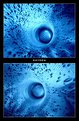
great abstract. i like your composition, as well as the way youve put this together. the framing and title work well.
|
| Photo By: Zeta Z. Brigden
(K:56)
|
|
|
Critique By:
elizabeth thompson (K:258)
11/10/2003 10:17:07 PM
how cute. good compostion. works very well in black and white.
|
| Photo By: Pat Fruen
(K:12076)
|
|


")