|
|
Critique By:
elizabeth thompson (K:258)
11/10/2003 10:30:04 PM
i really like your composition. the beads coming out of the frame are a really nice touch. i would like to see it all in really sharp focus, though. the beads in the foreground look a little soft.
|
| Photo By: Haleh B
(K:3741)
|
|
|
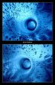
Critique By:
elizabeth thompson (K:258)
11/10/2003 10:22:27 PM
great abstract. i like your composition, as well as the way youve put this together. the framing and title work well.
|
| Photo By: Zeta Z. Brigden
(K:56)
|
|
|
Critique By:
elizabeth thompson (K:258)
11/10/2003 10:17:07 PM
how cute. good compostion. works very well in black and white.
|
| Photo By: Pat Fruen
(K:12076)
|
|
|
Critique By:
elizabeth thompson (K:258)
9/30/2003 9:19:36 PM
very well done, Ursula. the grain works very very well, and especially in b/w. love the contrast as well.
|
| Photo By: Ursula I Abresch
(K:6515)
|
|
|
Critique By:
elizabeth thompson (K:258)
7/31/2003 7:36:54 AM
i love your perspective. this is an often photographed site, but ive never seen it from this angle. i like that innovation. youve brought out the color of the sky very well. i like the simplicity in the composition and the color with shades of only 2 colors.
very well done.
beth
|
| Photo By: andrew vonbank
(K:2811)
|
|
|
Critique By:
elizabeth thompson (K:258)
7/21/2003 8:25:27 PM
this is really a pretty scene, but the best part is the glasslike water in the foreground!!
|
Photo By: Peppino Bonu
(K:7607)

|
|
|
Critique By:
elizabeth thompson (K:258)
7/21/2003 8:15:57 PM
this is a really pretty triptych. each of the 3 photos would be nice on its own, but together they really work well. i wish i lived in such a colorful place!
|
| Photo By: Pedro Libório
(K:36301)
|
|
|
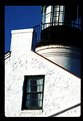
Critique By:
elizabeth thompson (K:258)
7/21/2003 8:05:20 PM
i like the way youve zoomed in on this. not your typical lighthouse picture, and i like that. the white seems really bright. i might try and tone that down a bit. converting to greyscale may help with that, also, and i think it would work well for this image.
|
| Photo By: Eric Mendoza
(K:1204)
|
|
|
Critique By:
elizabeth thompson (K:258)
7/21/2003 8:00:34 PM
well, id say you took it because it was a very pretty and interesting scene. i personally would prefer it without the severe shadow under the eave on the left. perhaps shoot it at a different time of day? but it has good color and very interesting detail. well seen.
|
| Photo By: Eric Mendoza
(K:1204)
|
|
|
Critique By:
elizabeth thompson (K:258)
7/20/2003 7:36:42 PM
this is spectacular. the color and lines and angles work very well.
|
| Photo By: Barry Walthall
(K:5312)
|
|
|
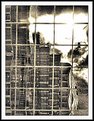
Critique By:
elizabeth thompson (K:258)
7/18/2003 2:24:52 PM
this is an interesting shot.....i would kind of like to know what the writing is about.
....it makes you wonder.
|
| Photo By: Brandon Brown
(K:25)
|
|
|
Critique By:
elizabeth thompson (K:258)
7/18/2003 2:22:58 PM
this is a fantastic portrait. the expression is priceless, and youve framed it well. good work.
|
| Photo By: Jamie Ferguson
(K:6284)
|
|
|
Critique By:
elizabeth thompson (K:258)
7/18/2003 2:19:25 PM
i like your rotation here. nicely toned.
|
| Photo By: Gábor Koscsó
(K:-229)
|
|
|
Critique By:
elizabeth thompson (K:258)
7/18/2003 2:15:33 PM
nice tone. good job with the light. this is well composed. the reflections in the water are very nice, also.
|
| Photo By: Gil Draper
(K:3194)
|
|
|
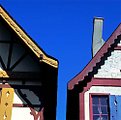
Critique By:
elizabeth thompson (K:258)
7/18/2003 2:13:27 PM
nice composition. i really like the background, and the lighting.
|
| Photo By: Alina Steiner
(K:64)
|
|