|
|
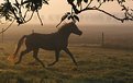
Critique By:
Martin Rohrmann (K:587)
11/10/2003 10:22:33 AM
nice babyshoot... good to remind.
|
| Photo By: Jessica Rees
(K:0)
|
|
|
Critique By:
Martin Rohrmann (K:587)
11/10/2003 3:33:21 PM
nice mood but flat colours, disturbing boughs.
|
| Photo By: Ria Swart
(K:283)
|
|
|
Critique By:
Martin Rohrmann (K:587)
11/9/2003 10:02:45 AM
As thumbnail perfect... now enlarged: breathtaking ! Brilliant work !
But take care that the colours becomes not to unnatural and flashy.
|
| Photo By: Paolo Pagnini
(K:1022)
|
|
|
Critique By:
Martin Rohrmann (K:587)
11/9/2003 10:06:13 AM
lovely place for living.
|
Photo By: Sandra Berry
(K:8352)

|
|
|
Critique By:
Martin Rohrmann (K:587)
11/9/2003 10:06:56 AM
Nice mood, very good compostion. It's too bad about the walker. He elapses in the dark
colours of the ocean.
the upper left corner is too strong.
|
| Photo By: Michael Hipp
(K:34)
|
|
|
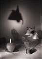
Critique By:
Martin Rohrmann (K:587)
11/9/2003 10:07:39 AM
looks very stylish and modern. nice toning... good work.
but the grey distortion inside the middle frame below the hand and
beneath the hair doesnt fit. Here it would be better, if the background
has the same colour than the background outside the frame.
Do you see what I mean?
|
| Photo By: Tamara L
(K:1387)
|
|
|
Critique By:
Martin Rohrmann (K:587)
11/9/2003 10:08:55 AM
The photo is good, the title not.
If you wanna show these kind of pictures (documentary) it is
mostly advisable that you explain the context, connection to your viewers.
So it is quite difficult to crituque your photo, because your motife isnt
self-explanatory.
|
| Photo By: Priscilla ciccilla
(K:48)
|
|
|
Critique By:
Martin Rohrmann (K:587)
11/9/2003 2:18:35 PM
Solid shot. A little bit fanciless (I see theses kind of pictures every day one million times) but simply ok. Next time try to find a more interessting perpective.
However... the smile is nice, even Iam not sure whether its a boy or a girl.
I guess it is a girl.
|
| Photo By: Pat Fruen
(K:12076)
|
|
|
Critique By:
Martin Rohrmann (K:587)
11/9/2003 2:19:16 PM
I intensive effect. I really like. Maybee this photo would be better by
reducing to black and white colours.
To make clear the documentary character of this photo describe where
and why you take the photo. People prefer things more if they know
the connection.
|
| Photo By: engin aydeniz
(K:241)
|
|
|
Critique By:
Martin Rohrmann (K:587)
11/9/2003 4:01:03 AM
interesting view. but for me the toning seems a little bit to strong.
very nice
|
| Photo By: Craig Hanson
(K:7836)
|
|
|
Critique By:
Martin Rohrmann (K:587)
11/8/2003 6:29:05 PM
mmmh, on my monitor it looks much better than here.
the original is much more sharper. sorry.
|
| Photo By: Martin Rohrmann
(K:587)
|
|
|
Critique By:
Martin Rohrmann (K:587)
11/7/2003 3:30:22 PM
yeah, thats maybee better.
Now try to give the dog a smile by using photoshop.
Then it would be perfect.
|
| Photo By: Mark Scheuern
(K:1428)
|
|
|
Critique By:
Martin Rohrmann (K:587)
11/7/2003 3:04:14 PM
No, this photo is NOT excellent ! To say its excellent is to overrate it.
Sorry. Dont worry.
The picture is nice... its ok... but it is not excellent.
|
| Photo By: Alex Tornqvist
(K:31)
|
|
|
Critique By:
Martin Rohrmann (K:587)
11/9/2003 2:20:16 PM
fantastic image... very well done.
I hope people with a darker monitor setting can
find the cat, because it is very very dark.
|
| Photo By: Timothy Cady
(K:29)
|
|
|
Critique By:
Martin Rohrmann (K:587)
11/9/2003 2:20:49 PM
nice autumn mood... nice colours... very sharp... altogether: quite lovely
|
| Photo By: Monica Riveiro
(K:836)
|
|
|
Critique By:
Martin Rohrmann (K:587)
11/9/2003 2:21:36 PM
nice snapshot. take care when you use a flashlight to photograph him, because
they really hate it, hurting their eyes.
|
| Photo By: Roberto De Dominicis
(K:125)
|
|
|
Critique By:
Martin Rohrmann (K:587)
11/9/2003 2:22:55 PM
Nice dog. It would be more aesthetic if the lines
of the flagstones would not appear.
|
| Photo By: Mark Scheuern
(K:1428)
|
|
|
Critique By:
Martin Rohrmann (K:587)
11/9/2003 2:23:48 PM
Nice snapshot... but nothing more.
I saw this kind of pictures (people who just taking a photo) one
million times before.
Next time try not to soften the skin or do it more
inconspicuous. There are many visible traces for photo-editing.
If Iam wrong and you dont edit this photo : sorry
|
| Photo By: Stuart Boyle
(K:1505)
|
|
|
Critique By:
Martin Rohrmann (K:587)
11/9/2003 2:56:42 PM
In my opinion this is a good idea. The toning is quite good.
BUT the composition is very chaotic and callow.
Especially the texture of the desks texture is unaesthetic
the shadows of the wall to arbitrarily.
Altogether, for me their is really no concept in this picture.
Dont worry.
|
| Photo By: Christian Wettergren
(K:1333)
|
|
|
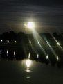
Critique By:
Martin Rohrmann (K:587)
11/7/2003 2:25:13 PM
A wonderful photo... a lovely mood.
But the horizn is horizon is is crooked.
Crooked lines arent always bad for a photo... but in this
case its disturbing.
Furthermore, Iam wondering about the boat.
Is this a real boat or was is put in via photo-editing?
The boat seems so unnatural... a little bit like a toy.
Strange. However... your pic is very beautiful.
/ / / feel free to visit my website where you can find my
portfolio: / / / www.martinrohrmann.de
|
| Photo By: Brenda Sellers
(K:322)
|
|
|
Critique By:
Martin Rohrmann (K:587)
11/7/2003 11:25:28 AM
scary face :-))))))))))))))
|
| Photo By: Naty Z
(K:16436)
|
|
|
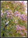
Critique By:
Martin Rohrmann (K:587)
11/7/2003 11:15:05 AM
I like! Unconventionall lightning.
But whats the strange gleam around the blossom?
It could be a photo editing trace (not good) or it
could be consciously made.
However... Iam not sure if I like this scary gleam.
/ / / feel free to visit my website where you can find my
portfolio: / / / www.martinrohrmann.de
|
| Photo By: Naty Z
(K:16436)
|
|
|
Critique By:
Martin Rohrmann (K:587)
11/7/2003 11:07:17 AM
I dont think its a "great shot". Sure this is a good photo to remind the girl.
But in my opinion the colours are very lifeless, their is really no sharpen
point in the whole pic and finaly... the photo is quite conventional, maybee boring.
Dont worry.
/ / / feel free to visit my website where you can find my
portfolio: / / / www.martinrohrmann.de
|
| Photo By: Debra Griffin-Ibrahim
(K:7119)
|
|
|
Critique By:
Martin Rohrmann (K:587)
11/7/2003 10:58:34 AM
lovely mood... but in my opinion a little bit awkwardly taken snapped.
/ / / feel free to visit my website where you can find my
portfolio: / / / www.martinrohrmann.de
|
| Photo By: ayman azraq
(K:284)
|
|
|
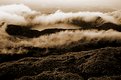
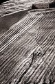
Critique By:
Martin Rohrmann (K:587)
11/7/2003 10:54:58 AM
Great, a very intensive photo with a lonely atmosphere... I can even imagine
to live there.
But in my opinion, the farmhouse vanished in the lines... so maybee the
display window is a little bit awkwardly.
/ / / feel free to visit my website where you can find my
portfolio: / / / www.martinrohrmann.de
|
| Photo By: Roberto Lupini
(K:143)
|
|
|
Critique By:
Martin Rohrmann (K:587)
11/7/2003 10:45:17 AM
its a very nice picture, even a little bit surreal.
But I guess this mood was not planned, it looks slightly conceptless.
/ / / feel free to visit my website where you can find my
portfolio: / / / www.martinrohrmann.de
|
| Photo By: Sandra Bozic
(K:3963)
|
|
|
Critique By:
Martin Rohrmann (K:587)
11/5/2003 6:41:58 PM
a great cow !
cow? did I really wrote cow???
Iam getting older... sorry... but Iam unfortunatly German ;-)
|
| Photo By: Getulio Melo
(K:6481)
|
|
|
Critique By:
Martin Rohrmann (K:587)
11/5/2003 6:20:08 PM
ok, sorry. strange colours :-)
|
| Photo By: Getulio Melo
(K:6481)
|
|
|
Critique By:
Martin Rohrmann (K:587)
11/5/2003 5:54:02 PM
Hi, I like the composing, i like the cow, but I dont like
the colours. The colours seems to me very unnatural.
I guess you edit the photo with a image-editing-software...
not very felicitous.
Nonetheless... a very good zoo-shoot.
|
| Photo By: Getulio Melo
(K:6481)
|
|
|
Critique By:
Martin Rohrmann (K:587)
11/5/2003 5:51:26 PM
Looks really like a painting.
Really lovely... quite amazing.
/ / / feel free to visit my website where you can find my
portfolio: / / / www.martinrohrmann.de
|
| Photo By: Scott Steeves
(K:209)
|
|