|
|
Critique By:
Paul Lara (K:88111)

9/26/2004 1:59:53 AM
Oh, yeah. soft and lovely and delicate!
|
| Photo By: Michael Alexander
(K:5293)
|
|
|
Critique By:
Paul Lara (K:88111)
9/26/2004 1:45:24 AM
This is a splendidly thought-out composition and nicely executed and exposed!
|
| Photo By: Michael Alexander
(K:5293)
|
|
|
Critique By:
Kostas Tzanetos (K:22012)
9/22/2004 9:06:56 PM
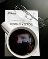
wonderful place and lighting that create a really relaxing mood,Michael... and those flowers are cute... composition is intersting,but i'd prefer a less tight framing so as to see more of this wooden ? ...
regards,
kostas
|
| Photo By: Michael Alexander
(K:5293)
|
|
|
Critique By:
Miroslaw Banasiewicz (K:954)
9/2/2004 10:05:58 PM
nice composition Michael
regards
|
| Photo By: Michael Alexander
(K:5293)
|
|
|
Critique By:
Howard M. Parsons (K:3496)
8/20/2004 4:32:14 PM
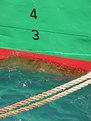
Good color. And Very interesting textures, not only the water as mentioned above, but the boat and rope also.
You have a good eye for stuff like this. I've seen it before in your postings here.
|
| Photo By: Michael Alexander
(K:5293)
|
|
|
Critique By:
Timothy R (K:3028)
8/18/2004 3:48:48 PM
I really like this! The colors are so cool and the water just looks so fresh...I want to jump in! Nice stop action on the water by-the-way.
This is one of those nice simple shots, where you don't have a lot of subject matter, yet it has a lot going on. It is also fun in that this is something I bet 1000's of people see all the time, and never think about it or notice how cool it looks.
Well done!
|
| Photo By: Michael Alexander
(K:5293)
|
|
|
Critique By:
Erika (K:315)
8/18/2004 3:44:45 PM
I like the colors and cropping on this quite a bit. The gelatinous look of the water is also quite interesting.
|
| Photo By: Michael Alexander
(K:5293)
|
|
|
Critique By:
Predrag Sudar (K:5075)
8/18/2004 3:00:50 PM
Great photo!
Great colors, great perspective!
congrats!
Pedja
|
| Photo By: Michael Alexander
(K:5293)
|
|
|
Critique By:
Michael Alexander (K:5293)
8/8/2004 4:17:34 PM
Howard, yes, it?s the Henry ford estate ?Fairlane Mansion? . It?s a great place for architecture, landscapes and floral shots. I highly recommend taking a tour of the estate if you ever go there. Henry actually died in his sleep, in that house during a massive storm that flooded the rouge river, disabling the estates powerhouse. It?s one place that actually gives me the chills being there.
~ Mike
|
| Photo By: Michael Alexander
(K:5293)
|
|
|
Critique By:
Howard M. Parsons (K:3496)
8/8/2004 1:42:47 AM
The place DOES look haunted. Very good infared shot though.By the way, is this the Henry Ford Mansion?
|
| Photo By: Michael Alexander
(K:5293)
|
|
|
Critique By:
Michael Alexander (K:5293)
8/7/2004 4:32:33 PM
Thanks Darren. While trying to figure out how I was going to crop this shot and getting rid of hot pixels, this image actually gave me a headache, sort of made me nauseous. It was then when I decided on the title.
~Mike
|
| Photo By: Michael Alexander
(K:5293)
|
|
|
Critique By:
Darren Arena (K:2999)
8/7/2004 4:22:18 PM
Wow..This really is a super spooky shot Michael! I like the infrared effect. *shivers*
|
| Photo By: Michael Alexander
(K:5293)
|
|
|
Critique By:
Shiv Kumar Surya (K:17362)
8/7/2004 3:30:00 PM
Wonderful shot.
Regards,
'Surya'
|
| Photo By: Michael Alexander
(K:5293)
|
|
|
Critique By:
oguzhan erim (K:2133)
8/7/2004 3:12:41 PM
Excellent picture.
Congrats!
|
| Photo By: Michael Alexander
(K:5293)
|
|
|
Critique By:
Enjoy (K:16125)
8/6/2004 3:04:10 PM
Very cool infrared...love the look
|
| Photo By: Michael Alexander
(K:5293)
|
|
|
Critique By:
Christian Payne (K:1398)
8/6/2004 11:06:04 AM
Great shot. The lens flare looks so clear it is like you put it in. I would definitely remove it as i think it destracts the eye from the graet lines drawing you in to this surreal land.
Makes me want to have a go at IR... But i'm too lazy.  ) )
|
| Photo By: Michael Alexander
(K:5293)
|
|
|
Critique By:
Michael Alexander (K:5293)
8/6/2004 10:35:22 AM
Thanks for the complement Howard! yeah, I know I should have spent some time on this and removed that flare. I was using a fisheye lens also, and it seems like I have to be real careful when using that lens, it?s prone to flares. Thanks for the advice and critique, I think I?ll try to remove the flare or just go back and shoot it again.
~Mike
|
| Photo By: Michael Alexander
(K:5293)
|
|
|
Critique By:
Howard M. Parsons (K:3496)
8/6/2004 5:25:07 AM
Personally, I would remove the lens flares. To me, they intrude upon an otherwise gorgeous photograph. I like the jet black sky, the range of tones, the lead-in lines formed by the bridge elements, and everything else about it. This is your best infrared yet.
|
| Photo By: Michael Alexander
(K:5293)
|
|
|
Critique By:
Natta Leonard (K:1206)
8/6/2004 3:41:47 AM
Beautiful photograph, Michael. Another perfect picture.
Natta
|
| Photo By: Michael Alexander
(K:5293)
|
|
|
Critique By:
Gabriella Carta (K:22879)
7/8/2004 9:57:03 PM
excellent shot, good
|
| Photo By: Michael Alexander
(K:5293)
|
|
|
Critique By:
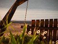
Margaret Sturgess (K:49403)
7/7/2004 8:52:40 PM
A fading beauty - how sad, but a great composition.
Margaret
|
| Photo By: Michael Alexander
(K:5293)
|
|
|
Critique By:
Paulo Machado (K:4482)
7/4/2004 9:54:09 PM
Great composition with the use of the selective focus and a beautiful light.
|
| Photo By: Michael Alexander
(K:5293)
|
|
|
Critique By:
Stjepan Banovic (K:571)
7/4/2004 4:46:46 PM
Great idea
|
| Photo By: Michael Alexander
(K:5293)
|
|
|
Critique By:
Murilo Rafael de Souza (K:19577)
7/3/2004 6:33:34 PM
Very beautiful image Michael! Very well done! I loved! Congratulations!
|
| Photo By: Michael Alexander
(K:5293)
|
|
|
Critique By:
Michael Alexander (K:5293)
6/19/2004 4:24:16 PM
Sure, give me your email, lets talk
|
| Photo By: Michael Alexander
(K:5293)
|
|
|
Critique By:
Michael Alexander (K:5293)
5/22/2004 3:19:54 PM
Sharon, Have you received my email? I?m not sure it went through.
|
| Photo By: Michael Alexander
(K:5293)
|
|
|
Critique By:
Sharon Sudman (K:3)
5/21/2004 4:17:34 AM
Michael,
I would like to reach you about possible use of your image, please write me at sharon at imagespigot dot com
|
| Photo By: Michael Alexander
(K:5293)
|
|
|
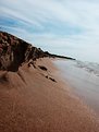
Critique By:
Danijel Micka (K:2532)
5/6/2004 12:29:22 PM
To me it looks better fliped (the one from portfolio) but I also don't like fact that you rotate photo, when I look at it I feel like I am goning to fall down. I also like thing that more accent on the sand.
Nice landscape, good noticed detail.
Regards,
Danijel
|
| Photo By: Michael Alexander
(K:5293)
|
|
|
Critique By:
Michael Alexander (K:5293)
4/28/2004 2:22:06 PM
Howard, yeah I know about the horizon not being level. That ?cliff? is about 3 inches tall, I couldn?t compose the shot since I couldn?t get behind the camera. I just set it for f/8 landscape and rolled the dice. I leveled it out in adobe but after comparing the two, I just thought the original was more dramatic perspective for some reason. In addition, (and I don?t know if this is right or wrong) but I mirrored the image so that it was tilting to the right rather than the left, it just looked better to me, I do not know why. Thank you for the honest critique and suggestion.
~Mike
|
| Photo By: Michael Alexander
(K:5293)
|
|
|
Critique By:
Gabriella Carta (K:22879)
4/27/2004 11:10:56 PM
wonderful and original shot, good!
|
| Photo By: Michael Alexander
(K:5293)
|
|