|
|
Critique By:
Kim Culbert (K:37070)
2/6/2003 8:13:51 PM
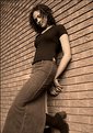
Beautiful lines matched with such deep colour... this is truly breath-taking. Great framing and thank goodness for randoms... I had seen this a long time ago but never commented.
|
| Photo By: richard trager
(K:111)
|
|
|
Critique By:
Antonio Díaz (K:2710)
1/13/2003 4:00:11 PM
even though this is not exactly a "portrait" i suggest you focus more on the eyes...IMO its a really great image, everything?s perfect, i just wish to see those eyes in perfect focus... keep shooting!
|
| Photo By: richard trager
(K:111)
|
|
|
Critique By:
Sean Fitzgerald (K:310)
1/8/2003 8:01:46 PM
Wow, your portfolio has a... feel to it. It's pretty destinct I think. I like your images, the framing of them, the characters in them, your subjects, they're all really neat. Cool work you've got.
|
| Photo By: richard trager
(K:111)
|
|
|
Critique By:
John Doe (K:170)
8/23/2002 10:50:53 AM
Very nice Richard. I like the sepia tone you've used. IMHO I personally don't think the wall is a distraction, rather adds some interest to the photo.
|
| Photo By: richard trager
(K:111)
|
|
|
Critique By:
Ken Alexander (K:3905)
8/22/2002 8:03:44 PM
Nice pose and angle, she looks sly. But the wall is too busy and is a distraction. A wall with more subtle texture would be good.
|
| Photo By: richard trager
(K:111)
|
|
|
Critique By:
Autumn Ruhe (K:993)
8/8/2002 7:09:22 PM
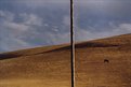
i think the pole is awesome... it helps make the picture so fresh and original.
|
| Photo By: richard trager
(K:111)
|
|
|
Critique By:
Gonçalo Lobo Pinheiro (K:105)
7/7/2002 5:57:57 PM
A very good portrait!
A great result in sepia...
|
| Photo By: richard trager
(K:111)
|
|
|
Critique By:
William R Eastman III (K:2141)
6/25/2002 5:18:06 AM
I still love this shot. The background colors can be switched for whatever application--photoshop can never recreate the original eye. Frankly, I think you were letting us know that other father's were 'pink' with envy.
|
| Photo By: richard trager
(K:111)
|
|
|
Critique By:
Siddharth Siva (K:3327)
6/23/2002 1:02:01 PM
super shot!! its kinda strange imagining what this man is going through or what he is thinking its almost surreal with the wide angle bulge!! I agree with Terrence about the tone...a bit much..
|
| Photo By: richard trager
(K:111)
|
|
|
Critique By:
William R Eastman III (K:2141)
6/23/2002 12:50:41 PM
Cool. Top marks for composition and a creative eye.
|
| Photo By: richard trager
(K:111)
|
|
|
Critique By:
Terrence Kent (K:7023)
6/23/2002 12:23:57 PM
Dig the wide angle bulge, a great shot sure to explain the torment of this poor man to future generations. Toning is heading in the right direction but seems a bit too much, dingy sorta. Great image~
|
| Photo By: richard trager
(K:111)
|
|
|
Critique By:
Shary Shary (K:428)
6/9/2002 6:46:28 PM
Very impressive. This is the least I can say.
|
| Photo By: richard trager
(K:111)
|
|
|
Critique By:
Terrence Kent (K:7023)
6/1/2002 10:29:00 PM
I don't think i need to explain why this is so damn good - Beautiful image~
|
| Photo By: richard trager
(K:111)
|
|
|
Critique By:
Mary Sue Hayward (K:17558)

5/28/2002 8:11:18 AM
Terrific photo. Would like just a tad more light on his face, but I'm impressed with how you captured his eyes. They are captivating.
|
| Photo By: richard trager
(K:111)
|
|
|
Critique By:
John Doe (K:170)
5/27/2002 8:32:55 PM
Very nice! I love the tone.
|
| Photo By: richard trager
(K:111)
|
|
|
Critique By:
richard trager (K:111)
5/27/2002 8:29:11 PM
barry,
thanks for your comments. i agree with you on the removal of the exhaust pipe.
rich
|
| Photo By: richard trager
(K:111)
|
|
|
Critique By:
Petros Stamatakos (K:12101)
5/27/2002 7:41:19 PM
Absolutely fantastic!!! I love it!
5 Stars!!!
|
| Photo By: richard trager
(K:111)
|
|
|
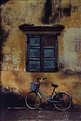
Critique By:
Barry Tipping (K:959)
5/27/2002 7:13:25 PM
I really like the composition of this. If it was me, I might remove the exhaust vent (?) on the building at left to allow the sky to flow uninterrupted. Very nice!
|
| Photo By: richard trager
(K:111)
|
|
|
Critique By:
mimoza veliu (K:481)
5/23/2002 9:16:51 AM
i like this.its a great combination of colors,i think so,
|
| Photo By: richard trager
(K:111)
|
|
|
Critique By:
Kim Culbert (K:37070)
5/22/2002 10:15:40 PM
I really like this shot. Those eyes hold so much expression, and your DOF works so well. I seem to remember something like this in black and white... was it yours as well? This has the warmth in the toning, not such a bleak feel. I really think this is great.
|
| Photo By: richard trager
(K:111)
|
|
|
Critique By:
Kim Culbert (K:37070)
5/20/2002 8:34:28 AM
I really like the framing you used here, as well as the sepia toning and the film grain. The one thing I would have liked would be catchlights in the eyes... they seem to get lost in the shadows.
She looks very comfortable with you... that smile is priceless.
|
| Photo By: richard trager
(K:111)
|
|
|
Critique By:
Dawna G. (K:7709)
5/19/2002 12:09:36 PM
very cool shot!
|
| Photo By: richard trager
(K:111)
|
|
|
Critique By:
Jake Sieg (K:673)
5/19/2002 8:23:16 AM
awesome, this is an excellent shot...the lighting sets the mood...i love the hair...i have dreads also...
|
| Photo By: richard trager
(K:111)
|
|
|
Critique By:
Barry Tipping (K:959)
5/18/2002 10:36:49 AM
Nice composition and tonality. If the models left eye was covered by hair, the shot would have been much less intriguing.
|
| Photo By: richard trager
(K:111)
|
|
|
Critique By:
Kim Culbert (K:37070)
5/13/2002 8:56:13 PM
I think this shot emits a strong sense of emotion... the pose, the lighting, the background... they all seem to work for this image. To me, the ring seems distracting. As soon as I saw it, I just kept going back to it. But I'm just the other voice... who knows what the majority will think?? Have you had any other thoughts on it?
|
| Photo By: richard trager
(K:111)
|
|
|
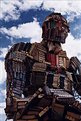
Critique By:
Barry Tipping (K:959)
5/8/2002 2:05:25 PM
This is disturbing on so many levels... 
Is this the actual burning man statue that gets burned at the end of the festival? Cool...
|
| Photo By: richard trager
(K:111)
|
|
|
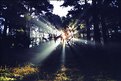
Critique By:
Kim Culbert (K:37070)
3/27/2002 10:28:58 AM
This is very cool. You managed to get the perfect balance of light and shadow. I love shots like this with the rays of light.. gorgeous.
|
| Photo By: richard trager
(K:111)
|
|
|
Critique By:
John Doe (K:170)
3/10/2002 9:38:39 AM
This is a cool shot. I think it needs more lighting on the subject though as his sunglasses get lost.
|
| Photo By: richard trager
(K:111)
|
|
|
Critique By:
Samuel Downs (K:7290)
3/9/2002 10:37:18 PM
Richard - classy look here.
|
| Photo By: richard trager
(K:111)
|
|
|
Critique By:
Miles . (K:896)
3/8/2002 8:09:00 PM
Good subject matter, well composed, perfect lighting and colour.
|
| Photo By: richard trager
(K:111)
|
|