|
|
Critique By:
Jeremy Publi (K:481)
10/28/2004 12:17:12 AM
The frenetic blur, painfully saturated colors, and narrow field of view *definitely* give me the feel of my most recent, very brief, visit to your... er, wonderful city  You've captured it. Now get some rest. You've captured it. Now get some rest.
|
| Photo By: Tom Miskiewicz
(K:119)
|
|
|
Critique By:
Jeremy Publi (K:481)
10/27/2004 4:38:44 AM
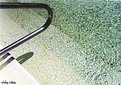
The Walgreen's where I live can only give me 2000x1500'ish scans, which are pretty taxed, to my eye, in an 8x10 print. I do not see the pixellation artifacts in your image on my monitor. Grain effect does not come out as pixellation in a scan. It has a distinct look that is easily recognizable - splurge for an 8-Megapixel scan at a pro-lab sometime and you'll see it. Fine-grain film (Velvia, Ektachrome, Optima) can hold its own at that resolution, but just barely. Sorry for the "lesson". If you plan to do a lot of film-to-digital, find a lab that will give you at least 6-Megapixel scans, and consider pro-grade film. It doesn't cost *that* much more
|
| Photo By: Lesley Silvia
(K:-66)
|
|
|
Critique By:
Jeremy Publi (K:481)
10/27/2004 4:10:08 AM
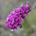
I LOVE it! Nice. Very nice. Do you have a polarizing filter? Can you digitally pull the blues of the sky out for more contrast? I like the composition, the timing, the subject... Very nice
|
| Photo By: Bret Hathaway
(K:556)
|
|
|
Critique By:
Jeremy Publi (K:481)
10/27/2004 4:08:28 AM
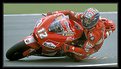
Nice crop. Great colors. The over-magnification artifacts are unfortunate - this is definitely an impressive shot and I would love to have seen it from some high-resolution film. Keep it up.
|
| Photo By: Rose Martin
(K:4696)
|
|
|
Critique By:
Jeremy Publi (K:481)
10/27/2004 4:05:03 AM
Hm. The dark blues and slant to the image, combined with the motion blur give the image a dark, forboding feel, but that could just be me. I see three dinosaurs marching on New York, the city aflame... I need more sleep.
|
| Photo By: Tom Miskiewicz
(K:119)
|
|
|
Critique By:
Jeremy Publi (K:481)
10/27/2004 3:51:54 AM
ARG! Advertisements - the bane of all photographers, except, of course, those shooting for advertising Think you can go back and have them remove that sign so you can retake the shot? Probably not.  Maybe a sharper angle would subdue it somewhat, make it less eye-catching. Could improve the overall image, too. Maybe a step to the left? Very good eye, though. Nice work. Maybe a sharper angle would subdue it somewhat, make it less eye-catching. Could improve the overall image, too. Maybe a step to the left? Very good eye, though. Nice work.
|
| Photo By: Jürgen Reinold
(K:1651)
|
|
|
Critique By:
Jeremy Publi (K:481)
10/27/2004 3:48:49 AM
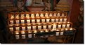
I see two guards standing watch over something - a different title might make this one stand well in the humor section Nice contrast. It may just be my monitor, but I see some over-saturation effects in the purple robe. Otherwise very nice.
|
| Photo By: Larry Hammond
(K:16631)
|
|
|
Critique By:
Jeremy Publi (K:481)
10/27/2004 3:44:07 AM
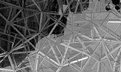
I love the lines. The angles definitely draw you into the picture. Would a skylight or haze filter have helped with the sky at the horizon? I would retake this shot many times to see what different skies do to the overall feel. Would love to see it also on a stormy day. Good eye. Happy snapping.
|
| Photo By: Özlem Mehmet
(K:-454)
|
|
|
Critique By:
Jeremy Publi (K:481)
10/27/2004 3:32:19 AM
You'll never please everybody Too much blue; though, I like how it helps spotlight the bag so sharply. Would like to see it with the same effect, only subdued, and the man's legs in the background desaturated some to blend in with the background more (The flesh-tones stand out from the blue). *Excellent* composition, and even the lighting seems very good, albeit a bit hard to distinguish under the extreme blue.
|
| Photo By: Tom Miskiewicz
(K:119)
|
|
|
Critique By:
Jeremy Publi (K:481)
10/27/2004 3:27:34 AM
Dunno if polarizing filter would have done much good - not enough angle from the sun. A lens hood might have eliminated the flare rings and increased contrast. See what you think about a tighter crop on the people - like a panoramic shot. You like?
|
Photo By: Taco heikamp
(K:3030)

|
|
|
Critique By:
Jeremy Publi (K:481)
10/27/2004 3:00:19 AM
Whadaheckizzit? Nice contrast, though, and composition. Good for a postcard I can send home to the USA as proof that Australians really are upside down after all.
|
| Photo By: Wayne Harridge
(K:18292)
|
|
|
Critique By:
Jeremy Publi (K:481)
10/27/2004 2:55:53 AM
Initial reaction was "Wow! Stunning!" I think it would have stayed that way if the background exposure (non-yellow part) hadn't come so prominently to eye. I'm not much with digital manipulation, but can you darken that part of the image while keeping the power-lines bright? Very abstract, yet definitely urban with all its attendant grit. Nice still.
|
| Photo By: paul lee
(K:45)
|
|
|
Critique By:
Jeremy Publi (K:481)
10/27/2004 2:43:25 AM
The contrast of colors from autumnal yellows to blue sky is striking, and it evokes something in me that keeps me looking, but what am I looking for? Something to look *at*, I think. The striking colors alone, to me, don't seem to carry the image. Recomposed with the gate more prominent, or a tighter crop around it... dunno. *Very* nice border selection. Wish you well.
|
| Photo By: Gil Draper
(K:3194)
|
|
|
Critique By:
Jeremy Publi (K:481)
9/8/2004 10:27:54 PM
One second look, I like this composition
|
| Photo By: Massimo Ghini
(K:2311)
|
|
|
Critique By:
Jeremy Publi (K:481)
9/8/2004 10:26:57 PM
Nicely done. I like the lighting. Using my browser, I cropped the top 1/5 of the image off, eliminating the light distractions in the upper right corner and thought it improved. Very nice image, regardless.
|
| Photo By: Eric Bumgardner
(K:0)
|
|
|
Critique By:
Jeremy Publi (K:481)
9/8/2004 10:22:57 PM
The multiple focal points confuse the eye, and I'm not sure what to think of it. Close cropping to the flowers in the foreground might salvage this very busy picture, or somebody else might see something in it that I'm missing. Happy snapping.
|
| Photo By: Wojciech Pietrusiewicz
(K:37)
|
|
|
Critique By:
Jeremy Publi (K:481)
9/8/2004 10:19:25 PM
Outstanding image, but you knew that already, right? Don't professional photographers use paychecks instead of critiques? I can't imagine how this image could be improved upon. Technically impeccable. Good work.
|
| Photo By: Harry Eggens
(K:14804)
|
|
|
Critique By:
Jeremy Publi (K:481)
9/8/2004 10:15:27 PM
I like this. I also shy away from the overly-edited feel it gives, but it's still interesting, enough to make me look twice anyway. Nice composition. Would love to see the raw image.
|
| Photo By: fokstrot .
(K:6560)
|
|
|
Critique By:
Jeremy Publi (K:481)
9/8/2004 10:11:20 PM
Did you take more than one image of this spot? Maybe one with the walker closer to the camera so we could "walk with her" around the curve with our eyes? Potentially a 7, placing a focus in the center of the image and having it face toward the edge tends to draw the eyes that way, unfortunately, and off of an otherwise outstanding photograph.
|
| Photo By: Massimo Ghini
(K:2311)
|
|
|
Critique By:
Jeremy Publi (K:481)
9/8/2004 10:06:44 PM
Wow. The sense of depth (or lack thereof?) makes the picture seem almost dangerous. Impressive color, great timing. Very nice image. Could be used on a warning poster at that fence
|
| Photo By: ken krishnan
(K:19102)
|
|
|
Critique By:
Jeremy Publi (K:481)
9/8/2004 10:00:23 PM
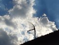
The clouds and sky make an excellent backdrop. Bumping the subject to the right may have provided for more eyecatching composition - few things can stand in silouette in the dead center of an image successfully. Your eye wants to follow in the direction it is pointing, and that takes the eye directly off the page. Nice work, all the same. Happy snapping.
|
| Photo By: Gilberto Santa Rosa
(K:11147)
|
|
|
Critique By:
Jeremy Publi (K:481)
9/8/2004 9:48:36 PM
I like the subject matter, and your eye for composition works well. Would love to have seen this same image with more grain, almost to the point of "artsy" grainy, to add to the roughness of the image. Nice work, regardless.
|
| Photo By: Adam Kimmerly
(K:382)
|
|
|
Critique By:
Jeremy Publi (K:481)
9/8/2004 9:44:41 PM
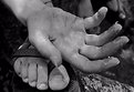
The color in the wood is eye-catching. A polarizing filter would have brought the sky down to make the contrast even more striking. I'm not sure what to think of it. Unable to dismiss it out of hand, unable to heap praise either. I don't know how many pixels you have to work with, but you might try recomposing what you have. A vertical panorama-esque view? A little more air below the end of the wood? Dunno. Keep it up
|
| Photo By: Richard Morton
(K:571)
|
|
|
Critique By:
Jeremy Publi (K:481)
9/8/2004 9:37:52 PM
My instant reaction to this photograph was negative - I don't like it. But before I hit the Back button, I hesitated. Well composed. Good lighting (Consider high-contrast paper or some artistic burning-in?). Good to focus on eyes like you did. The photograph is technically excellent - it's the subject matter that repels me, and as art goes, eliciting an emotion (and I assume my reaction is the one you were seeking?) is everything. Successful photograph. Good work.
|
| Photo By: Ken Tinley
(K:1856)
|
|