|
|
Critique By:
Brenda Guiles (K:6128)
8/5/2005 4:14:39 AM
Most definately the sepia version here! An excellent in camera tight composition and crop, full of emotion! 
|
| Photo By: Susie OConnor
(K:34798)
|
|
|
Critique By:
Brenda Guiles (K:6128)
8/5/2005 4:05:20 AM
A lovely vision you have created here with natural framing that only adds to this image!
|
| Photo By: Radu Angheloiu
(K:8)
|
|
|
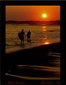
Critique By:
Brenda Guiles (K:6128)
8/5/2005 3:55:54 AM
This is a beautiful sunscape image, I love the warm colors here! I might have brought up the view a bit cutting off the bottom at the bottom of the railing and showing a bit more of the sky, an in camera crop if you will. Otherwise the off center sun and the sillouhettes do very well here! A perfect entry into project #51 sillouhettes and abstracts!
|
| Photo By: Jacinthe Duranceau
(K:1246)
|
|
|
Critique By:
Brenda Guiles (K:6128)
8/5/2005 3:55:23 AM
This is a beautiful sunscape image, I love the warm colors here! I might have brought up the view a bit cutting off the bottom at the bottom of the railing and showing a bit more of the sky, an in camera crop if you will. Otherwise the off center sun and the sillouhettes do very well here!
|
| Photo By: Jacinthe Duranceau
(K:1246)
|
|
|
Critique By:
Brenda Guiles (K:6128)
8/5/2005 3:50:32 AM
Just had a peek at your portfolio and I see that you like doing macros! I can appreciate the macro image especially one such as this! I must come back here again when I have some more time! This is a beautiful delicate and feminine image btw! I really like it!
|
| Photo By: Ron Wilson
(K:18362)
|
|
|
Critique By:
Brenda Guiles (K:6128)
8/5/2005 2:42:40 AM
You did this shoot and by the looks of it shot many images that evening! And what stunning works came out of it! You set the mood perfectly with all of these shots, the lighting is magic and these shots are all aptly titled! I love them all! Congrats on having a shoot produce so many stunning images!
|
| Photo By: John Loreaux
(K:86210)
|
|
|
Critique By:
Brenda Guiles (K:6128)
8/5/2005 2:38:36 AM
Now this is a beautiful and creative portrait! I love the unusual composition and the fact that he was unaware that you took it! Beautiful work my friend! Keep them coming!
|
| Photo By: John Loreaux
(K:86210)
|
|
|
Critique By:
Brenda Guiles (K:6128)
8/5/2005 2:36:45 AM
A wonderful image and a beautiful dedication! Love the POV here John!
|
| Photo By: John Loreaux
(K:86210)
|
|
|
Critique By:
Brenda Guiles (K:6128)
8/5/2005 2:33:13 AM
A little different perspective here, still love the colors and the compo! A very creative eye you have there John!
|
| Photo By: John Loreaux
(K:86210)
|
|
|
Critique By:
Brenda Guiles (K:6128)
8/5/2005 2:20:07 AM
This landscape caught my eye, a beautiful view and composition! I love the tones, they make this shot very moody!
|
| Photo By: Hanggan Situmorang
(K:24833)
|
|
|
Critique By:
Brenda Guiles (K:6128)
8/5/2005 1:43:26 AM
WOW! Dave this is an instant favorite! Love the dark background against these beautiful bright colors! Excellent work!
|
Photo By: Dave Stacey
(K:150877)

|
|
|
Critique By:
Brenda Guiles (K:6128)
8/5/2005 1:37:59 AM
Another wonderful macro image Dave! You are quite good with these dragonflys. I only have one this close, excellent work once again!
|
| Photo By: Dave Stacey
(K:150877)
|
|
|
Critique By:
Brenda Guiles (K:6128)
8/5/2005 1:36:23 AM
A wonderful macro image of this skipper butterfly Dave! The composition, focus and colors are excellent! The tongues on butterflies amaze me! This one has it's tongue stuck right into that flower!
|
| Photo By: Dave Stacey
(K:150877)
|
|
|
Critique By:
Brenda Guiles (K:6128)
8/5/2005 1:26:31 AM
I think this is a wonderful perspective here, makes for a very interesting image. Love the patterns and textures and of course the composition! A creative view my friend!
|
| Photo By: Dave Stacey
(K:150877)
|
|
|
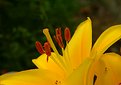
Critique By:
Brenda Guiles (K:6128)
8/5/2005 1:20:07 AM
PETAL!!! OMG this is a beautiful macro image! This spider looks like it is balanced on brain coral! Those flowers are awesome! Beautiful textures and colors here! Excellent work!
|
| Photo By: Petal Wijnen
(K:50989)
|
|
|
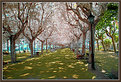
Critique By:
Brenda Guiles (K:6128)
8/5/2005 1:12:45 AM
You have some magnificent landscapes in here Zeev! I really like how you experiment using different effects! This is beautiful, the trees almost look like they are made out of cottom balls! I personally think this shot would look good in color or black and white or even sepia, the composition is what does it for me here!
|
| Photo By: Zeev Scharf
(K:25603)
|
|
|
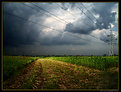
Critique By:
Brenda Guiles (K:6128)
8/5/2005 1:08:54 AM
Love these moody skies! You have captured the mood so well here! I love it!
|
| Photo By: Vasile Florin
(K:3003)
|
|
|
Critique By:
Brenda Guiles (K:6128)
8/5/2005 1:05:21 AM
Lovely composition and sillouhettes! I love this scene very much! OK now I understand the coloring, just looked and noticed this is Fuji Superia. Have you ever shot slide/positive film?
|
| Photo By: Lea Mulqueen
(K:7396)
|
|
|
Critique By:
Brenda Guiles (K:6128)
8/4/2005 10:57:28 PM
Wooooo Hoooo! Your here!!! I like this image in black and white! I am sure color would have been pretty too, but it doesn't look like that was an option!  Can't wait to see more of your works on here! By the way, welcome to Use Film! Can't wait to see more of your works on here! By the way, welcome to Use Film!
|
| Photo By: Gene Bradford
(K:0)
|
|
|
Critique By:
Brenda Guiles (K:6128)
8/4/2005 6:51:18 PM
While I think this is probably a beautiful image in it's original format, I am not really fond of the wrinkles from the watercolor paper. The wrinkles were the first thing that my eye saw and kept going back to, when I looked at this image. Maybe it is because of the small size that you uploaded? Maybe it looks better bigger? I dunno. I normally upload a 640 x 480 image or there about, so that the viewer can see more detail.
I would love to see this in a larger version Nicole. If you need any help, feel free to contact me, you can find my e mail address in my profile!
|
| Photo By: N.R. Miller
(K:946)
|
|
|
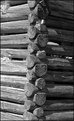
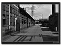
Critique By:
Brenda Guiles (K:6128)
8/4/2005 6:37:23 PM
This does remind me of an old shot, I do believe that this shot could have been taken 50 years ago or more. Now the cell phone towers and the satellite dishes wouldn't have been there. But hey if you really wanted to make this shot look old you would clone out the towers and the satellite dishes and go with a faded sepia tone. The black and white looks good too, don't get me wrong!
|
| Photo By: Mark Kresl
(K:9434)
|
|
|
Critique By:
Brenda Guiles (K:6128)
8/3/2005 9:05:40 PM
Now this one again screams "ART"! I love how you took this Petal and made this into a natural abstract! I would prefer a tad more focus on the bottom, I mean the veins in this Petal are very intricate and deserve to be shown in all of its glory! I love this composition, even over number II! Geeze can't decide on a favorite! I think this is my favorite though to be honest, the composition is what does it for me here! MORE.... I wanna see MORE! And don't limit yourself, using this style, I love it. Geeze how many times I have wanted to send a private IM and it just isn't available, send me an email (it's in my profile, I want you to look at an image or two via link!)
|
| Photo By: Angelo Villaschi
(K:49617)
|
|
|
Critique By:
Brenda Guiles (K:6128)
8/3/2005 8:56:54 PM
OK honest opinion coming here, I really prefer "borderless tulip petal II" to this one. I think you are lacking some DOF here. I love the colors here, but with the DOF being this shallow, the bottom of the petal is a blur, and it really doesn't "speak" to me like number II did.
|
| Photo By: Angelo Villaschi
(K:49617)
|
|
|
Critique By:
Brenda Guiles (K:6128)
8/3/2005 8:44:56 PM
I love how you did this Angelo! I am thinking you did this in a little studio you created? This screams "ART"! Love the lines the colors the colors and the textures here! This is just a gorgeous image! I will wait untill I comment on all in this series before I pick a favorite! But make no mistake, IMO this has to be one of your best series that I have viewed!
|
| Photo By: Angelo Villaschi
(K:49617)
|
|
|
Critique By:
Brenda Guiles (K:6128)
8/3/2005 8:39:25 PM
And what a neat looking weed errrr flower it is! Love the play of light amongst the PETALS!
|
| Photo By: Petal Wijnen
(K:50989)
|
|
|
Critique By:
Brenda Guiles (K:6128)
8/3/2005 8:37:00 PM
A wonderful capture of this ladybug!? The colors aren't that of a typical ladybug, so maybe it isn't? Anyway I haven't ever seen one like this and I think it is very unique.
As for suggestions? How about something for the title Lavender Blue?
|
| Photo By: Petal Wijnen
(K:50989)
|
|
|
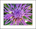
Critique By:
Brenda Guiles (K:6128)
8/3/2005 8:29:07 PM
Love the composition and colors here Petal! The lavender, violet and green look awesome together! It is funny how Mother Nature seems to have this natural color palette and you captured it wonderfully here! This would make for a fine wallpaper!
Thank you for your wonderful comment on my thank you image, I can teach you how do that if you are interested! My e mail is in my profile!
|
| Photo By: Petal Wijnen
(K:50989)
|
|
|
Critique By:
Brenda Guiles (K:6128)
8/2/2005 3:48:39 AM
Breathtaking John! These colors are simply amazing! Excellent work and composition! Love this image!
|
| Photo By: John Loreaux
(K:86210)
|
|
|
Critique By:
Brenda Guiles (K:6128)
8/2/2005 3:47:08 AM
A gorgeous display of color here and some awesoem collage work! Yes I do like this! Sorry about the loss of this person, it really looks as if he will be sorely missed.
|
| Photo By: Angelo Villaschi
(K:49617)
|
|
|
Critique By:
Brenda Guiles (K:6128)
8/2/2005 3:41:09 AM
I like the saturated colors in this image Angelo! A wonderful addition to your series!
No worries if you have to remove me, I can understand having limited time as I am not here everyday due to other commitments. I would miss you, but my feelings wouldn't be hurt.
|
| Photo By: Angelo Villaschi
(K:49617)
|
|