|
|
Critique By:
Ethan Lewis (K:1536)
7/25/2005 9:51:39 PM
wow... I actually never noticed that before...
|
| Photo By: Ethan Lewis
(K:1536)
|
|
|
Critique By:
Ethan Lewis (K:1536)
7/25/2005 9:50:18 PM
Thanks for the comments, everyone.
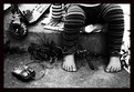
Yeah, this shot was completely lucky. My friends and I jump off of things (a.k.a. "freestyle walking") and I photograph it sometimes, and neither him nor I had any idea how this would turn out.
|
| Photo By: Ethan Lewis
(K:1536)
|
|
|
Critique By:
Ethan Lewis (K:1536)
7/25/2005 2:13:56 AM
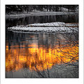
Tranquil and beautiful, but very foreboding at the same time.
|
Photo By: KEVIN TEMPLE
(K:8657)

|
|
|
Critique By:
Ethan Lewis (K:1536)
7/25/2005 1:54:29 AM
Nice...It reminds me of when they made a hyperspace jump in Star Wars...
|
| Photo By: Ed Rhodes
(K:1113)
|
|
|
Critique By:
Ethan Lewis (K:1536)
7/18/2005 2:33:03 AM
Amazing. Perfect composition, tones, depth of field, everything.
You certainly are versatile.
|
| Photo By: ppdix
(K:17069)
|
|
|
Critique By:
Ethan Lewis (K:1536)
7/18/2005 2:26:26 AM
Very nice. The colors are stunning, and the depth of field really enhances the shot.
|
| Photo By: steven carter
(K:2140)
|
|
|
Critique By:
Ethan Lewis (K:1536)
7/18/2005 2:23:42 AM
Very nice. I like the composition and tones a lot.
|
| Photo By: Sian
(K:2487)
|
|
|
Critique By:
Ethan Lewis (K:1536)
3/3/2005 12:56:30 AM
The sky in this photo is amazing, overwhelming. Excellent mood. Feels like a storm's coming....
|
| Photo By: Xunilek
(K:717)
|
|
|
Critique By:
Ethan Lewis (K:1536)
2/22/2005 5:28:44 AM
You have an impressive portfolio, and this one is my favorite of the bunch. Great facial expression, tones, and depth of field.
|
| Photo By: Twisted Rich
(K:691)
|
|
|
Critique By:
Ethan Lewis (K:1536)
2/22/2005 5:25:48 AM
This is a great shot that could made even better by tinkering a little with the color balance to bring out the reddish browns of the rocks
|
| Photo By: Daniel Silva
(K:2512)
|
|
|
Critique By:
Ethan Lewis (K:1536)
2/22/2005 5:23:52 AM
I love the earthy brown tones of the rocks and the deep green of the sea. I agree with James that it would be better if the other gull weren't there, but you can't exactly do anything about that.
|
| Photo By: Michael Sean Fleming
(K:2267)
|
|
|
Critique By:
Ethan Lewis (K:1536)
2/22/2005 5:20:35 AM
A good shot of a lovely looking place, but the fence in the foreground is a little distracting, and the sign seems to intrude on the skyline. If you moved forward to where the fence is no longer visible in the shot. I don't think you'll lose anything really important to the shot.
This is a minor thing, I know, but it also looks like your horizon's a little crooked.
|
| Photo By: Gabrielle Willson
(K:7978)
|
|
|
Critique By:
Ethan Lewis (K:1536)
2/22/2005 5:12:05 AM
Quite a nice shot (of quite an unusual scene), but the lines are a bit distracting. The steeple isn't pointing straight up, which means your horizon is probably off (unless the building is really crooked) which makes the whole picture feel a little off balance. Not a difficult thing to fix if you know what you're doing, though.
|
| Photo By: Zsolt Radákovits
(K:10376)
|
|
|
Critique By:
Ethan Lewis (K:1536)
2/22/2005 5:05:25 AM
A nicely done photograph, and a sobering message.
|
| Photo By: In Transit
(K:29432)
|
|
|
Critique By:
Ethan Lewis (K:1536)
2/22/2005 5:03:00 AM
Amazing. Is that UV or something else?
|
| Photo By: Paul Harrett
(K:791)
|
|
|
Critique By:
Ethan Lewis (K:1536)
2/22/2005 5:02:04 AM
Nice color saturation. It makes the whole scene look very vivid.
|
| Photo By: Gabrielle Willson
(K:7978)
|
|
|
Critique By:
Ethan Lewis (K:1536)
2/22/2005 2:26:22 AM
Certainly a spectacular view, but this photo doesn't have any striking features. The sky is hazy, not quite blue and not quite white, with no clearly defined clouds either. The landscape is a nearly uniform sea of green which isn't bad, but isn't that great either. I surmise from the shadows that this was taken in the mid-afternoon, which isn't a great time for outdoor photography because the light tends to be a little harsh. Wait a couple hours for the "golden hour" before sunset and the difference is considerable.
If I were in the same situation, I would try to find some aspect of the landscape that really stands out. Perhaps you could take that tree in the foreground and shoot it from a different perspective. Maybe you could tinker with the color balance to make it a bit bolder.
|
| Photo By: Michele Pesta
(K:256)
|
|
|
Critique By:
Ethan Lewis (K:1536)
2/22/2005 2:20:13 AM
Very nice portrait. The eye makeup is a little heavy-handed for my taste, but that's not a photography issue, it's a fashion issue.
|
| Photo By: Arthur John Grossman III
(K:1214)
|
|
|
Critique By:
Ethan Lewis (K:1536)
2/22/2005 2:18:23 AM
Very nice. Simple, yet striking.
|
| Photo By: Rebecca Raybon
(K:26654)
|
|
|
Critique By:
Ethan Lewis (K:1536)
2/22/2005 2:10:07 AM
Is that perspective distortion, or is that a digital alteration?
The overall yellowish cast is dramatic.
|
| Photo By: EUGENIO SINATRA
(K:1948)
|
|
|
Critique By:
Ethan Lewis (K:1536)
2/22/2005 2:04:14 AM
The contrast between the red and white really draws the eyes. I live in the US, and they don't make a lot of buildings bright colors like that these days...
|
| Photo By: Cesar Augusto Carvalho
(K:982)
|
|
|
Critique By:
Ethan Lewis (K:1536)
2/22/2005 2:01:17 AM
The simplicity of this shot is what really makes it work.
|
| Photo By: Roberta Elena Dragan
(K:345)
|
|
|
Critique By:
Ethan Lewis (K:1536)
2/22/2005 1:23:16 AM
Very striking. Well done!
|
| Photo By: Lars Raun
(K:1701)
|
|
|
Critique By:
Ethan Lewis (K:1536)
2/16/2005 4:12:40 PM
Very subtly done.
|
| Photo By: Mate Kovac
(K:59)
|
|
|
Critique By:
Ethan Lewis (K:1536)
2/16/2005 4:04:04 PM
That looks like something out of Salavdor Dali's nightmares...
|
| Photo By: Miao Yingyu
(K:0)
|
|
|
Critique By:
Ethan Lewis (K:1536)
2/16/2005 4:01:07 PM
Incredible. The details, the facial expression, the textures, the tones...everything.
|
| Photo By: paul dzik
(K:6)
|
|
|
Critique By:
Ethan Lewis (K:1536)
2/16/2005 5:06:05 AM
The lighting from below really creates a surreal effect.
|
| Photo By: Zsolt Radákovits
(K:10376)
|
|
|
Critique By:
Ethan Lewis (K:1536)
2/16/2005 5:04:36 AM
I like the perspective a lot. The levels and contrast could use a little tinkering (at least that's what I'd tinker with first if I was photoshopping this one)
|
| Photo By: Steve Bull
(K:2094)
|
|
|
Critique By:
Ethan Lewis (K:1536)
2/16/2005 5:02:57 AM
I like how you freezed the action.
I know how hard it is to photograph birds in motion without blurring them a lot...what was your shutter speed? I'd have to guess 1/500s or faster.
|
| Photo By: Donna Johnson
(K:9906)
|
|
|
Critique By:
Ethan Lewis (K:1536)
2/16/2005 3:55:20 AM
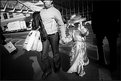
Great composition. "Cutting off" part of the woman's head helps the viewer see the picture from a child's perspective.
|
| Photo By: Oliver Dienst
(K:452)
|
|