|
|
Critique By:
Ethan Lewis (K:1536)
11/8/2004 3:48:13 PM
A very nice looking model with a great expression, but I think this photo would be even better if it were taken against a darker background, which would make the subject stand out more distinctly.
|
| Photo By: Andrew Soebroto
(K:0)
|
|
|
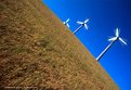
Critique By:
Ethan Lewis (K:1536)
11/5/2004 12:04:29 AM
I like the conrast of the dull brown against the brilliant blue sky. The angle definitely makes this shot feel a lot 'crazier'. How did you get the fan blades to be in the middle of the blur, rather than on the leading edge?
|
| Photo By: Jim Goldstein
(K:21230)
|
|
|
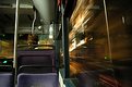
Critique By:
Ethan Lewis (K:1536)
11/5/2004 12:01:20 AM
Looks as if the bus is approaching Warp factor 7! Did you hold the camera by hand for this shot, prop it on or against something, or use a tripod?
|
| Photo By: Subata Kitano
(K:2717)
|
|
|
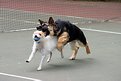
Critique By:
Ethan Lewis (K:1536)
11/4/2004 11:58:52 PM
Great action shot. Little guy looks like he's about to be decapitated...but I also have a dog, and I know those things always look worse than they are.
Also, thanks for commenting on my image.
|
| Photo By: Jim Goldstein
(K:21230)
|
|
|
Critique By:
Ethan Lewis (K:1536)
11/4/2004 11:41:46 PM
Excellent shot. The blurring adds an almost panicked vibe to the picture.
|
| Photo By: RC. Dany
(K:64104)
|
|
|
Critique By:
Ethan Lewis (K:1536)
11/4/2004 11:30:46 PM
A great cityscape shot. The dark tones compliment the old-looking buildings. The cannon in the foreground enhances feeling of the photograph. It makes it seem almost as if I am actually looking out over Edinburgh.
|
| Photo By: Scott Whitelaw
(K:1434)
|
|
|
Critique By:
Ethan Lewis (K:1536)
11/4/2004 11:27:21 PM
A great capture of everyday life. I wonder, what did that young lady see that momentarily diverted her attention from Kafka?
|
| Photo By: Francesca Cadeddu Concas
(K:7443)
|
|
|
Critique By:
Ethan Lewis (K:1536)
11/4/2004 11:24:22 PM
Wow...that really is a big leaf. I like how it seems to stick up out of nowhere.
|
| Photo By: waldemar ebner filho
(K:5242)
|
|
|
Critique By:
Ethan Lewis (K:1536)
11/2/2004 2:29:10 PM
Wow...very creatively done. But don't tell everybody how you did it. Use it to "prove" the existence of ghosts to some gullible person...
|
| Photo By: Kostas Tzanetos
(K:22012)
|
|
|
Critique By:
Ethan Lewis (K:1536)
10/27/2004 12:51:44 AM
This is probably my favorite of your portfolio at the moment. The tones and posture of the subject are very striking. Excellent work.
|
| Photo By: Todd Huffman
(K:165)
|
|
|
Critique By:
Ethan Lewis (K:1536)
10/27/2004 12:47:13 AM
Making order out of chaos. Quite an honorable pursuit.
|
| Photo By: Jürgen Reinold
(K:1651)
|
|
|
Critique By:
Ethan Lewis (K:1536)
10/27/2004 12:46:23 AM
A nice portrait. It would be a little nicer if the angle were slightly different (lower and to the left) so as to show the subject's face a little more clearly. However, this is merely an "armchair photographer" opinion and as such, deserves to be taken with a grain of salt.
|
| Photo By: Todd Huffman
(K:165)
|
|
|
Critique By:
Ethan Lewis (K:1536)
10/27/2004 12:43:27 AM
An excellent capture. Shots like this are part of what I love about dogs. They are so expressive. They also don't mind being photographed, and that always helps too. :-D
|
| Photo By: Jürgen Reinold
(K:1651)
|
|
|
Critique By:
Ethan Lewis (K:1536)
10/27/2004 12:41:01 AM
This isn't a bad shot, but it just seems to lack any particular striking features that grab the eye. The colors are all pretty drab. The leaves aren't in any particular pattern. This is more of a personal preference, but I tend to prefer shots that show great detail of a small part of a scene (Macro photography, for example) to shots that try to take in an entire scene or large part thereof.
|
| Photo By: Jürgen Reinold
(K:1651)
|
|
|
Critique By:
Ethan Lewis (K:1536)
10/27/2004 12:37:32 AM
Wow...great use of tones to make the mood of a photograph. Being a midwesterner (not born, but definitely raised in the midwest) the corn stubble reminds me of home. I'm not saying it makes me wish I was back home. I'm just saying it reminds me of home. :-D
But seriously folks, this is a great piece of photo art. Overall, the clouds are a little blah, but it works for the scene. It's subtle, but the textures in the clouds seem a little weird.
|
| Photo By: K
(K:221)
|
|
|
Critique By:
Ethan Lewis (K:1536)
10/27/2004 12:33:16 AM
You certainly did a good job of it on this one. Very good composition. That part of his face is missing from the shot makes one wonder what else (intentions, for example) may be hidden from view.
Is this subject a friend of yours? If so, does he know that he is the new poster boy for lust? If he does, then is he okay with this? :-P
|
| Photo By: Renata Boruch
(K:91)
|
|
|
Critique By:
Ethan Lewis (K:1536)
10/27/2004 12:30:33 AM
Very nice tones, and striking shadows. An excellent job of taking the ordinary and making it look bizarre.
|
Photo By: Verena Rentrop
(K:15233)

|
|
|
Critique By:
Ethan Lewis (K:1536)
10/27/2004 12:27:29 AM
This is a particularly striking use of desaturation (an effect which occasionally borders on cliche, IMO). This is an extremely effective use of depth of field as well. The subject, a harmless flower, looks almost like something out of Little Shop of Horrors in this shot. Probably because of the hairs, and that the subject is beginning to open slowly. All in all, refreshingly different from your typical "photograph of a flower". Well done.
|
| Photo By: SAYGIN Mavinil
(K:281)
|
|
|
Critique By:
Ethan Lewis (K:1536)
10/26/2004 11:26:29 AM
I'm not sure what the color shift is. It's subtle, but I see it... It could be an irregularity on the part of whoever printed the photo (snapfish.com not exactly a pro lab, but they're cheap and they never scratch my negs unlike the local mini labs)
|
| Photo By: Ethan Lewis
(K:1536)
|
|
|
Critique By:
Ethan Lewis (K:1536)
10/25/2004 4:45:17 PM
That particular subject is right outside the front of my dorm, so I walk past it every single day as I go to class. I couldn't resist photographing it. Something about it is intriuging to me. It leads one to wonder how exactly something that thick and heavy and made of solid iron gets simply cracked in half...
As a matter of fact, the photo is upside down. I took it from a pretty normal angle, but then scanned it on a flatbed scanner. I thought I had all my scans corrected so that they were all "right-side-up" but apparently I skipped over that one. I only noticed this after I uploaded the image, and at that point I decided that I actually like it better upside down.
|
| Photo By: Ethan Lewis
(K:1536)
|
|
|
Critique By:
Ethan Lewis (K:1536)
10/25/2004 2:46:12 PM
Way to capture the emotion of a moment...Is that some kind of playground equipment? I've never seen anything like that before, and I've seen more than my share of playgrounds...
|
| Photo By: Katia Cutrone
(K:12940)
|
|
|
Critique By:
Ethan Lewis (K:1536)
10/25/2004 2:43:37 PM
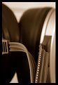
An excellent macro shot. I love the color and texture.
|
| Photo By: In Transit
(K:29432)
|
|
|
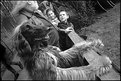
Critique By:
Ethan Lewis (K:1536)
10/25/2004 2:31:23 PM
Reminds me of something they did in "A Beautiful Mind"
|
| Photo By: Stace Walker
(K:4175)
|
|
|
Critique By:
Ethan Lewis (K:1536)
10/25/2004 2:17:19 PM
I really can't even guess at what the blurred shapes in the background are. A great shot. And a great song as well, incidentally.
|
| Photo By: Patrick Jacobson
(K:29151)
|
|
|
Critique By:
Ethan Lewis (K:1536)
10/25/2004 2:03:07 PM
Wow...very creative composition. Is that a double exposure, or is that figure a reflection in a window, or is it something totally different from either of those?
|
| Photo By: Panos Skouloudis
(K:484)
|
|
|
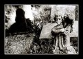
Critique By:
Ethan Lewis (K:1536)
10/24/2004 9:19:58 PM
Great use of perspective and symmetry.
|
| Photo By: Panos Skouloudis
(K:484)
|
|
|
Critique By:
Ethan Lewis (K:1536)
10/24/2004 9:18:52 PM
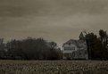
A beautiful shot. I like the tones and mood. Very bleak.
|
| Photo By: Aris Michalopoulos / OsirisiS
(K:1916)
|
|
|
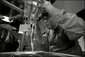
Critique By:
Ethan Lewis (K:1536)
10/24/2004 9:17:35 PM
I can't even guess at what that machine is doing, but you certainly did a good job of capturing someone "at work."
|
| Photo By: Oliver Dienst
(K:452)
|
|
|
Critique By:
Ethan Lewis (K:1536)
10/24/2004 9:12:57 PM
The way the dog has its paws up on the rail is a nice touch. It makes it look almost anthropomorphic.
|
| Photo By: Mick Feuerbacher
(K:218)
|
|
|
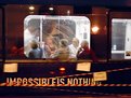
Critique By:
Ethan Lewis (K:1536)
10/24/2004 9:08:13 PM
An excellent job of capturing a moment of everyday life. Amazingly, it looks as if only one of the people in the photo is aware that you are taking a picture. Not that I advocate sneaking up on people...but usually to get a natural looking photograph you have to click the shutter before they are even aware that you are there.
On a technical note, I really like the lighting of this shot. Are those rectangular overhead lights fluorescent tubes or skylights? If they are fluorescent, I must commend you on however you made the light turn out looking somewhat white. Usually with fluorescent lights, I have a choice of photos looking green (unfiltered) or orange (fluorescent filter). While fluorescent light is less of a problem than it used to be, thanks partially to four-layer films, it still doesn't look quite natural to me. I don't know the details of Fuji Sensia, but if memory serves it's daylight balanced. Did you use any filters or post-exposure color balance tinkering? However you managed it, this is quite a good shot.
|
| Photo By: Mick Feuerbacher
(K:218)
|
|