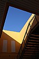
|
|
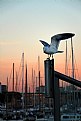
Critique By:
Serge Moscow (K:-2917)

2/21/2015 7:32:01 AM
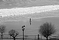
From my point of view, the reflectioin in this case is not so expressive. I'd cut bottom part.
Regards,
Serge
|
| Photo By: Alfons Rial
(K:7600)
|
|
|
Critique By:
Serge Moscow (K:-2917)
2/16/2015 11:55:33 PM
Great photo, Alfons! Congratulations.
Regards,
Serge
|
| Photo By: Alfons Rial
(K:7600)
|
|
|
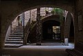
Critique By:
Serge Moscow (K:-2917)
2/16/2015 12:09:42 AM
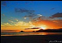
Interesting composition. I like this photo.
Probably, it'd be better to move POV down a little to show whole ark at the right.
Regards,
Serge
|
| Photo By: Alfons Rial
(K:7600)
|
|
|
Critique By:
Serge Moscow (K:-2917)
2/9/2015 11:43:41 AM
Beautiful pastel tones. A little bit noisy and low contrast. My variant below
Regards,
Serge
|
| Photo By: Peter Hurtubise
(K:1124)
|
|
|
Critique By:
Serge Moscow (K:-2917)
2/8/2015 12:06:23 PM
My variant of this interesting photo is below
Regards,
Serge
|
| Photo By: pasquale ale angelini
(K:2543)
|
|
|
Critique By:
Serge Moscow (K:-2917)
2/8/2015 11:59:51 AM
Nothing to critisize, image is not interesting.
Regards,
Serge
|
| Photo By: pasquale ale angelini
(K:2543)
|
|
|
Critique By:
Serge Moscow (K:-2917)
2/8/2015 11:57:03 AM
Interesting, I like this photo.
Regards,
Serge
|
| Photo By: win. ka
(K:3288)
|
|
|
Critique By:
Serge Moscow (K:-2917)
1/27/2015 1:26:48 AM
Very good photo, just nothing to critisize:)
Regards,
Serge
|
| Photo By: pasquale ale angelini
(K:2543)
|
|
|
Critique By:
Serge Moscow (K:-2917)
1/26/2015 2:08:14 AM
Very pleasant picture.
Regards,
Serge
|
| Photo By: Mark Broman
(K:338)
|
|
|
Critique By:
Serge Moscow (K:-2917)
1/25/2015 11:12:46 AM
Interesting, with nice mood.
Regards,
Serge
|
| Photo By: Barbara Socor
(K:13559)
|
|
|
Critique By:
Serge Moscow (K:-2917)
1/25/2015 1:17:29 AM
Paul, is this a photo - or it's just an "observation"?
If this is a photo, I'd like to say, that technical quality is not enough for photoforum. BW is bluish, a lot of noise, low contrast, problems with shadows.
If this is an observation - thank you, it's interesting to see.
Regards,
Serge
|
| Photo By: Paul Freeman
(K:35606)
|
|
|
Critique By:
Serge Moscow (K:-2917)
1/25/2015 1:10:32 AM
I like this photo. My varian (just for discussion) is below
Regards,
Serge
|
| Photo By: Alfons Rial
(K:7600)
|
|
|
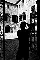
Critique By:
Serge Moscow (K:-2917)
1/25/2015 1:01:03 AM
It's a very long tradition of americal photography called in common "abandoned". Aa for me, it's connected with the absence of interesting scenes to capture. At least, from my experience in Texas.
And the best samples are really good, with nice mood. But here just a shot of "Real Estate Agent".
I remember very interesting album
Abandoned America by Steve Gottlieb, Sleeping Beer Press, of ca.2003. This is really interesting.
Regards,
Serge
|
| Photo By: The Pilgrim
(K:64989)
|
|
|
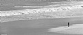
Critique By:
Serge Moscow (K:-2917)
1/25/2015 12:55:07 AM
I agree in principle about AA works. But in this particular case I think that Alfons express his idea. Black figure of the man - and light space of Nature.
|
| Photo By: Alfons Rial
(K:7600)
|
|
|
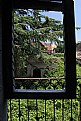
Critique By:
Serge Moscow (K:-2917)
1/24/2015 5:02:37 AM
Very nice!
|
| Photo By: Alfons Rial
(K:7600)
|
|
|
Critique By:
Serge Moscow (K:-2917)
1/22/2015 10:55:27 PM
Nice mood and b&w.
It's a kind of compromise here. You icluded trees, etc. below. But in this case I'd like to see trees in whole size, not cutted below.
Or you should live beach and man only (like my photo from San-Sebastian).
In current state this is very nice photo with small issues:)
Regards,
Serge
|
| Photo By: Alfons Rial
(K:7600)
|
|
|
Critique By:
Serge Moscow (K:-2917)
1/22/2015 10:44:21 PM
Nice colors. I'd crop below a little, black "bar" is too thick, imho.
Regards,
Serge
|
| Photo By: Marcos R Fernandes
(K:3630)
|
|
|
Critique By:
Serge Moscow (K:-2917)
1/21/2015 11:20:42 PM
Hola Alfons,
1. I know all reasons about "absence of sky". And finally it's author's decision - publish such photo or not. I wrote about my firm belief - photo with holes must not be published.
2. It doesn't matter why photographer received "hole" on the image. If he just overexposed his shot - it's simple technical issue, nothing to discuss. If this is just structurless sky - it's still a problem. Let me explain why.
Every piece/part of the image should contain information or help to express that emotions author would like to express. In this sence absence of sky is HOLE. There is no information for audience. So, outhor did NOT do everything possible for meximum of expression.
2. About contrast. My point about treatment is as follows - everything must be done according author's idea. In this case I was trying to understand your's one - and did not success in this. I do not understand why you need so high contrast.
Of course, you can say "I just would like to do in such a way, it's my photo!!!" And you'll be absolutely right. But in this case nothing to discuss...
Regards,
Serge
|
| Photo By: Alfons Rial
(K:7600)
|
|
|
Critique By:
Serge Moscow (K:-2917)
1/21/2015 6:59:43 AM
Alfons,
1. I told about PANORAMA from vertical shots. Framing should be horizontal, of course.
2. I understand, why sky is absent:) It's typical situation. I'd like to say, that real photos MUST have the sky. Otherwise it's not suitable for publishing. From technical point of view.
So or you have good weather with nice blue sky or clouds - or you're trying to hide this issue with b&w, for e.g. Or you do not shoot at all.
I mean not "you" personally, I'm about photographer (icluding me).
It's just a necessary demand for normal photo.
Regards,
Serge
|
| Photo By: Alfons Rial
(K:7600)
|
|
|
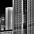
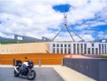
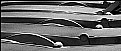
Critique By:
Serge Moscow (K:-2917)
1/21/2015 12:09:21 AM
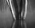
Very intersting "game" of lines. Good b&w. I like this photo.
BTW, what does it mean LU lens?
Regards,
Serge
|
| Photo By: CAGATAY ATASAGUN
(K:21564)
|
|
|
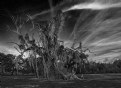
Critique By:
Serge Moscow (K:-2917)
1/21/2015 12:06:14 AM
IMHO, or photo should give common view (without details) - or photo should show fine details. Intermediate variant is succesfull quite rare (at least from my experience).
Then, composition is not perfect. Tree nor in the center, not at 1/3. Framing could be wider, I'd like to see more sky and clouds.
Regards,
Serge
|
| Photo By: Studio East
(K:3349)
|
|
|
Critique By:
Serge Moscow (K:-2917)
1/20/2015 11:48:28 PM
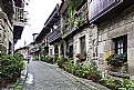
It's very interesting for me to see how peoples leave in small villages in Spain. And I like very much what I see here. Cosily and beautiful.
Shot is overcontrasted and not perfectly framed (I'd try panorama from vertical frames). And sky is absent:(
Regards,
Serge
|
| Photo By: Alfons Rial
(K:7600)
|
|
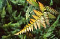
|
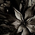
Critique By:
Serge Moscow (K:-2917)
1/20/2015 11:43:57 PM
Interesting. Nice color of the leaf. Good texture of the stone. I'd framed a little bit higher - to move leaf in the left corner and to stress the diagonal of the black holes.
Regards,
Serge
|
| Photo By: Barbara Socor
(K:13559)
|
|
|
Critique By:
Serge Moscow (K:-2917)
1/18/2015 11:16:21 PM
Very nice, gentle photo.
Regards,
Serge
|
| Photo By: Carmen Fuchs
(K:6967)
|
|
|
Critique By:
Serge Moscow (K:-2917)
1/14/2015 12:40:43 PM
Imho, to show a wide palette of pastels is more interesting here. One possible variant below.
I mean exactly this when wrote that your's photos demand more sophisticated treatment. Most interesting point in such type of shots are colors and transitions between them.
Regards,
Serge
|
| Photo By: Salvador María Lozada
(K:69375)
|
|
|
Critique By:
Serge Moscow (K:-2917)
1/14/2015 7:28:03 AM
Nice b&w and toning. I'd change framing in such a way when lines of petals came to corners of picture.
Regards,
Serge
|
| Photo By: Sylvia H.
(K:22195)
|
|
|
Critique By:
Serge Moscow (K:-2917)
1/13/2015 9:09:23 AM
Good photo, I like it.
I'd try to enchanced a little. My variant below.
(I'd say, your's photos demand better, more sophisticated treatment.)
Regards,
Serge
|
| Photo By: Salvador María Lozada
(K:69375)
|
|
|
Critique By:
Serge Moscow (K:-2917)
1/13/2015 5:10:51 AM
Very good photo, Alfons.
Regards,
Serge
|
| Photo By: Alfons Rial
(K:7600)
|
|
|
Critique By:
Serge Moscow (K:-2917)
1/13/2015 12:47:27 AM
Good photo. I'd crop 25% from the left and increase contrast a little.
Regards,
Serge
|
| Photo By: James Fraser
(K:941)
|
|
|
Critique By:
Serge Moscow (K:-2917)
1/9/2015 11:50:29 PM
Very nice photo.
Due to holidays I've time to show my variant:)
Regards,
Serge
|
| Photo By: Alfons Rial
(K:7600)
|
|