|
|
Critique By:
paul durrant (K:1047)
10/25/2004 8:08:00 PM
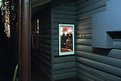
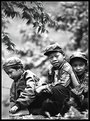
It's parents/grandparents etc. on the very first day of school 2003. I found them to be more interesting to shoot than the kids!
|
| Photo By: paul durrant
(K:1047)
|
|
|
Critique By:
paul durrant (K:1047)
9/28/2003 1:16:44 PM
only the usual minor things done in PS (unsharp mask, resizing etc.)
|
| Photo By: paul durrant
(K:1047)
|
|
|
Critique By:
paul durrant (K:1047)
8/8/2003 4:11:42 PM
excellent shot overall - there is perhaps a couple of white spots
which could be removed. great stuff!
|
| Photo By: Hanna Siljeholm
(K:59)
|
|
|
Critique By:
paul durrant (K:1047)
5/23/2003 5:16:41 PM
nice idea and for the web it looks ok if not a little soft and flat.
perhaps needs to be sharpened more and the contrast raised.
if you were to print this image i think it would look a bit muddy.
i would desaturate the tone a little and try those things i mentioned
already and see how you go. i do like the subject and composition a lot.
|
| Photo By: Chris Mitchell
(K:16)
|
|
|
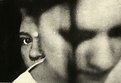
Critique By:
paul durrant (K:1047)
5/23/2003 5:07:09 PM
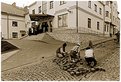
very good b + w street image. tells a story, but i'm not sure
whether it really fits your title!
i like it very much.
|
| Photo By: Sofia Quintas
(K:754)
|
|
|
Critique By:
paul durrant (K:1047)
5/23/2003 5:02:41 PM
i like this one Al !
the subdued colours are very pleasing to the eye.
|
| Photo By: Allan Lineker
(K:37)
|
|
|
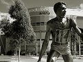
Critique By:
paul durrant (K:1047)
3/17/2003 11:47:27 AM
it was taken in the sporting precinct right next to the city of melbourne australia.
|
| Photo By: paul durrant
(K:1047)
|
|
|
Critique By:
paul durrant (K:1047)
3/10/2003 4:05:54 AM
excellent work! clean and well composed. very well lit.
well done.
|
| Photo By: Javed Rassi
(K:8223)
|
|
|
Critique By:
paul durrant (K:1047)
3/10/2003 3:59:02 AM
wonderful shot! great expression, composition and lighting
well done!
|
| Photo By: Gustaf L Bjerne
(K:245)
|
|
|
Critique By:
paul durrant (K:1047)
3/3/2003 11:46:39 AM
superb composition and colors!
|
| Photo By: Flavio Ferrarese
(K:287)
|
|
|
Critique By:
paul durrant (K:1047)
3/2/2003 11:53:29 AM
very well executed shot! lighting is perfect and so is the composition and mood. nicely done!
|
| Photo By: Arthur Sevestre
(K:552)
|
|
|
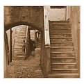
Critique By:
paul durrant (K:1047)
3/2/2003 11:49:30 AM
well seen and executed! the sepia gives it the look of an old photo!
|
| Photo By: lucio brando
(K:2295)
|
|
|
Critique By:
paul durrant (K:1047)
3/2/2003 11:46:42 AM
very interesting motion shot that looks like a painting.
very nice!
|
| Photo By: Suvomoy Mitra
(K:8369)
|
|
|
Critique By:
paul durrant (K:1047)
3/2/2003 11:37:56 AM
nice composition, color and use of the diagonals. good work!
|
| Photo By: karl magnuson
(K:373)
|
|
|
Critique By:
paul durrant (K:1047)
3/2/2003 11:25:52 AM
very nice! love the expressions and use of B+W for this.
|
| Photo By: Darrin James
(K:3944)
|
|
|
Critique By:
paul durrant (K:1047)
2/26/2003 11:35:32 AM
very nice! good use of the diagonals in the composition.
the ladder leading into the clouds is like the entrance to another world - great shot!
|
| Photo By: Michael Duncan
(K:86)
|
|
|
Critique By:
paul durrant (K:1047)
2/24/2003 12:19:17 PM
quite nice but i would have prefered if you had panned down slightly to include the whole of the breast. that's the only thing that spoils the shot. otherwise great!
|
| Photo By: Michael Duncan
(K:86)
|
|
|
Critique By:
paul durrant (K:1047)
2/24/2003 12:02:34 PM
i guess everyone has there own opinion. personally i think the exposure fits the scene. it is possible that the leaves that you wanted in focus are perhaps not quite sharp enough but that's nitpicking. the short DOF does IMO suit the shot well. overall i like this and agree that the twig would be better outa there but nice work i think. just for the record i gave it a 7.
|
| Photo By: Mattias Eklund
(K:2921)
|
|
|
Critique By:
paul durrant (K:1047)
2/24/2003 11:51:19 AM
very nice! i would have panned just a tiny bit more to the right to get that guy into the shot a little more - but only a bit! nice work anyway!
|
| Photo By: Zenon Drabik
(K:26)
|
|
|
Critique By:
paul durrant (K:1047)
2/24/2003 11:48:20 AM
nice - the picture tells the story! well documented.
|
| Photo By: Wallace Rollins
(K:149)
|
|
|
Critique By:
paul durrant (K:1047)
2/24/2003 11:45:13 AM
quite like the composition but it's a bit blurry and what's with the god-awful frame you have added?? needs some tweaking.
|
| Photo By: Fahredin Spahija
(K:98)
|
|
|
Critique By:
paul durrant (K:1047)
2/23/2003 12:13:07 PM
very nice effort! good and sharp with plenty of punch - well done!
|
| Photo By: Ian T
(K:114)
|
|
|
Critique By:
paul durrant (K:1047)
2/23/2003 12:09:08 PM
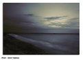
a beautifully subtle peaceful shot! (i think that sounds right!!)very nice indeed!
|
| Photo By: Soren Hojberg
(K:10)
|
|
|
Critique By:
paul durrant (K:1047)
2/23/2003 12:36:16 AM
very nice indeed lynn! this has a lovely mood to it and the subject is great. excellent work!
|
| Photo By: Lynn Moore
(K:1059)
|
|
|
Critique By:
paul durrant (K:1047)
2/21/2003 9:09:22 PM
i like this shot very much. toning used is great! nice work
|
| Photo By: David Doler
(K:467)
|
|
|
Critique By:
paul durrant (K:1047)
2/21/2003 9:07:04 PM
very nice indeed david! love the tones and shapes/lines.
nothing wrong with pocket cameras!!
|
| Photo By: David Doler
(K:467)
|
|
|
Critique By:
paul durrant (K:1047)
2/21/2003 8:51:34 PM
well done richard! i think this one looks more natural - i don't know whether that's better though who knows. now that i have seen this one, i think perhaps just a plain deep toned sky might be the way to go. just my thoughts.
|
| Photo By: Richard Wells
(K:310)
|
|
|
Critique By:
paul durrant (K:1047)
2/21/2003 8:46:23 PM
agree with the above - nice capture!
|
| Photo By: Slava Khristich
(K:75)
|
|
|
Critique By:
paul durrant (K:1047)
2/21/2003 8:21:45 PM
very nice - i also agree with the above even though it is great as is. perhaps try cropping just above the chairline.
just a thought!
|
| Photo By: Paul Treffers
(K:321)
|
|
|
Critique By:
paul durrant (K:1047)
2/21/2003 8:17:50 PM
this could have been very nice but it's just not sharp enough IMO
|
| Photo By: David Doler
(K:467)
|
|