|
|
Critique By:
Mike George (K:3429)
6/12/2008 9:53:43 PM
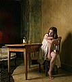
Good Sir Claude.
First, I really enjoy this shot. It is captivating and the shadows really lend a mood to the picture. Her expression are both inviting and tranquil. I would not change anything.
As for UF. Your proposed leaving prompted me to log in for the first time in many months. Unfortunately it was to bid you well and thank you for your work giving me inspiration. I long ago quit posting my works here primarily because critical examination and critiquing were non existant. Worse, I had a moderator berate me over my chose of words in the Photography Help forum. Worse it was not about what I was saying, but rather my choice of what I capitalized and didnt. It wasn't even about anyone. I was asking for help in how to photograph something. So I requested Al immediately remove me as a Donor. Al does a nice job with the site but some of the moderators and donors definately have, how shall I put it, different and intolerant views of others.
I agree, when I go through my friends list, only a few are still posting images and critiquing shots. Most have not been here in years. Where is Per Johansen? Eldor Gemst? Hannu Eskelinen? Stephane Bourson? Many could have learned more from them and been inspired. It is truly sad when exceptional photographers leave. I wish you well and if nothing else, consider the time spent here a success, as you have inspired at least one other person.
|
| Photo By: Claude Tenot
(K:9960)
|
|
|
Critique By:
Mike George (K:3429)
9/18/2006 8:43:48 PM
As always I enjoy your work. I like the look, the pose and expression. I, for one, am appreciative of your adding the lighting setup.
|
Photo By: Phillip Filtz
(K:1792)

|
|
|
Critique By:
Mike George (K:3429)
9/8/2006 3:32:09 PM
Good Luck!!!!
I like it a lot. I think you will be quite successful!
|
| Photo By: Kevin Greggain
(K:2572)
|
|
|
Critique By:
Mike George (K:3429)
6/22/2006 1:36:43 PM
This is a wonderful shot! I particularly like the use of light and shadow for dramatic effect. I also like the classy look of the pose and use of jewely. Very well done. I am curious how you chose to light this.
|
| Photo By: Justyna Ortyl
(K:-159)
|
|
|
Critique By:
Mike George (K:3429)
6/22/2006 1:34:04 PM
Chuck, I am having a hard time deciding between the two. I am leaning toward the color one, but like them both. You passion for remembering history is fantastic. In the cemetary where my mom is buried, there are about a dozen civil war graves, most union but even a couple of confederate. That concept seems kinda ironic to me. I really must go and capture them with the camera. It is an a very small out of the way place in Missouri.
|
| Photo By: Chuck Freeman
(K:13616)
|
|
|
Critique By:
Mike George (K:3429)
6/9/2006 1:50:05 PM
Hi Roberta. I like your concept here and think you did a very nice job on it. Exposure is right on and colors are very good. I would offer the following suggestions. I like the sunglasses, but bring them down her nose a bit thus showing her eyes looking over them. This would also give her right hand something to do, pulling the glasses down. The other suggestion is to not cropping the fingers on her left hand or her feet. Just a couple of small things to make a nicely done shot even better.
|
| Photo By: Roberta Elena Dragan
(K:345)
|
|
|
Critique By:
Mike George (K:3429)
5/30/2006 1:45:46 PM
First, it is a very good shot. The lighting, exposure and sharpness are wonderful. I have looking at this shot for some time. I like it but find there is something just a bit off. I am having a hard time placing it. Perhaps it is her expression, she doesn't see comfortable. For me eyes tend to make or break shots. Perhaps a hint of smile or some emotion showing in her expression. Just a couple of thoughts to make a good shot better.
|
| Photo By: Roberta Elena Dragan
(K:345)
|
|
|
Critique By:
Mike George (K:3429)
5/22/2006 5:42:55 PM
Welcome to UF. Nice shot. A couple of things I would try to make it even better. I think it could be a bit better, contrast wise. Colors should stand out a bit more. I would like to see how the same shot would look with her right hand (resting on the rocks) would look if it was up by her chin or check, resting her head on it and the head tilted slightly. You have a very good shot here.
|
| Photo By: Alice Healy
(K:36)
|
|
|
Critique By:
Mike George (K:3429)
5/18/2006 3:55:43 PM
I like your shot quite a bit. My preference is a bit more light on the face (for portrait). However, I am looking at it under the fashion category which is more for the clothing or look. The shot could be just a bit sharper IMHO. Good idea with good result.
By the way you have a unique view of the world and I enjoyed your portfolio.
|
| Photo By: Katleen Waterplas
(K:207)
|
|
|
Critique By:
Mike George (K:3429)
3/29/2006 2:30:20 PM
It works for me, for whatever my 2cents worth is. Both are good, but I like this one better. Well done.....
|
| Photo By: Shoot Mike
(K:3255)
|
|
|
Critique By:
Mike George (K:3429)
3/28/2006 5:38:45 PM
I like the shot for the most part. I especially like the contrast in colors. Her pose is good for fashion style. I can't quite put my finger on it, but there is something a bit off. Perhaps it is her expression. She doesn't seem into the shoot, just kinda there. My own personal view is that the eyes/expression often are what makes or breaks the shot. It would likely be a good catalog shot, if just a tad brighter. Nicely done overall though.
|
| Photo By: Shoot Mike
(K:3255)
|
|
|
Critique By:
Mike George (K:3429)
3/23/2006 5:44:42 PM
Welcome to UF. Nicely done shot. Basic, simple and intimate. I'm in MO as well. What part are you in?
|
| Photo By: Connie LaFlam
(K:68)
|
|
|
Critique By:
Mike George (K:3429)
3/20/2006 4:32:58 PM
First word that comes to mind, SUPERB. I am curious how you shot this. Any reflector to get the facial tones correct? Thanks for the camera settings.
|
| Photo By: Shoot Mike
(K:3255)
|
|
|
Critique By:
Mike George (K:3429)
3/8/2006 1:31:17 PM
Welcome to UF. Very nicely done. Colors are sharp and vibrant. Good use of depth of field. It really brings your eye to hers. Very captivating.
|
| Photo By: Nessa Gnatoush
(K:341)
|
|
|
Critique By:
Mike George (K:3429)
3/7/2006 1:50:09 PM
Welcome to UF. Nicely done. Looking at your portfolio so far, you have definately got the knack of the high key shot.
Lighting is right on. The tight shot really brings your eyes to hers. Very well done.
|
| Photo By: Jonny
(K:50)
|
|
|
Critique By:
Mike George (K:3429)
3/3/2006 1:34:10 PM
Welcome to the UF community. I have been studying this shot for a while. I like it. I am trying to decide how it could be better. She tends to fall off into the background. I wonder if a hair or halo light might have helped her to stand out a bit better. I think your colors, pose and exposure are right on. Well done.
|
| Photo By: gina lowthert
(K:707)
|
|
|
Critique By:
Mike George (K:3429)
3/2/2006 4:46:39 PM
Well done. I like the use of geometric shapes, shadows and color. Makes for an interesting and pleasing shot.
|
| Photo By: Paul Pardue
(K:39)
|
|
|
Critique By:
Mike George (K:3429)
3/2/2006 4:30:44 PM
I like the shot. It is ideal for her head shot in her portfolio.
|
| Photo By: Eveline Shih-Pitcairn
(K:4406)
|
|
|
Critique By:
Mike George (K:3429)
3/2/2006 4:24:24 PM
I got curious and went back to the original and rotated a bith and cropped in. Again, a quickie at work. Another view which might work.
I get this way often with my shots. When I take it I might like it. Later I'll look at the same shot and not like it as much and play around with it. Then I might decide the original is better. I am know for going back and forth so you can take my suggestions with a grain or two of salt. Playing around has helped me in trying different angles/poses when I shoot now. Hope this was helpful.....
|
| Photo By: Robin Dunham
(K:1851)
|
|
|
Critique By:
Mike George (K:3429)
3/2/2006 4:13:33 PM
It is better than the original. I don't see any problems with the sharpness. I did a quick crop to show what I suggested in the original. I had to do this quickly at work so it was done in Windows editor... this might help a bit IMHO.
|
| Photo By: Robin Dunham
(K:1851)
|
|
|
Critique By:
Mike George (K:3429)
2/27/2006 1:23:56 PM
Hmmm, I agree and disagree with Joe. I think the bra strap is a distraction. Pose is pretty good and exposure ok. What I think would help the shot the most is a tighter crop. I would like to see the crop on the left side just to the left of the fold line in backdrop (not too close to her) and the bottom cropped below the top of the shoulder but above the armpit. I think this would warm the shot up, perhaps making it a tad be more personal or intimate. My 2cents worth.
|
| Photo By: Robin Dunham
(K:1851)
|
|
|
Critique By:
Mike George (K:3429)
1/17/2006 9:20:36 PM
Wonderful shot. It is superbly lit. She has a nice intimate expression which goes with the mood of the lighting, clothing and scene. Very well done and welcome to UF.
|
| Photo By: JASON LEE PARRY
(K:34)
|
|
|
Critique By:
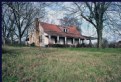
Mike George (K:3429)
1/16/2006 8:40:34 AM
Nicely done. Another lost from and earlier era. Makes ya wonder who was raised here, why it was left to ruin. From a technical perspective, I think a little less foreground might have improved this a bit. I bet it would make a really cool shot with fall colors in the trees. If you would, email me at sundance333@hotmail.com.
|
| Photo By: Chuck Freeman
(K:13616)
|
|
|
Critique By:
Mike George (K:3429)
8/17/2005 4:23:04 PM
I really like the concept of the shot, the dark background really makes you look at her. I agree there a couple of hot spots, but not bad. I think a reflector on behind her/to camera's left might have helped just a little. I would love to know how you lit this shot, it appears to be 1 light to the camera right and above.
|
| Photo By: susan darcey
(K:601)
|
|
|
Critique By:
Mike George (K:3429)
8/15/2005 12:33:16 PM
Kudos, it is a very captivating and intimate shot. I like the depth of field and use of shadows. Her gaze is solidly upon you, inviting you to gaze back. I can't tell if you PS her skin but it looks good to me.... A very good shot.
|
| Photo By: Luca B.
(K:53)
|
|
|
Critique By:
Mike George (K:3429)
8/8/2005 2:16:45 PM
A very striking and lovely image. I like it a lot. I think her gaze to the left and the expression give this a very nice intimate feel. From a technical point, the shot has a blue tint to it. I think adding a tad bit of warming in PS or using a warming filter might have helped. Also the black straps are a very minor distraction. Overall, a wonderful shot.
|
| Photo By: Lida Chaulet
(K:3430)
|
|
|
Critique By:
Mike George (K:3429)
8/8/2005 2:09:06 PM
Hi Robert, I was intriqued by your post under the forum "I just don't get it". As you wished for more critical/indepth I have come to your portfolio and looked for a shot that has few responses. I've always been a person who says, if ya can't say something nice, don't say anything. Well, I decided even before I pulled up your portfolio that you wanted to know ways to get better, so I decided to take a look and would find one to comment on. I am not a pro so take my views with that in mind.
I liked the idea behind this shot. It actually reminds me of the begining (or end) of the show Married with Children. It could use a bit of improvement in my eyes. I do like the way the sunlight lights the fountain spray. I think the best improvement is with the sky and buildings. The sky is a bit white to me and the buildings a bit underexposed ( a problem not to uncommon to my shots as well). So I began considering how I would have tried this shot. I think I would have shot a few with a polarizer. I think that would have helped with the sky and perhaps the buildings (although I am not too sure about what the polarizer would have done to the dark buildings). The polarizer might have even made the distant buildings silhoutte, which might not have been bad either. I am pretty sure the clouds would have shown up better with the polarizer. Another would have been to take the shot from a different view, moreso with the sun behind you. However, I don't know what the skyline or background was like so perhaps you did the best that was available with the circumstances that you had.
I am also curious what the shot would have looked like with a slow shutter speed, blurring the water. You know kind of like the blurred stream shots. I would also like to see what the shot would look like in the early morning or late afternoon with the gold tint from the sun. Just thinking aloud.
Good luck and keep shooting.......
Mike
|
| Photo By: Robert Lewis
(K:491)
|
|
|
Critique By:
Mike George (K:3429)
8/1/2005 4:36:26 PM
Lovely use of color. The blue sky makes this shot in my opinion. One thing I see in your shot that I have problems with in my wide angle shots is the pillar leaning to the right but the steeple leaning into it (It might be nice to see them both remaining vertical). Kinda affects the perspective. I wish I know how to prevent this without having to work it in PS.
|
| Photo By: Markus Scholz
(K:23722)
|
|
|
Critique By:
Mike George (K:3429)
8/1/2005 4:31:52 PM
Lovely shot. When will we see more????
|
| Photo By: Deb Mayes
(K:19605)
|
|
|
Critique By:
Mike George (K:3429)
8/1/2005 4:31:07 PM
It is amazing how we find these by sheer happenstance. I was at a race in Indiana. There was a storm front approaching. I kept looking behind me to see when to put my gear away. The sun disappeared behind the line of clouds giving a brilliant orange cloud shot. I can't remember if I ever posted it. The shot found me, not me searching for it.
|
| Photo By: Sid Mallick
(K:1040)
|
|