|
|
Critique By:
Angelo Villaschi (K:49617)
8/15/2006 5:56:30 PM
Danny, I have tried the e-mail address you sent me, but I think you didn't get my message.
e-mail me on angelo_villaschi@yahoo.com
Regards.
|
| Photo By: Angelo Villaschi
(K:49617)
|
|
|
Critique By:
Angelo Villaschi (K:49617)
8/13/2006 3:08:24 PM
Danny, I sent you an e-mail. Let me know if you don't get it.
Nice textures on that stone, but the black-on-white text doesn't parse.
|
| Photo By: Danny Brannigan
(K:19523)
|
|
|
Critique By:
Angelo Villaschi (K:49617)
8/11/2006 7:26:14 PM
I wouldn't say "masterpiece"... should've remembered to remove all that dust first  plus the frame cropped one of the pieces. plus the frame cropped one of the pieces.
Thanks for the high praise, tough! 
|
| Photo By: Angelo Villaschi
(K:49617)
|
|
|
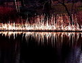
Critique By:
Angelo Villaschi (K:49617)
7/22/2006 9:30:36 PM
Hi Kev. Your photos are one of the main things I miss in my self-imposed UF exile.
This one's beautiful. Love that grain and the contrast between hard man-made forms and the natural ones.
Good stuff!
|
| Photo By: Kevin C
(K:280)
|
|
|
Critique By:
Angelo Villaschi (K:49617)
7/15/2006 6:49:52 PM
You can't scare me. I have children!
|
| Photo By: Angelo Villaschi
(K:49617)
|
|
|
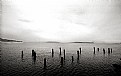
Critique By:
Angelo Villaschi (K:49617)
7/15/2006 5:51:41 PM
I looked at this at 100% with the grid on. It is level, but you get a slight optical illusion because of the sweep of the land.
And, if the land was level, the river wouldn't flow...
(That's my excuse and I'm sticking to it!)
|
| Photo By: Angelo Villaschi
(K:49617)
|
|
|
Critique By:
Angelo Villaschi (K:49617)
7/15/2006 5:18:38 PM
Damn globalisation... all the signs are in English!
Nice colours, Danny.
My membership lapsed, so I can only upload one byte per 24 hours.
I think I'll be uploading some stuff to "that other photo critique place that cannot be mentioned in posts lest they be 'moderated'" too...
|
| Photo By: Danny Brannigan
(K:19523)
|
|
|
Critique By:
Angelo Villaschi (K:49617)
7/14/2006 11:21:21 AM
I went and bloody missed the fair again... I so want to go one of these days. Mind you work has been so overwhelming. I can't remember but I bet I worked that entire weekend. Story of my life recently.
|
| Photo By: Danny Brannigan
(K:19523)
|
|
|
Critique By:
Angelo Villaschi (K:49617)
7/14/2006 11:18:50 AM
Nice shot with great light. A beautiful profile against a very nice background.
I hope you didn't have to deal with too much BS to get this shot...
|
| Photo By: Danny Brannigan
(K:19523)
|
|
|
Critique By:
Angelo Villaschi (K:49617)
7/14/2006 11:16:38 AM
Hi Danny. Long time no comment. I come to have a peek at UF again after a long time and see this one.
Ewe did a nice job using the backlight with this one, though your subject is looking a bit sheepish...
|
| Photo By: Danny Brannigan
(K:19523)
|
|
|
Critique By:
Angelo Villaschi (K:49617)
5/8/2006 7:54:35 PM
Nice blue colours, Luke.
I am a little confused by the photo. Am I looking at the "back" of the flower (i.e. the bit connected to the stem)? It seems so.
Overall, the image looks a little (1/3 - 1/2 a stop?) dark.
I like the off-center placement of the subject, but I wonder if the horizontal orientation is the ideal one... A vertical orientation would have shown more of the stem and perhaps cut out that distracting in-focus leaf.
|
| Photo By: Luke Luther
(K:14693)
|
|
|
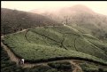
Critique By:
Angelo Villaschi (K:49617)
12/25/2005 10:33:25 AM
Hugo,
I hadn't seen this one the first time around, so it is quite nice to see it now. Similar to the one I have recently uploaded, in that you have the classic "river and mountain" composition, but quite different in light, colour and mood. Whereas I had monsoon-type weather, here you have cheerful, colourful sunny skies and bright light.
Nice use of the reflections and layers within the image.
Here's wishing you a Happy New Year, and may it be filled with great photo oportunities!
Regards,
Angelo.
|
| Photo By: Hugo de Wolf
(K:185110)
|
|
|
Critique By:
Angelo Villaschi (K:49617)
12/25/2005 10:29:28 AM
Hi Hugo,
I wanted a very subtle toning effect and I thought the duotone looked better than the grayscale.
Just a question of artistic license
Thanks for the comment!
Angelo.
|
| Photo By: Angelo Villaschi
(K:49617)
|
|
|
Critique By:
Angelo Villaschi (K:49617)
12/21/2005 11:47:43 AM
Thanks, Danny. See my comments to Hugo and the un-cropped original.
Regards,
Angelo.
|
| Photo By: Angelo Villaschi
(K:49617)
|
|
|
Critique By:
Angelo Villaschi (K:49617)
12/21/2005 11:46:12 AM
Hi Hugo,
Thanks for the in-depth comment. As usual, it is thought-provoking, considered and very helpful. I appreciate it!
This is the best I could do of a bad job. I had greater hopes for it, but I was hurried: I too could sense the rain and had fallen way behind my companions. I didn't even change from the 15-30 to the 28-80...
This is already a crop and I hesitated to crop it more. I attach the un-cropped one.
Regards,
Angelo.
|
| Photo By: Angelo Villaschi
(K:49617)
|
|
|
Critique By:
Angelo Villaschi (K:49617)
12/21/2005 11:37:28 AM
Hi Paul,
Nice shot. I like the simple abstract quality of this image. You have to look closely to make it out. Nice contrasts between highlights and shadows.
I do feel your composition is "sitting on the fence" to some extent, if you allow me. It's neither symmetrical nor fully committed to being off-center.
|
Photo By: Paul Lara
(K:88111)

|
|
|
Critique By:
Angelo Villaschi (K:49617)
12/21/2005 11:32:57 AM
Thanks, Paul. That is a very flattering comment.
|
| Photo By: Angelo Villaschi
(K:49617)
|
|
|
Critique By:
Angelo Villaschi (K:49617)
12/20/2005 3:37:26 PM
Beautiful misty look, Vancea. Love the golden light from the sun.
|
| Photo By: Vancea Dorin
(K:164)
|
|
|
Critique By:
Angelo Villaschi (K:49617)
12/19/2005 1:46:42 PM
What comment?
|
| Photo By: Danny Brannigan
(K:19523)
|
|
|
Critique By:
Angelo Villaschi (K:49617)
12/18/2005 2:29:40 PM
Nice idea, Vlad. I can see what you are trying to do. I just think maybe the highlights are a bit washed out, making it hard to look at.
Nice toning work, though.
|
| Photo By: Vlad Shtrom
(K:117)
|
|
|
Critique By:
Angelo Villaschi (K:49617)
12/18/2005 2:27:07 PM
Nice work, with some lovely detail, Rich.
A bit noisy (over-enlarged?) bus still nice to look at.
|
| Photo By: Rich Swanner
(K:-3732)
|
|
|
Critique By:
Angelo Villaschi (K:49617)
12/18/2005 2:25:41 PM
Wonderfully crisp and simple, Yusman. I like the placement of the plant. Nice job, great textures.
|
| Photo By: Yusman Budiawan
(K:45)
|
|
|
Critique By:
Angelo Villaschi (K:49617)
12/18/2005 1:05:52 AM
Nice panorama, Roger. I guess you will be a heavy user of this function.
This is nicely done. I particularly like the chap looking at the camera from the side of his eye. Looks like he turned just to avoid being in shot. Little did he know!
|
| Photo By: Roger Williams
(K:86139)
|
|
|
Critique By:
Angelo Villaschi (K:49617)
12/17/2005 3:53:41 PM
Nice use of the lines and light, Thilo. Good idea to go for the silhouettes.
|
| Photo By: Thilo Bayer
(K:50358)
|
|
|
Critique By:
Angelo Villaschi (K:49617)
12/17/2005 3:16:08 PM
Beautifully done, Dokko! The yellow rim with backlighting is simply superb. You made the most of the advantageous lighting, and the image is crisp, clean, simple and striking.
I have tried shots like this in the past but have always struggled with the framing. No such problems here.
|
| Photo By: In Dokko
(K:289)
|
|
|
Critique By:
Angelo Villaschi (K:49617)
12/17/2005 3:13:32 PM
Brilliantly done, Vojtech! I like the full sense of motion in this one, and also the way the divers in the foreground create little frames inside the image, separating the observers on the far end.
Do you have the photo taken by the other photograper???
|
| Photo By: Vojtech Tryhuk
(K:900)
|
|
|
Critique By:
Angelo Villaschi (K:49617)
12/17/2005 3:10:39 PM
Hi Vojtech. Thanks for your comment.
There is no saturation in the top part because of the very low cloud covering the top of the mountain. Do you mean that you think it is too bright?
Regards,
Angelo.
|
| Photo By: Angelo Villaschi
(K:49617)
|
|
|
Critique By:
Angelo Villaschi (K:49617)
12/17/2005 8:11:03 AM
Nice one, Danny. No butts about it! Er...
|
| Photo By: Danny Brannigan
(K:19523)
|
|
|
Critique By:
Angelo Villaschi (K:49617)
12/17/2005 7:27:22 AM
Excellent juxtaposition.
Just one question: why not just crop out the right edge to get rid of whatever it is you wanted to hide?
|
| Photo By: Danny Brannigan
(K:19523)
|
|
|
Critique By:
Angelo Villaschi (K:49617)
12/17/2005 7:24:54 AM
Excellent juxtaposition.
Just one question: why not just crop out the right edge to get rid of whatever it is you wanted to hide?
|
| Photo By: Danny Brannigan
(K:19523)
|
|