|
|
Critique By:
Jula Amore (K:2823)
7/26/2004 8:28:40 PM
Very sweet!
Regards
J.
|
Photo By: Anthony Gorman
(K:140)

|
|
|
Critique By:
Karen Engelbreth (K:943)
7/26/2004 8:26:17 PM
so cute!
|
| Photo By: Anthony Gorman
(K:140)
|
|
|
Critique By:
kita mcintosh (K:18594)
5/3/2004 7:06:43 PM
:~(
|
| Photo By: Anthony Gorman
(K:140)
|
|
|
Critique By:
Jani Salvataggio (K:27283)
4/28/2004 6:03:16 PM
very good details!!!
regards
Jani
|
| Photo By: Anthony Gorman
(K:140)
|
|
|
Critique By:
Erland Pillegaard (K:34147)
4/26/2004 7:07:28 PM
Good photo
|
| Photo By: Anthony Gorman
(K:140)
|
|
|
Critique By:
Brian T. Ach (K:1742)
4/26/2004 2:48:57 PM
Great results for a difficult lighting situation!
|
| Photo By: Anthony Gorman
(K:140)
|
|
|
Critique By:
Anthony Gorman (K:140)
4/25/2004 12:05:51 AM
Respectfully,
I disagree. At least the image provokes something in you. A friend of mine (musician) said once that he would rather have someone hate his music than be indifferent, then at least it would have invoked some sort of emotion. Not all photos are fun or nice. I am an omnivour, and I personally like roast duck. Haven't you ever walked by something and it caught your eye? For whatever reason. That's what happened here.
Enjoy,
Anthony Gorman
|
| Photo By: Anthony Gorman
(K:140)
|
|
|
Critique By:
Radim Sobotka (K:4050)
4/24/2004 7:10:35 PM
Nice photo
|
| Photo By: Anthony Gorman
(K:140)
|
|
|
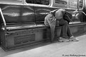
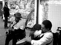
Critique By:
Sérgio Vieira (K:3384)
4/23/2004 5:55:26 AM
I agree with David! Just showing dead bodies filled with grease isn't very fun.
Maybe if we could see the cook's face, and whatever expression he had at the moment (maybe you could even make him look at you) your photo could tell some story.
Best regards,
Sérgio
|
| Photo By: Anthony Gorman
(K:140)
|
|
|
Critique By:
david gemmell (K:64)
4/22/2004 10:38:59 PM
Well seen - but not very nice.
David
|
| Photo By: Anthony Gorman
(K:140)
|
|
|
Critique By:
Dr. Rafael Springmann (K:89517)
4/21/2004 6:05:36 PM
Light and composition make this photo work and draw you into it.
Dr. Rafael Springmann
|
| Photo By: Anthony Gorman
(K:140)
|
|
|
Critique By:
Dustin Cowen (K:2837)
4/20/2004 9:08:46 PM
I like the use of space here. Good composition. The stairs ascending up to the "beautiful and clean" flowers from the homeless gentleman adds a touch of conscious. Nice job.
Cheers, Dustin
|
| Photo By: Anthony Gorman
(K:140)
|
|
|
Critique By:
Abeer Al Jarsh (K:10209)
4/20/2004 4:35:47 AM
excellent shot

|
| Photo By: Anthony Gorman
(K:140)
|
|
|
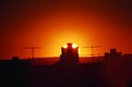
Critique By:
Timothy R (K:3028)
4/20/2004 3:12:06 AM
Well done. Sad that in a country where the rich get a tax break, people are homeless.
|
| Photo By: Anthony Gorman
(K:140)
|
|
|
Critique By:
waldemar ebner filho (K:5242)
4/20/2004 1:28:06 AM
Anthony,
Very nice,almost all white,I like,good composition.Hug
|
| Photo By: Anthony Gorman
(K:140)
|
|
|
Critique By:
ken krishnan (K:19102)
4/19/2004 9:36:31 PM
Sad
|
| Photo By: Anthony Gorman
(K:140)
|
|
|
Critique By:
Stephen Bowden (K:64141)
4/19/2004 9:35:55 PM
A sad but very good photo Anthony
|
| Photo By: Anthony Gorman
(K:140)
|
|
|
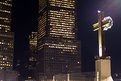
Critique By:
Sun Shine (K:6225)
4/18/2004 1:05:05 PM
Well done! Excelent!
Giselle
|
| Photo By: Anthony Gorman
(K:140)
|
|
|
Critique By:
Amy Drake (K:996)
4/16/2004 5:14:15 PM
Very nice! I like how the shot is framed.
|
| Photo By: Anthony Gorman
(K:140)
|
|
|
Critique By:
Enjoy (K:16125)
4/12/2004 8:33:20 AM
pretty pretty what a shot....
|
| Photo By: Anthony Gorman
(K:140)
|
|
|
Critique By:
Ellen Smith (K:14418)
4/11/2004 2:20:26 PM
Outrageous! Now can you do that with a digital camera?
|
| Photo By: Anthony Gorman
(K:140)
|
|
|
Critique By:
Amy Drake (K:996)
4/11/2004 1:16:08 PM
The shot really works - great movement and texture. Black and white was definitely the way to go.
|
| Photo By: Anthony Gorman
(K:140)
|
|
|
Critique By:
narabia (K:9563)
4/11/2004 1:14:44 PM
good shot
|
| Photo By: Anthony Gorman
(K:140)
|
|
|
Critique By:
Amy Drake (K:996)
4/11/2004 1:12:48 PM
I'm with you on the fuzzy edges, but it's still a really cool effect. This was a great subject to try out the lens.
|
| Photo By: Anthony Gorman
(K:140)
|
|
|
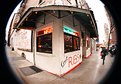
Critique By:
Amy Drake (K:996)
4/11/2004 1:02:30 PM
Love the effect! The black area at the bottom - is this due to the lens? Did you think about cropping it out? This might be present at the top, too, but isn't noticable because of the bridge's features. What do you think about cropping it square?
|
| Photo By: Anthony Gorman
(K:140)
|
|
|
Critique By:
foob Niemand (K:267)
4/11/2004 1:01:40 PM
Interesting effect, as shooting by the fish eye.
|
| Photo By: Anthony Gorman
(K:140)
|
|
|
Critique By:
Ken Tinley (K:1856)
4/11/2004 12:48:53 PM
its nice
|
| Photo By: Anthony Gorman
(K:140)
|
|
|
Critique By:
Baki Berk Kayalar (K:75)
4/11/2004 12:42:53 PM
excellent
|
| Photo By: Anthony Gorman
(K:140)
|
|
|
Critique By:
Roy V (K:13082)
4/6/2004 9:21:52 AM
Anthony,
Very Beautiful! Excellent
Roy
|
| Photo By: Anthony Gorman
(K:140)
|
|
|
Critique By:
Kees and Carolyn (K:15193)
4/5/2004 2:45:27 PM
Beautiful image!
Carolyn
|
| Photo By: Anthony Gorman
(K:140)
|
|