|
|
Critique By:
Michael Kanemoto (K:22115)
1/18/2006 11:47:42 PM
Peta>
Extremely crisp images, I had to click on this macro since the DOF is a little bit more refined than some of the other floral shots, and I am a sucker for super macro shots.
The pistel and stamen shot is somewhat comment, but I like the fact that you put it on a diagonal and tried to show the 3D recession into space.
I really like the crisp points on the end.
I like the portfolio, a lot of shots cropped short to essenial minimum language, and a refined crispness.
|
| Photo By: p e t a .
(K:18700)
|
|
|
Critique By:
Michael Kanemoto (K:22115)
7/19/2005 10:16:31 PM
Wonderful work - manipulating colors and matching the city geomerty. Certainly a creative idea that I have not seen before.
Placing the subject on a diagonal and not one of the standard 15, 30 ,60 degrees certainly gives this more energy, yet there is repetition and stability through the grid and reflections. I think the application of color lends itself to a Mondrian sort of view.
Clear and crisp, yet still abstracted. Heck of a shot.
|
| Photo By: Dominic Daigle
(K:641)
|
|
|
Critique By:
Michael Kanemoto (K:22115)
6/23/2005 2:23:48 PM
Hasan:
Next time you have the chance, take two versions of the shot. Take your "normal" shot, and on the second one try this:
Only show what is barely essential for someone to understand what the subject is. If there is radial symmetry (like a wheel) only show a quarter of it (since the rest is the same). Or, if it is like a person with symmetry, try showing only one half since the other half will be the same.
I've noticed that people's minds will fill in the rest and actually compose a scene beyond the shot that you give them, allowing their brain to interpret more than what is there. For some reason this makes the overall image more exciting and also a little off balance.
I cropped off most of the bike because just from a few parts you can tell what that it is a motorcycle, it's yellow, and even what type it is. The pattern on the wall is assumed to repeat and I sliced out the seams to make it a little cleaner.
Give it a try the next time you are out and see if it makes a difference.
I'm trying out this tool and have been somewhat pleased with the results (I make a lot of mistakes). When it works, some stuff looks great.
Once again, this is just a "trick" and you shouldn't get hooked on it as a crutch, but it is a nice tool to keep in the back of your mind along with the rule of thirds.
|
| Photo By: Hasan Ozkapici
(K:551)
|
|
|
Critique By:
Michael Kanemoto (K:22115)
6/15/2005 1:45:52 PM
I'm still trying to contemplate what goes through your mind to say: "that would make a great photograph"... Most of us (me included), wouldn't consider this location.
The composition really makes this a great photograph, but ultimately the subject, color, and just the plain subject of it all really has a thoughtful presentation.
Thanks for posting - you give newbies like me something to consider and a new way of seeing.
|
| Photo By: Todd Miller
(K:16464)
|
|
|
Critique By:
Michael Kanemoto (K:22115)
12/1/2004 11:18:43 PM
Kostas:
I lost my camera on the final frame to sub-freezing wind and a good gust of wind. The camera went into the windshield of the car in back of me and then into the curb. My cheap assembly of cardboard was run over many times and crushed to death...
It took me a few minutes to pull back around, park, and find the camera, so there was a resulting double exposure, and some headlight burn from flying into the car. I had the camera mounted like you high on the roof looking backwards.
|
| Photo By: Kostas Tzanetos
(K:22012)
|
|
|
Critique By:
Michael Kanemoto (K:22115)
11/22/2004 10:45:21 PM
John:
I pulled down the image to see and noticed that it is not a pure black and white, but instead a B&W with a blue tone, I think by design.
In this version I converted the photo to pure black and white and adjusted the brightness and contrast of the sky independantly of the ground features for a little more contrast. Is this what you were thinking?
|
| Photo By: Steve Marcus
(K:195)
|
|
|
Critique By:
Michael Kanemoto (K:22115)
10/26/2004 11:31:57 PM
Hey there -
I was attracted to this photograph because the composition is really solid. I think it just needed a little contrast.
- Converted to grayscale.
- Inceased the contrast and brightness
- Used a sharpening filter to make the spines stand out white
- Converted back to color and added equal parts yellow and red back into the photograph.
|
| Photo By: Ran Brosh
(K:1498)
|
|
|
Critique By:
Michael Kanemoto (K:22115)
8/25/2004 5:44:52 PM
Excellent use of backlighting to bring out the shape of the umbrellas. I think this would work best in black and white, where the shape of the umbrellas becomes a study of geometric repetition through perspective against the light background.
Only improvement suggestion is to use the rule of thirds and show a little less sky.
I have attached a crop to give you an idea, and I also darkened the sky per another comment just to see if it added any drama.
|
| Photo By: andrea erreenne
(K:36)
|
|
|
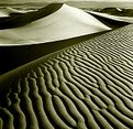
Critique By:
Michael Kanemoto (K:22115)
8/19/2004 10:17:44 PM
Excellent side lighting to bring out the dunes. Was this taken during the morning or evening? It looks like you are getting some side lighting redness from a setting sun - adds to the overall warmth and effect.
I like the rhythm in the sand.
Perhaps next time get in really close to the sand with a wide angle and high F-stop in the late afternoon when the clouds come out to get a really interesting perspective shot. A polarizing lens will get you pop in the clouds.
|
| Photo By: win robins
(K:329)
|
|
|
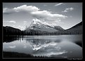
Critique By:
Michael Kanemoto (K:22115)
8/19/2004 10:22:20 PM
Fantastic contrast, good light and dark balance, and a lot of dynamic energy in the composition.
You seem to be using near/far field composition with a wide angle lens and shooting late or early in the day for side lighting. Good job.
Also props on hitting the tic-tac-toe balance in the composition.
|
| Photo By: Dr. Thomas Krebs
(K:1376)
|
|