|
|
Critique By:
David N. VanMeter (K:552)
5/2/2002 6:32:44 AM
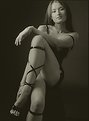
I agree with the previous two posts except one little thing that bugs me. I wish the crop wasn't so tight at the top of the head. Other than that you are right on the money IMHO.
|
| Photo By: Chris Blaszczyk
(K:610)
|
|
|
Critique By:
David N. VanMeter (K:552)
5/2/2002 6:26:35 AM
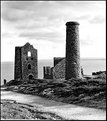
A Holga is the best $20 investment a photographer can make. It is also a lesson in pure composition cause you sure can't do much else with it but compose. I am impressed with this image. Nicely done.
|
| Photo By: Ted Williams
(K:324)
|
|
|
Critique By:
David N. VanMeter (K:552)
5/2/2002 4:22:05 AM
This would have been really interesting on IR film.
|
| Photo By: Sylvia Jones
(K:652)
|
|
|
Critique By:
David N. VanMeter (K:552)
5/1/2002 6:12:50 PM
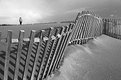
This would have been far less interesting without the person walking in the sand. The elements of this image work together really well. Good seeing.
|
Photo By: Sérgio Vieira
(K:3384)

|
|
|
Critique By:
David N. VanMeter (K:552)
5/1/2002 11:59:55 AM
Thank goodness for the catch light in the left eye or the eye might have been lost in the fur. Good looking dog.
|
| Photo By: Bob Helvey
(K:619)
|
|
|
Critique By:
David N. VanMeter (K:552)
4/29/2002 11:19:42 AM
Cyanotype printing is a lot like platinum/palladium. I use a coating rod to spread the chemistry on sized water-color paper then make a contact print exposed to sunlight. Watch your latent imaging then develop in.... water. Pretty cool stuff.
|
| Photo By: David N. VanMeter
(K:552)
|
|
|
Critique By:
David N. VanMeter (K:552)
4/29/2002 8:36:43 AM
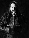
Lelu have bad day!
|
| Photo By: Chris Blaszczyk
(K:610)
|
|
|
Critique By:
David N. VanMeter (K:552)
4/29/2002 6:45:59 AM
Jola, I like the use of high-key here. The mind tends to fill in details that aren't immediately apparent anyway. What I really enjoy about this is that to me it seems less of a formal portrait and more of an image of someone who is generally interested in what they are looking at. The position of the head and look in the eyes imparts a strong sense of action to me. My first thoughts of this shot were mosty questioning why not vertical framing but then I realized the horizontal framing was also lending to the feeling of action.
|
| Photo By: Jola Lipka
(K:2)
|
|
|
Critique By:
David N. VanMeter (K:552)
4/29/2002 5:45:28 AM
I like the concept but if you set the fog aside it seems to be fuzzy.
|
| Photo By: peter de haan
(K:38)
|
|
|
Critique By:
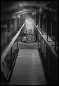
David N. VanMeter (K:552)
4/29/2002 5:37:09 AM
Your framing is throwing me off visually. There is nothing on the left side of the frame to hold my attention. If possible I would have backed up and went with more of a telephoto length and framed the end of the bridge closer to the left of the frame. But thats only my opinion.
|
| Photo By: Yoav Sinai
(K:22)
|
|
|
Critique By:
David N. VanMeter (K:552)
4/29/2002 5:01:27 AM
Miles,
in order to keep use of server space down I reference the following article for a brief expanataion of Pyro:
http://www.phototechmag.com/previous-articles/nov99-chem/no v99-chem.htm
I will point out one thing the article does not stress well enough. Pyro is deadly and precautions need to be taken when using it. I splashed some on my arm once and could taste it in my mouth about 90 seconds later as it was absorbed into the skin. There is also theories that it causes Parkinson's disease if you are not careful with it.
With regard to the cyanotype printing process I reference this web site:
http://www.ndirect.co.uk/~c.j.ball/formulae1.html
It gives a brief explanation of how it works
|
| Photo By: David N. VanMeter
(K:552)
|
|
|
Critique By:
David N. VanMeter (K:552)
4/28/2002 2:59:41 AM
Awesome! I got a chill when I looked at it. I am also glad to hear your comments on the Kiev equipment.
|
| Photo By: Joe Shupienis
(K:19)
|
|
|
Critique By:
David N. VanMeter (K:552)
4/28/2002 2:54:34 AM
How very Escher. I find this perspective on such a common item to be wholly disturbing and provoking. Good job!
|
| Photo By: Bill Lange
(K:8)
|
|
|
Critique By:
David N. VanMeter (K:552)
4/27/2002 9:31:33 PM
Grainy appearance is a combination of the paper I use and the crappy scanner I own. Actual image is not grainy.
|
| Photo By: David N. VanMeter
(K:552)
|
|
|
Critique By:
David N. VanMeter (K:552)
4/27/2002 6:14:51 AM
Before someone asks because I didn't mention it. The streaks and spots of light are people walking about with flash lights and cameras with flash units. The misty look in the lighted area is the "ghosts" of people walking about during the exposure.
|
| Photo By: David N. VanMeter
(K:552)
|
|
|
Critique By:
David N. VanMeter (K:552)
4/27/2002 6:12:45 AM
James, excellent suggestions and I have already put the wheels in place to do that. Its on my list of things to do... I swear!
|
| Photo By: David N. VanMeter
(K:552)
|
|
|
Critique By:
David N. VanMeter (K:552)
4/27/2002 5:48:38 AM
I will grant the arm being chopped off and to be honest I didn't notice it that much until you mentioned it. I did this portrait in a very confined space. A room about 8x10 in size. Talk about a trick. I couldn't back up much more without removing a wall. The original print does show a lot more detail on the dark side- blasted scanner. As to the "evil" look. I was not trying to achieve evil just intense. However, I will admit that many people could percieve it that way. Thanks for everyone's comments.
|
| Photo By: David N. VanMeter
(K:552)
|
|
|
Critique By:
David N. VanMeter (K:552)
4/27/2002 5:44:33 AM
When I said the scanner fails here, I am serious. The graininess you see was the scanner's work and try as I might I could not get rid of it. The precise reason I detest scanning my work. It stands well on its own but never translates to electronic format correctly. There is, however, a softness to it that comes from the texture of the paper I used. With regards to Sepia toning. I don't really care for it. Seems to be overdone in many circles.
|
| Photo By: David N. VanMeter
(K:552)
|
|
|
Critique By:
David N. VanMeter (K:552)
4/26/2002 5:19:54 PM
I love it! Never tell whee this is. Keep it to yourself and go back time and time again. I want to see more of your take on this location.
|
| Photo By: Jason McClendon
(K:19)
|
|
|
Critique By:
David N. VanMeter (K:552)
4/26/2002 5:16:25 PM
Great example/use of telephoto compression. I really like this alot. The white plastic lawn chair actually adds an ironic twist to the image.
|
| Photo By: CJ McKendry
(K:1388)
|
|
|
Critique By:
David N. VanMeter (K:552)
4/26/2002 8:59:33 AM
This is very reminiscent of Art Wolfe's Canon ad.
|
| Photo By: Steve Kaufman
(K:2748)
|
|
|
Critique By:
David N. VanMeter (K:552)
4/26/2002 5:32:04 AM
I can't really say anything that anybody else hasn't said except to add my support for this wonderful image.
|
| Photo By: Bob Helvey
(K:619)
|
|
|
Critique By:
David N. VanMeter (K:552)
4/26/2002 5:29:00 AM
I apologize for my spelling, I meant distract, not sitract. I don't know what sitract means.
|
| Photo By: Carl Beihl
(K:357)
|
|
|
Critique By:
David N. VanMeter (K:552)
4/26/2002 5:25:04 AM
I think more of the foreground would sitract from the mood of this. I would crop them out entirely leaving the sharply focussed fisherman isolated against the muted water and vegetation. I think that would give it a better sense of solitude.
|
| Photo By: Carl Beihl
(K:357)
|
|
|
Critique By:
David N. VanMeter (K:552)
4/26/2002 5:19:52 AM
I'll be honest, "Grapes Never Give Up" made me laugh so I had to look at this a little closer. Well balanced image. You placed the elements where they needed to be to make this interesting and proportioned. I'd hang it on my wall. :-)
|
| Photo By: Carl Beihl
(K:357)
|
|
|
Critique By:
David N. VanMeter (K:552)
4/26/2002 5:17:47 AM
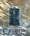
Normally I would say I was sick to death of pictures of windows in walls that seem to be everywhere in photography circles. This one, however, caught my eye. The shadows in this make it more visually interesting, add depth, help to make this much less of a photographic cliche.
|
| Photo By: Carl Beihl
(K:357)
|
|
|
Critique By:
David N. VanMeter (K:552)
4/26/2002 5:13:59 AM
This is very well done and effectively captures the girl's interest and dare I say, awe at her surroundings. If I were to nitpick over one thing though it would have been to hide the pointed end of the boat behind her head. That way the lines of the boat would have pulled you right into her face instead of into the background.
|
| Photo By: Carl Beihl
(K:357)
|
|
|
Critique By:
David N. VanMeter (K:552)
4/26/2002 5:10:10 AM
I love playing "Spot the Photographer" in shots like this. This is a fun shot and very non-traditional way to shoot architecture. I think I would have tilted down a hair more to get rid of the columns at the top.
|
| Photo By: Carl Beihl
(K:357)
|
|
|
Critique By:
David N. VanMeter (K:552)
4/26/2002 5:06:25 AM
I know exactly where you took this picture from and I almost took it myself but I couldn't bring myself to do it. Using to window to frame the scene was a natural thing to do but in doing so, I feel you have diminished the viewer's sense of the grandness of the landscape. Armadale is a cool place to go though.
|
| Photo By: Carl Beihl
(K:357)
|
|
|
Critique By:
David N. VanMeter (K:552)
4/26/2002 5:02:00 AM
Your description is right on the money. Morning in Scotland is a glorious thing. Well done.
|
| Photo By: Carl Beihl
(K:357)
|
|