|
|
 Dave Arnold
{K:55680} 10/12/2007
Dave Arnold
{K:55680} 10/12/2007
|
Thanks, John... I shot this while homeless and aimlessly wandering the southwest... LOL
|
|
|
|
 John Hatz
{K:156973} 10/11/2007
John Hatz
{K:156973} 10/11/2007
|
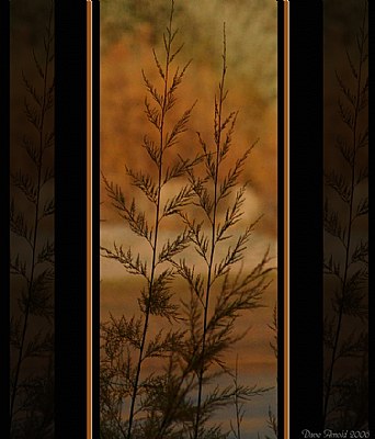
Excellent job, not only just a common plant, you use with a very smart way the frame to make a very artistique work Dave. Yeap, it works perfectly to me, excellent!
Be well Dave!
|
|
|
|
 Larry Fosse
{K:66493} 7/9/2006
Larry Fosse
{K:66493} 7/9/2006
|
The full frame is very nice Dave...I think I prefer it over the cropped/framed version IMHO
Thanks
|
|
|
|
|
Dave Arnold
{K:55680} 7/8/2006
|
Thanks, Larry. You asked for the full frame of this shot, here it is.
Best wishes,
Dave
|

original, untouched |
|
|
|
|
Larry Fosse
{K:66493} 7/6/2006
|
Hey Dave
Read your piece in the Donor Forum and decided to take a peek...Before I start I've failed to recognize over time that Joggie is famous for his borders...I'll have to pay more attention.I am generally not a frame fan..I've have used them in the past and never been quite satisfied. I do , on occasion use a subtle vingette. So.no..I don't like the border. I'd also be interested in seeing the entire frame as shot to get a better perspective on how it was cropped. My initial impression is the bottom is chopped off and perhaps a little of the top too.
So, your plan has worked you guided the commentor into the topic to get the feedback you wanted with a diversity of opinion.
Great idea...super feedback from everyone.
Take Care
Larry
|
|
|
|
 Doyle D. Chastain
 {K:101119} 7/6/2006
|
Wow Dave
. . . quite an image and, if I might add, a stunning use for the CC! Great to see it used like this and I will HAVE to ask pointed questions in mine since you seem to have gotten some great critiques!
. . . First (all this is IMO, of course), I like the image. Muted, simple, yet beautiful. I would adjust brightness and contrast a tad though . . . to make it pop out a bit more--but only in the centered image . . . NOT the frame.
. . . In answer to the specifics--I like the crop. It seems to work well for this image and the almost Fantasia-like peek through a doorway or window makes it even more elegant. The rightside shadowy image does need (IMO) to be flipped so that the entrance into the composition by the stem comes from the lower right side . . . which would add more balance. I would also either lose or seriously reduce the highlight lines . . . 1 or 2 mm max (if I kept them at all). I would also likely reduce the width of the vertical black border.
....I do like what you've done with the frame . . . it's become a part of the image itself.
....the frame doesn't just plain snck. With some Doyle Modifications, it would even be great!! :)
Regards,
Doyle I <~~~~~
|
|
|
|
|
Dave Arnold
{K:55680} 6/30/2006
|
Thanks Joggie for the thoughtfulness. I am so glad you'd consider this an Arnold instaead of a van Staden but, in all honesty, it did start out that way, just heavily altered to avoid any lawsuits.
As I said to Kathy, I did consider turning that one slice on the right but then thought it should stay in the same lean angle.
I played around a bit more with the image, including toned the frame down and altered the colors. I have it posted in my porfolio. I think a more pleasing appearance, myself.
Best wishes,
Dave
|
|
|
|
|
Dave Arnold
{K:55680} 6/30/2006
|
Thanks, Kathy. I ALMOST turned the right side piece horizontally but then thought, no, it should lean the same way as the others.
I about agree with you on the frame. I have played around a little and posted a variation with smaller side frames.
Dave
|
|
|
|
 Kathy Hillard
{K:25721} 6/30/2006
Kathy Hillard
{K:25721} 6/30/2006
|
Hi Dave,
I tried to comment on this image last night, but for some reason the comment was blocked. You may get it later. Oh well, then you'll get two from me!
I haven't read all the other critiques, so don't know if I'm repeating, but I like the original image...the tones and the subject matter. As far as the frame goes, I think that if you leave it as is the outside right one should be flipped so that they mirror each other. That being said I think that this would be a stronger image if you ended the framing after the wide black lines. I think this frame is a bit much for the simplicity of the image. There you go...that's just MHO :) Very creative work!
Kathy
|
|
|
|
 Joggie van Staden
{K:41700} 6/29/2006
Joggie van Staden
{K:41700} 6/29/2006
|
Hi Dave - Love the creative juices flowing! My comments: I nwould rate this as a pure Arnold frame! I would never thought of this! I see it rather as a combo of three images split by two broad dividers. What I would change: I would increase the contrast in the centre image a bit with a slightly brighter background and then I would flip the righthand image horisontally so that it also leans towards the middle image. I would also reduce the brightness of the two light brown verticals and get rid of the white lines. My final verdict: A great image to start with, the narrow upright format is great and the combo adds a very appealing element of natural symmetry (echoes the central one). Great work here my friend.
Joggie
|
|
|
|
 Roberto Arcari Farinetti
{K:209486} 6/29/2006
Roberto Arcari Farinetti
{K:209486} 6/29/2006
|
a fine shot..
best regards
roby
|
|
|
|
 Toshi
{K:11924} 6/29/2006
Toshi
{K:11924} 6/29/2006
|
The photo itself is aesthetically pleasing - love the subtle warm colors against the darker silhouette.
As for the frame, I really like the outer two copies (with opacity adjustment) - it gives it a nice wallpaper feel to it. The overall black border blends well with it as well, although maybe a bit too thick for my taste.
The only part of the frame that distracts too much IMO is the darker orange - I feel it fights a little too much for attention. I think the orange in the photo itself is plenty enough as far as color is concerned.
|
|
|
|
 pan g.
{K:16899} 6/29/2006
pan g.
{K:16899} 6/29/2006
|
Moody work... lovely...
|
|
|
|
|
Dave Arnold
{K:55680} 6/29/2006
|
Thank you Cathy but please, whatever you do, don't blame me if you go frame crazy. I'm just the enabler here.
Best wishes,
Dave
|
|
|
|
|
Dave Arnold
{K:55680} 6/29/2006
|
Phil
Get to the point. No pun intended. Geeze, my head is spinning. "Do it, don't do it, do it, don't do it". LOL
Actually, I really do think this needs some kind of frame and it should be black instead of my usual white frame. I just wanted to try something different. But a thin, 1/2 inch black all-around frame might look just fine too instead of all the fancy stuff.
Best wishes,
Dave
|
|
|
|
|
Dave Arnold
{K:55680} 6/29/2006
|
Mark
Thanks for the feedback. I just keep going back and forth on this myself. That is why I am valuing the opinions I am receiving.
Best wishes,
Dave
|
|
|
|
|
Dave Arnold
{K:55680} 6/29/2006
|
Jim
Thanks for the extraordinary critique. And the fact that you are anti-frame in the first place makes it all the better. You could have been very closed minded about the frame attempt so I appreciate your candor.
Surprising the variations I am getting. Much like my "I like it, I hate it" argument with myself before deciding to post it and ask for feedback.
Best wishes,
Dave
|
|
|
|
 Jim Budrakey
{K:24393} 6/29/2006
Jim Budrakey
{K:24393} 6/29/2006
|
First let me say that this is a very satisfying image. It has a wonderful soft quality about it that makes it easy to look at. Now, about the frame - I think it works very well. And this coming from someone who has been complaining a lot recently about how distracting most digital frames are. In this case I think you frame works very well. I think your idea of using the image itself to extend the frame to be quite creative and I think it works very well indeed. Cropping the top and bottom off so the frame is only at the sides is surprising but it works well too. All in all this has a slightly oriental feel for me and I like it a lot. Nice work indeed.
|
|
|
|
|
Lori Stitt
{K:75282} 6/29/2006
|
Hi Dave,
Love the photograph, don't like the frame, but not sure what I would do.......so (naturally) I downloaded it, and will get to play around in PS tomorrow, don't have time at the moment. I don't mind this format, but something is needed, maybe even if the photo was off centered in the black. Not sure about this.
I'll check in with you tomorrow!
Lori :)
ps..yep, I called home!! :)
|
|
|
|
 Cathy Carroll
{K:28144} 6/29/2006
Cathy Carroll
{K:28144} 6/29/2006
|
This is a very appealing image. The photograph itself is interesting and rich. I like the treatment of the frame, it makes it unique. I particularly love the story you have written. It guides the viewer to your end point and inspires us to look again at how we present our images. I would not have attempted anything like this. You have opened my mind with what I consider a successful experiment. Well done. Cathy
|
|
|
|
 Phillip Minnis
{K:13131} 6/29/2006
Phillip Minnis
{K:13131} 6/29/2006
|
Dave, I'm of two minds about this one!
To frame, or not to frame, that's the question!!!!! LOL
I faced a similar dilemma with my 'The Shadow on the Wall' image.
http://www.usefilm.com/Image.asp?ID=1136581
Originally, I uploaded this image with a frame, however, after looking at it many times, I felt it did not look right.
I note Mark's comment "Think the black bars you have is where I would crop" and "what's inside that window you caught is really stunning" is plausible, however, the way you have framed and presented it, IMHO, would look wonderful as a print in one of today's modern homes.
My conclusion? I say 'leaf (leave) it as is' (pardon the pun)! LOL Now, out you go and sell it!!! LOl
Cheers
Phil
|
|
|
|
|
Mark Sherman
{K:15669} 6/29/2006
|
feels like looking out of a window, what's outside the "window" frame feels like wall paper. what's inside the window feels beautiful. feels like a water color background. Think the black bars you have is where I would crop, because what's inside that window you caught is really stunning.
|
|
|
|
|
Alicia Popp
{K:87532} 6/29/2006
|
Delicadeza y elegancia en esta imagen...la combinación de colores es magnífica... felicitaciones!!!
|
|
|
|
 Gustavo Scheverin
{K:164501} 6/29/2006
Gustavo Scheverin
{K:164501} 6/29/2006
|
Una hermosa , suave y poética imagen.
Felicitaciones!
|
|
|
|
 Pablo Dylan
{K:63918} 6/29/2006
Pablo Dylan
{K:63918} 6/29/2006
|
Great composition!!
Pablo
|
|
|
|
 Mitra Nademi-Nassari
{K:28234} 6/29/2006
Mitra Nademi-Nassari
{K:28234} 6/29/2006
|
Perfect! I love the colors!
|
|