|
|
 Cleveland Smith
 {K:7006} 8/15/2006
|
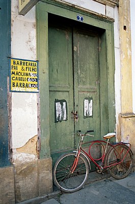
pp, I took the liberty to copy and adjust your image, then deleted it off my computer. Adjusted the Brightness to -17 and Contrast to +22, Cropped and burned the golden pillar on the right of the image. Just some thoughts.
|

|
|
|
|
 pp croitor
{K:1197} 8/15/2006
pp croitor
{K:1197} 8/15/2006
|
dear cleveland. what do you think about this version? kind regards
|

|
|
|
|
|
pp croitor
{K:1197} 7/28/2006
|
dear cleveland, first person ever to give me a good and usefull critic here in UF! I totally agree with you! I have another shot of this door, maybe I'll post it so you can compare.
thanks a lot for taking the time.
pp
|
|
|
|
 Sheila Carson
{K:5924} 7/28/2006
Sheila Carson
{K:5924} 7/28/2006
|
Great composition PP Croitor! I love everything about it! Well done.
|
|
|
|
|
Cleveland Smith
{K:7006} 7/27/2006
|
Good idea, but IMHO you should have moved a little more to the right. The top of the image in my opinion is too cluttered, part of a sign, part of the cornice work, the corner of the door is cut off. Also you could boost the contrast to bring out the colors. Through my eyes only.
|
|