|
|
 absynthius .
{K:20748} 2/9/2008
absynthius .
{K:20748} 2/9/2008
|
hey fabrice,
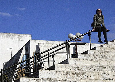
yes, i did try it but did not like it. the sky was becoming gray and pritty much the same with the rest there is within the frame- except for the subject which is not dominant in side. and became dull somewhat- or so i found it. thus, the coloured version seem to have some more of what i intended to present here.
thanks a lot for the interest,
all the best,
v.
|
|
|
|
 Nick Karagiaouroglou
 {K:127263} 2/9/2008
|
I wouldn't clone them, Visar! Especially the lamps - the antenna on the left is just to be neglected - no serious role here - that's peanuts. but the lamps... what kind of tangible feel of the strong sunlight would still be present if the lamps would be taken away? They support the very light here, with their spherical way to reflect light and create also shadows. No, I would keep them anyway!
Cheers,
Nick
|
|
|
|
 G G
{K:61359} 2/9/2008
G G
{K:61359} 2/9/2008
|
I like the angle and the play you did with the stairs. Did you try it in B&W?
THis is a nice work.
Cheers
|
|
|
|
|
absynthius .
{K:20748} 2/8/2008
|
hey Nick,
many thanks for the so detailed comment on the photo. i see you pretty much mentioned all the elements of it.
i had a talk with a friend about this very image, and he pointed out the bulbs on the right and the antenae on the left- and asked me to clone them.
i did agree with him that that would make a neater image but then i argued that that way it would be a shot for advertisment or fashion, and that i somehow despise; while here i wanted to present that what you named 'the worst time is over' in a ambiance, sort of glorification of the mud where i live in- give a nice feeling with a serie of shots i have done here.
cheers,
v.
|
|
|
|
 biljana mitrovic
{K:48110} 2/8/2008
biljana mitrovic
{K:48110} 2/8/2008
|
Great one Visar !!
Everything is perfect ,but you already know that:)
big hug
biljana
|
|
|
|
 Erland Pillegaard
{K:34147} 2/8/2008
Erland Pillegaard
{K:34147} 2/8/2008
|
Great shot
Good light
Good color
Good comp.
erland
|
|
|
|
|
Nick Karagiaouroglou
{K:127263} 2/5/2008
|
Just a few colors and a composition that starts quite simple at the top right and goes more and more complicated (but without losing it's well done definition) as we proceed to the bottom left corner. So there's also some implicit diagonal sense of composition here that gets also supported by the railings at the steps, despite the fact that the orientation is horizontal. I think that the hard contrasts support further the image in conveying the strong sunlight too.
What I also find remerkable is that the sitting girl seems to have walked the more complicated parts, reaching at last the simpler part - where she sits much like breathing in confidence that... "the worst is over now" - or that's my impression here. She seems to really enjoy the sunlight after some hard problems.
The lighting is excellent here. Even the overexposed steps of concrete work towards making us feel the strong light. So there is also advantage in letting some parts of the image be overexposed, doesn't it?
The overall impression reamains also quite simple, much like the top left corner. And so I find the image quite a success, since it combines all the above elements on a very easy overall result, that one can just sit and view for a long time without getting tired of it.
Cheers!
Nick
|
|
|
|
 Marian Man
{K:80636} 2/3/2008
Marian Man
{K:80636} 2/3/2008
|
excellent composition dear Visar!!!!!
fine colors and details! a fine image so well titled too!!!
bravo!!
al the best
Marian
|
|
|
|
 Mahmoud Baha Sadri
{K:19634} 2/1/2008
Mahmoud Baha Sadri
{K:19634} 2/1/2008
|
Fantastic in every sense,Visar..
baha
|
|
|
|
 Arif Ertan Ersoy (aersoy)
{K:27380} 2/1/2008
Arif Ertan Ersoy (aersoy)
{K:27380} 2/1/2008
|
very nice composition!! nice standing and placement of your model in the frame!!
compliments my friend visar.,
regards.,
arif
|
|