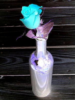
Most of the negative images that people post just don't work for me. It always seems like the colors clash, the composition gets thrown off, and most of all, it seems like the photographer just inverted an already poor image in the hopes of making it a good one.
That's why I was impressd with this shot. This is one of the (very) few shots that actually looks great in negative (in my opinion). The blue of the rose has an illuminating glow, the reflections off the bottle make it look like its made of polished steel or aluminum, and the black wood grain looks, well, pretty damn cool.