|
|
|
Jay Hams
{K:31} 1/29/2004
|
The other isn't as good.
|
|
|
|
 Wouter van Noort
{K:4369} 1/22/2004
Wouter van Noort
{K:4369} 1/22/2004
|
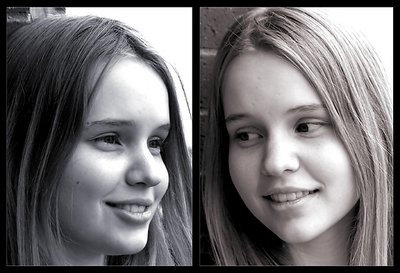
Yes, the contrast is much better. But I liked the old composition more - where (how do you say that?) she is facing away from herself.
|
|
|
|
|
Jason Harris
{K:392} 1/22/2004
|
The reason they are together is simple. Why not? They don't look bad necessarily together, and it was just something different to do. Thanks all for your comments. I really appreciate your input.
|
|
|
|
 Dina Marie
{K:-1410} 1/21/2004
Dina Marie
{K:-1410} 1/21/2004
|
I agree- they can both stand alone - they are both beautiful shots. Beautiful model.
|
|
|
|
|
David Yates
{K:4698} 1/21/2004
|
I like both these shots, but particularly the one on the right. However, I don't see how anything is gained by combining them- each could stand on its own just fine.
Regards, David
|
|
|
|
 davide lupo-pasini
{K:8079} 1/21/2004
davide lupo-pasini
{K:8079} 1/21/2004
|
surely, kat don't look flat as in the previous shot,but now, there's many spots on the faces overexposed....
she look so fine... whort a more intensive photoshopping...
(please, don't misunderstand my words, my english is not so good, and here, it's very late in the night;) )
...so u live in colordo.... ahhh... lucky guy!:) i'll be there with my family next summer... who know... maybe we will meet!:) )
my best regards from italy
Davide
|
|
|
|
 c c
{K:13449} 1/21/2004
c c
{K:13449} 1/21/2004
|
Much improved--love it! Great work! Charisse
|
|
|
|
|
Cris Mitchell
{K:119} 1/21/2004
|
Jason, Nice Job I think they look much better then the previous version. Keep up the good work.
Cris...
|
|


")