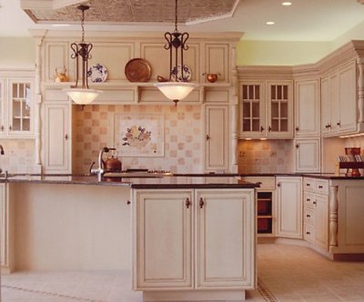
Mike, an excellent photo. A few tiny points--small reflection in the glass cab at left, green cast from the fluorescent over-cab lighting at right (cover the tube with magenta gel). I would have put a stool or two in the area front left where the stools will go when people move in. You could also consider the ultra-cliche-but-effective big bowl o'fruit on the counter to give a small dose of color punch. But anyway, you the man if you can get these shots. Someone should cut you loose with a 4x5 and a truck full of grip gear.
Mike, I read the other comments, I was almost, believe me, afraid to comment before I saw some other comments, because when I see what others have said I learn something for myself, just decided to go for it tho...I was really impressed when I saw the thumbnail, so had to enlarge just to see, and decided to comment. As for the tilt, it must be an optical illusion on my part, maybe because the wall under the cabinet on the left is darker and the floor is lighter than on the right side. Oh, well, but definitely now that I've looked again, I agree with Dave, those plates....I still think it's really a nice picture. I really, really, really doo.
0
Deleted User{K:2231} 7/10/2001
The only think I don't like is that the top of the hanging lamp in the center is converging (? - along the same path as) the top of the shelf that is behind it; and the placement of the plates, and such on the shelf may have been better places so they are now intersected by the handing hardware.
These are just minor details.. but if you agree.. and think of it next time.. your shot will be even BETTER!
Mike you did an admirable job here....all lines are right on no tilts or perspective distortion.....natural light from the left is directional and your fill light is pretty good since the natural light doesnt look forced...right side could have used a little more fill but this is ok as this is how it would look under normal circumstances (naturally)....framed very well....
Debbie yellow on ceiling is natural...tungsten light ablove cabinet casting a tone on ceiling....it belongs there and adds or shows a feature....there is no tilted lines in this.. Lalitha ceiling is fine it shows a drop and lighting fixtures plus spot lights ...triangle on lower left is raised floor....this is a display kitchen
I really like the lighting on this one. I think perhaps, and I'm only opinionating, coz I could'nt even begin to get a pic like this, but, I think to have cropped from the top to the wall cabinet, or included more of the ceiling some way or another, the right corner top is a little yellow in lighting and only just a tad tad tad bit tilted at the bottom cabinets. But it's all so close to being "ad" like that I really am impressed.