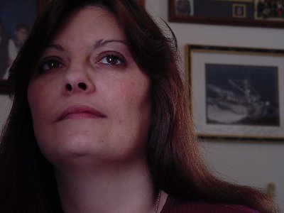
Hi Alvin. Did you delete all your previous posts? I like the pose and the low angle you have used here. Although I like B&W images I think this one works well in colour but they need a slight balance and the face needs a bit more light to take centre stage. What do you think. Regards John
Alvin, I think Sergio has hit the nail on the head here, and the difference between the two images is quite astounding. It's worth taking the time to try some of his suggestions and then play around in Photoshop to get the best results.
Alvin, I really like the pose and the expression you caught here. I rated it 6 just for that.
I also took some time playing around in PS so I could show you what could be diferent with the correct lightning and framing.
As for the lightining in your photo it is very poor. Is that a window reflected in her eyes? Although that sparkle is fundamental in the photo, I don't think a frontal ilumination does that good the skin tones. I'm no expert in lightning but the basics say you should get your subject near the window so you can get advantage of all the lightning conditions you have. Then you could have complemented it with a (-) compensated fill in flash that would give that sparkle in the eyes and difuse those harsh shadows.
The background it's absolutely distracting and not even out of focus it would have been better due to it?s poor pictorical quality.
I really like the pose, the composition and the low angle. I would however liked to see more negative space. Giving us more possibility to interpret her reserved feelings.