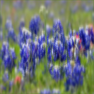
This is a digital effort to approach the impressionistic work that is done much better (and on film) by John Barclay and John Charlton. I started out with an image of bluebonnets, then created layers, and treated each layer somewhat differently. I played freely without recording the actual steps involved. At times I flattened the layers and created new ones. At various times I applied smart blur, gaussian blur, motion blur (90 degrees), desaturation, facet x 2 or 3, etc. I also experimented with blending modes, varying degrees of opacity, etc.
In all I find the original technique (multiple exposures in the camera, on film) to be far superior, but I had to post this for feedback.
I wanted this to look like the impression of bluebonnets, not the real thing. I wanted to represent some of what I feel when I'm there breathing in that wonderful bluebonnet scent, watching the swatches of blue wave in the breeze.
I will add a comment that includes the original image upon which this impression was built.
Mary, I just recently read a book on Photo impressionism and was inspired to experiment with some images similar to this one. I think I had varying degrees of success with a similar method. Check out my images "The Old Mill Lane" "Tangled Up In Blue" and a few other recent shot if you like.
I found there is always some second guessing when you decide to post something like this, for fear of people thinking you are too pretentious. Lots of fun experimenting though and a lot of people seem to like the results. Andre
Thanks to all who have given suggestions and feedback on this image. Overall I am not satisfied with the results I produced from haphazard application of blurring and filters. Nevertheless, it was fun to do and it is something I want to keep experimenting with.
Dirck's comments about saturation are interesting since I desaturated everything except the middle...and it turns out that it produced a oddly saturated image.
Bob, I appreciate your specific suggestions about how to achieve an impressionistic effect in a more pleasing way. I will try that with another image one of these days soon!
Again, thanks to all who commented. I'm way on the beginning of the learning curve with post-image manipulations of this sort. Your feedback is a great help!!
The impressionistic effect may be a tad too vertical and uniform in the application, which to me, makes the effect appear a bit more like camera shake than impressionistic blur.
I am not sure how you applied your layers and filters, but I think the image would have been enhanced if the "impressionistic" filtering would have gained more intensity as you moved back into the scene, even to the point that the main flowers in the foreground were enhanced only enough to give the suggestion of impressionism.
I think this could have benn done by adding small effects in different layers until you reached the maximum impressionistic effect you are looking for in the background. Then which each layer, before flattening, use your history brush or eraser, and erase the effects on items nearer and nearer the foreground.
Mary Sue, what beautiful color in these flowers - the original is quite lovely, too! Overall I think the effect worked quite well on this, although I agree with Peter (if I understood correctly :) that the colors in the middle 1/3 of the shot may be a tad too intense, and so come off a little 'heavier.' I wonder if you were to desaturate the color on the sharply focused flowers a bit more if that would make it a little more diaphanous?
Both images are beautiful. Would I change anything with the impressionistic version? I might have first taken out the darker stalks in PS which intrude a little on the overall effect, leaving this as a study in pure colour and mood. But thats a small quibble on an image I really like. What do you think?
I look forward to seeing more experimentation... 7 smiles - :) :) :) :) :) :) :)


")