|
|
 Thilo Bayer
{K:50358} 7/21/2004
Thilo Bayer
{K:50358} 7/21/2004
|
Hi Uwe,
argh, du hast die magischen worte gesagt ;-)
danke für dein feedback, ich gelobe nächstes mal mehr muße beim photoshoppen. zum schluss hin hat sich schon so ne nervbugwelle aufgebaut... und da habe ich dann die letzte konsequenz verloren. Thx. Thilo
|
|
|
|
|
Thilo Bayer
{K:50358} 7/21/2004
|
Hi Ursula,
ach, das passt schon ;-) ich hätte ja eines gepostet, wenn die teile nicht so verdammt schmal geworden wären. und panorama mit 280 pixeln höhe sieht irgendwie albern aus ;-)
Beste Grüße, Thilo
|
|
|
|
|
Gertrud Gozner
{K:14222} 7/21/2004
|
great work!! congrats. G
|
|
|
|
|
Uwe Bachmann
{K:10222} 7/21/2004
|
ein glückj, der hugo hat schon wieder alles geschrieben was man eigentlich nur dazu schreiben kann. als anhänger seiner wahren worte folgt hiermit mein traditionelles: wie hugo schon sagte.
beide bilder für sich sind schon sehr sehenswert, das mit der geometrischen dingens ist auch klar. im oberen bild hätte ich mir vielleicht einen tick mehr kontrast gewünscht, im unteren setzt die tonung eine zusätzliche trennung zu dem anderen bild, die vielleicht gar nicht notwendig wäre.
nichtsdestotrotz, die idee ist klasse mit den beiden panoramen....
vg, uwe
|
|
|
|
 Bradley Prue
 {K:30678} 7/21/2004
|
Sorry about the headache, Thilo.....but this image is just outstanding! Well worth the effort. (easy for me to say, right?)
...Brad
|
|
|
|
|
Enjoy
{K:16125} 7/21/2004
|
WOW...this is wonderful..wait till Roger Williams sees this...lol... he will love it... =)) This is wonderful..wow...I like this
|
|
|
|
 Lukasz Kuczkowski
{K:14687} 7/20/2004
Lukasz Kuczkowski
{K:14687} 7/20/2004
|
really good shots; they should be isolated, they are good enough to be shown one by one
regards
Lukasz
|
|
|
|
 Ursula Luschnig
{K:21723} 7/20/2004
Ursula Luschnig
{K:21723} 7/20/2004
|
Hallo Thilo,auch ich bin keine Ausnahme,und halte jedes Bild einzeln für hervorragend.Sorry...Du hast gefragt...:)
Viele Grüsse,Ursula
|
|
|
|
|
Carmem A. Busko
{K:48785} 7/20/2004
|
I agree with Hugo, Thylo both shot are good isolated.Cheers!
Carmem
|
|
|
|
 Tony Diana
{K:13396} 7/20/2004
Tony Diana
{K:13396} 7/20/2004
|
7 Excellent
|
|
|
|
|
Thilo Bayer
{K:50358} 7/20/2004
|
Dear Angelo,
thanks for your worty comments. I responded to some of your remarks in a posting to Hugo, so please have a look.
as for the stitching: actually, I distorted the one above to get the same size as the bottom one. ;-) Nobody recognizes that.
If I had the original images, I would probably get a better result today. Unfortunetaly, they are gone.
Take care, Thilo
|
|
|
|
|
Thilo Bayer
{K:50358} 7/20/2004
|
Dear Marcel,
you're totally right about the size problem. one image alone has just 240 pixel in height (800 wide), and this format doesn't look very good. I instantly try to crop the pictures in width but that hurt the look a lot. So I went for the 2 pictures for the price of one.
Take care, Thilo
|
|
|
|
|
Thilo Bayer
{K:50358} 7/20/2004
|
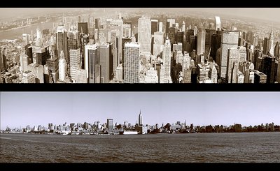
Dear Hugo,
as always, you're a master of analysis. The bottom shot has indeen some distortions that are a bit distracting. to be honest, I don't have the original pictures and I combined the separate some time ago.
as for toning, I actually tried to match the colors on both and found that version a bit boring. I deliberately opt for the different toning to get more tension in the double picture itself (and removing some tension with the pictures as a stand-alone).
as for the bars, you are probably right. I gave up trying to play around with that part as the other process took some time ;-)
thx very much for your effort. I learned a lot.
Take care, Thilo
|
|
|
|
|
Maria José Barres
{K:11276} 7/20/2004
|
Great doble work!!!!!!
|
|
|
|
 Angelo Villaschi
{K:49617} 7/20/2004
Angelo Villaschi
{K:49617} 7/20/2004
|
Thilo,
I will agree with Hugo for the most part. While I think both shots are good (more on this later), the combination lets them down. The main point for me, also mentioned by Hugo, is the different toning. Again, I agree with Hugo that the sepia toning of the top one would look great if applied to both sides.
As for the shots: the bottom one still shows signs of stitching, especially in the sky. I can't find any of this in the top one, which looks absolutely great!
Lots of hard work here, and good experimentation.
|
|
|
|
 Roberto Arcari Farinetti
{K:209486} 7/20/2004
Roberto Arcari Farinetti
{K:209486} 7/20/2004
|
oh my friend.. a magnific contrast! nice idea...
cheers
roby
|
|
|
|
|
Marcel Laurens
{K:3654} 7/20/2004
|
great images!!!
my guess is thilo had to put two together because of the size restrictions of the site.... you can't really post a pano rama... as a viewer, you can shrink your browser and view one at a time!!!
|
|
|
|
 Hugo de Wolf
{K:185110} 7/20/2004
Hugo de Wolf
{K:185110} 7/20/2004
|
Hi Thilo, both shots would qualify as a perfect stand alone. The change in perspective suggests a movement, as if diving down (looking form top to bottom). The different angle of view on the city as well as the different tone in the image split the two photos a bit (maybe a bit too much, removing the unity between them) I'd settle for the brown tone of the top one, as it presents the viewer with a much more timeless look. The bottom one has a distracting pinch (or appears to have one). Last, I think the three equally spaced black horizontal bars remove the tension a bit. I think that either choosing a different frame division, or narrowing down the middle bar, or changing their colour to match the tone of the image would've created a more unified and consistent overview.
Nonetheless, each of these individual shots are very well taken, and well composed. The current combination of the two discredits each of them. Still, I know how difficult it is to combine two shots seperately, and I like the effort and excersise you've put into it.
Cheers,
Hugo
|
|


![[Quadratic Head]](http://thumbs.imageopolis.com/images/2/0/5/4/2054/525856-Micro.jpg "[Quadratic Head]")
