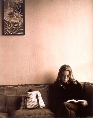
Why wouldn't this work in 35mm? Purse aside, the frame looks like it should be seen in full, with a little space on the top and to the left(viewer's left). The shadow is too dense; no detail at all in her shirt.
Excellent comments - thanks !! Don't you want to know what is in the purse ?? Nope - I don't either... I will make sure that the purse is disposed of properly and it will never be seen again !! JCB :)
I like the balance between the model and the picture frame in the upper left, the color tone, and like james has said she is very cute. The purse however kills the photo, wrong color, wrong style, wrong place to be.
What doesn't work for me is the purse, and the empty shadow in the shirt. The framing is great. The gal is cute, the couch has character galore, The painting or poster makes me look closely. But the purse just jumps out at me. It gives the scene a cluttered look. And the shadow on the front of her distracts me too much. Like not enough care was taken with the metering. It's too empty. But she is cute. The toning is great. Really makes more of the scene than the subjects do in just B&W. James