|
|
Critique By:
Jeff Cable (K:3599)
10/18/2002 6:09:18 PM
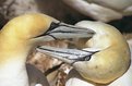
Hi Shahryar. This is a great shot considering the difficult conditions you were working under. Such harsh lighting is often hard to work with, notwithstanding the movements of the boat. 8>
Nitpicks... a minor two. I wanted to see a little more highlight detail and some additional saturation. In no way does that detract from your excellent picture and I wish I had taken it. Nice work!
Cheers!
Jeff
|
| Photo By: Shary Shary
(K:428)
|
|
|
Critique By:
Jeff Cable (K:3599)
10/18/2002 5:55:05 PM
Hi Samuel. You have captured really excellent skin tones here. I found myself wanting a little more separation of the model from the background. I thought that Anne's skin and the background were a little close in tone.
What technique did you use in PS to convert the picture from colour to monochrome? Often the whites of the eyes look better if they appear as white. I was curious and I measured them with a software digital colour meter and was surprised to find the whites were placed on zone 3 in this shot (about 30% gray).
A final point (not a nitpick... just a comment which you are free to ignore) - I found that I could not avoid looking at the half closed eyelid of Anne's right eye. When I divided her face in PS (right side uploaded for you) I could see that either half of Anne's face would make a good picture. My own opinion (FWIW) is that her more widely open eye gives a better impression of her obviously vivacious personality.
I then wondered about ways to shoot her face without adding what I believe to be a strong distracting element. I have never had the challenge of this type of shot but I cannot imagine what sort of solution I would need to find if the sitter demanded it.
I would be interested to have your opinion. Nice work anyway!
Cheers!
Jeff
|
| Photo By: Samuel Downs
(K:7290)
|
|
|
Critique By:
Jeff Cable (K:3599)
10/17/2002 2:03:23 PM
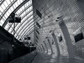
Hi Carl. This is a well seen picture. The strong lines make this shot for me. It is what I would call a graphic image (although all images are graphic) and it has been enhanced by the use of monochrome.
Nice that you could shoot it when there were no people around. It heightens the feel of great space and the ultra modern architecture complements and suggests the technological achievements of the TGV. Good capture and nice work!
Cheers!
Jeff
|
| Photo By: Carl Beihl
(K:357)
|
|
|
Critique By:
Jeff Cable (K:3599)
10/16/2002 2:36:05 PM
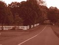
Hi Emily. I like the idea behind this shot. The fence stands out really well. Can you explain the colour in your picture. I have noticed a similar colour in your other postings and wondered how you were achieving it.
Nice work! Keep posting.
Cheers!
jeff
|
| Photo By: Emily Enderes
(K:192)
|
|
|
Critique By:
Jeff Cable (K:3599)
10/16/2002 2:09:31 PM
Hello Jak. Welcome to Usefilm. I was drawn by the thumbnail. This is a very graphic image. You have handled the high contrast lighting well. I am sure that the picture is much sharper than the scan has shown. Nice work! Hope to see more.
Cheers!
Jeff
|
| Photo By: Jak King
(K:0)
|
|
|
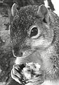
Critique By:
Jeff Cable (K:3599)
10/15/2002 7:58:18 AM
Whoops! I was drawn by the thumbnail William. The pity is that the little crittur did not comply and pose for you but moved just as you pressed the shutter. 8>
It would have made a great shot. It fills the frame really well.
Cheers!
Jeff
|
| Photo By: william l. borch(jr.)
(K:315)
|
|
|
Critique By:
Jeff Cable (K:3599)
10/14/2002 3:04:26 AM
Hi Phillip. This is an excellent picture and I wish I had taken it.
I am an avid fan of pictures that say everything simply. I don't share TKs concern over the lighting here. My concern is probably far more pendantic than his in that the two angled and indented lines on the leaf on the left really draw my eye.
My liberty is the Photoshopped version uploaded with this comment. I hope you don't mind too much. 8>
Cheers!
Jeff
|
Photo By: Phillip Cohen
(K:10561)

|
|
|
Critique By:
Jeff Cable (K:3599)
10/14/2002 2:31:55 AM
Hi Debi. Stunning! A fresh look at a common subject. I like the technique. Your deft touch in Photoshop has really helped this high key treatment and makes this picture for me. I echo everything that was said by William and Chris. Well seen! Great work! I hope the editor is looking. 8>
Cheers!
Jeff
|
| Photo By: Debi Bishop
(K:140)
|
|
|
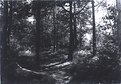
Critique By:
Jeff Cable (K:3599)
10/14/2002 2:24:49 AM
Hi John. I noticed this picture and wondered if i could usefully make some comments that I believe are constructive. You are, of course, free to ignore anything I say. 8>
This type of picture can be very dramatic and you have picked a subject with extremely difficult lighting. The very harsh sunlight and the very dark shadows create a problem for film to register everything you saw with the same fidelity.
My first comment concerns the scan which appears to have artifacts created by compression into .jpg format. I have uploaded a different version of the file with a red ring drawn around one of the artifacts for you.
I have also cropped the picture to lose the very large area of competing highlight which tends to draw the eye away from your subject matter (the path).
Despite the fact that the lighting was difficult, with normal exposure the film should have been able to record a full range of tones from black to white. i think your picture appears to from zone i to x (see grayscale on the bottom of the usefilm page). I have changed the tonal values slightly in my version, to give you an example of what I mean.
The other marks on the version I have uploaded show the path (your subject) and an arrow which indicates the direction you could have moved to get more of the path in view. (it is obscured partly by a tree. Getting detail into shadows can be done in several ways but here it looks as if the metering was influenced by the very bright area that I removed in my version. Metering close to a tree from the tree would have given you far more shadow detail. The path would have moved towards a lighter zone but could have been controlled a bit at the printing stage. Just opening the aperture from your metered reading by one or two stops would have provided a little more shadow detail.
Keep shooting because you have an eye for a picture.
Cheers!
Jeff
|
| Photo By: John A Scott
(K:623)
|
|
|
Critique By:
Jeff Cable (K:3599)
10/14/2002 2:20:59 AM
Hi John. I noticed this picture and wondered if i could usefully make some comments that I believe are constructive. You are, of course, free to ignore anything I say. 8>
This type of picture can be very dramatic and you have picked a subject with extremely difficult lighting. The very harsh sunlight and the very dark shadows create a problem for film to register everything you saw with the same fidelity.
My first comment concerns the scan which appears to have artifacts created by compression into .jpg format. I have uploaded a different version of the file with a red ring drawn around one of the artifacts for you.
I have also cropped the picture to lose the very large area of competing highlight which tends to draw the eye away from your subject matter (the path).
Despite the fact that the lighting was difficult, with normal exposure the film should have been able to record a full range of tones from black to white. i think your picture appears to from zone i to x (see grayscale on the bottom of the usefilm page). I have changed the tonal values slightly in my version, to give you an example of what I mean.
The other marks on the version I have uploaded show the path (your subject) and an arrow which indicates the direction you could have moved to get more of the path in view. (it is obscured partly by a tree. Getting detail into shadows can be done in several ways but here it looks as if the metering was influenced by the very bright area that I removed in my version. Metering close to a tree from the tree would have given you far more shadow detail. The path would have moved towards a lighter zone but could have been controlled a bit at the printing stage. Just opening the aperture from your metered reading by one or two stops would have provided a little more shadow detail.
Keep shooting because you have an eye for a picture.
Cheers!
Jeff
|
| Photo By: John A Scott
(K:623)
|
|
|
Critique By:
Jeff Cable (K:3599)
10/13/2002 1:21:21 PM
This one is really eye catching Scott. It seems so alive now. Can I nitpick? Of course I can... it would not be me to keep quiet. 8>
I really like the picture but had trouble imagining leaves of quite those hues. In the UK, the Autumn leaves are often a uniform and dreary muddy brown colour - perhaps because they are frequently wet. You have a great technique and I like the picture a lot. Nice work!
Cheers!
Jeff
|
| Photo By: Scott Cressey
(K:61)
|
|
|
Critique By:
Jeff Cable (K:3599)
10/13/2002 1:11:43 PM
This works for me Adam. A moment to savour for this little boy when he looks back over time. A nice composition. I like the way his blue clothing draws the eye to him. nice work!
Cheers!
Jeff
|
| Photo By: Adam E. J. Squier
(K:9803)
|
|
|
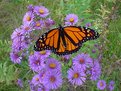
Critique By:
Jeff Cable (K:3599)
10/13/2002 12:59:47 PM
Great capture Kennard. Your right about it looking like a composite image... no signs of what the insect is resting on. Lovely colour balance to the whole picture and thye monarch is particularly vivid.
Nice work!
Cheers!
Jeff
|
| Photo By: kennard
(K:106)
|
|
|
Critique By:
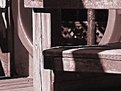
Jeff Cable (K:3599)
10/13/2002 12:46:36 PM
This caught my eye and I had to have a closer look Marja. You are doing well with your new camera. I usually have trouble with more than two controls.  My wife looking over my shoulder said "neat" when she saw your well seen monochrome shot. I lliked teh differential focus and the tonal range. It could easily change my whole approach to digital photography. Nice work! My wife looking over my shoulder said "neat" when she saw your well seen monochrome shot. I lliked teh differential focus and the tonal range. It could easily change my whole approach to digital photography. Nice work!
Cheers!
Jeff
|
| Photo By: Marja Konimaki
(K:178)
|
|
|
Critique By:
Jeff Cable (K:3599)
10/13/2002 12:41:15 PM
This is a lovely composition Marleen. It has a compelling
simplicity that is enhanced by the restrained use of colour. My screen shows a somewhat mottled background and I wondered if that was intended or was just noise from the scan. Anyway it is an admirable capture. Nice work!
Cheers!
Jeff
|
| Photo By: Marleen den Brok
(K:374)
|
|
|
Critique By:
Jeff Cable (K:3599)
10/5/2002 9:47:12 AM
This is a delightful image. It was a difficult lighting situation and you did well to record the spontaneity of this game. Excellent capture.
Cheers!
jeff
|
| Photo By: ws b
(K:62)
|
|
|
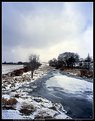
Critique By:
Jeff Cable (K:3599)
10/5/2002 9:42:23 AM
Brrr... this picture feels like it really conveys a cold morning Marja. The colours are perfect. The scene looks so still and I can just imagine the sounds of the water and the feel of the crisp morning air. Very evocative image Marja. Nice work!
Cheers!
jeff
|
| Photo By: Marja Konimaki
(K:178)
|
|
|
Critique By:
Jeff Cable (K:3599)
10/2/2002 1:04:20 AM
Hi Tim. Wow! what a great picture. Everything from the idea, tonal range, composition and execution does it for me. Brilliant! I wish I had taken it.
Cheers!
Jeff
|
| Photo By: Tim Dinofa
(K:162)
|
|
|
Critique By:
Jeff Cable (K:3599)
9/27/2002 5:25:45 AM
Hi Michael.
I really liked the idea behind this picture. I have some minor nitpicks that may help (you are free to ignore them of course)
I have no idea what your model was wearing around her neck but if she had lost it, I think that a major distraction would have been removed. Vertical things need to look vertical , in my humble opinon, and the Empire State building falls over to the left in this shot.
The window frame and brickwork add nothing to your shot and I would lose them... my PS crop should show you what I mean.
What do you think? Do the suggested changes make a good idea into a better shot?
Cheers!
Jeff
|
| Photo By: Michael Harp
(K:9)
|
|
|
Critique By:
Jeff Cable (K:3599)
9/27/2002 5:02:05 AM
Hi Joffre. I liked this picture. Good tonal range and the muted almost monochromatic use of colour really suit this subject well. I echo Sarah's comment about the exposure.
I do have one small nitpick though...
I think the area of sky detracts a little from the main picture (forgive me if the whole shot is what you had intended). I cropped a bit of the sky until the horizon was about level with the line dividing the upper third (or perhpas a little higher) and it ended up as a landscape format shot, which I personally preferred. I have not included my crop because your work quality is something I aspire to. Nice work!
Cheers!
Jeff
|
| Photo By: Joffre Swait
(K:626)
|
|
|
Critique By:
Jeff Cable (K:3599)
9/26/2002 2:26:37 PM
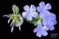
Hi Marleen. Great picture! Super sharp and a good use of complimentary colours - intriguing image - nice use of reflection.
A tiny criticism... there is an out of focus highlight in the upper right area just at the edge of the petals about a third of the space between the subject and the border, in from the border.
It seemed to drag my eye to it. I think this is because our brains want to make sense out of what we see and I think it has too much of a shape to ignore. My eye keeps wanting to turn it into a circle. Perhaps PS work could remove it?
Nice work anyway.
Cheers!
Jeff
|
| Photo By: Marleen den Brok
(K:374)
|
|
|
Critique By:
Jeff Cable (K:3599)
9/26/2002 2:02:37 PM
Hi Przemyslaw. This picture is excellent! Good range of tones and graphic composition. It is a well seen and very expressive picture. I missed some of your earlier posts but had a good look at your portfolio. I look forward to seeing more like this.
Cheers!
Jeff
|
| Photo By: Przemyslaw Piwowar
(K:136)
|
|
|
Critique By:
Jeff Cable (K:3599)
9/23/2002 4:20:59 AM
Hi Bonnie. It was the thumbnail that drew me to this picture. It looked so much like an old master's painting. Nice work! I like the high contrast and the painterly feel to this image. Wish I had taken it.
Cheers!
Jeff
|
| Photo By: Bonnie Shedd
(K:174)
|
|
|
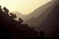
Critique By:
Jeff Cable (K:3599)
9/22/2002 5:00:44 PM
Nice work Ken. It is a really clear example of aerial perspective and a very powerful composition. I like your choice of film too.
Cheers!
Jeff
|
| Photo By: Ken Alexander
(K:3905)
|
|
|
Critique By:
Jeff Cable (K:3599)
9/22/2002 4:53:20 PM
Nice work Preston. A long tonal range with detail in the light waistcoat and the dark hair. The composition shouts 'Alone'. Nice work and I wish I had taken it. Well seen.
Cheers!
Jeff
|
| Photo By: Preston Heller
(K:15)
|
|
|
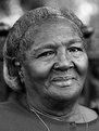
Critique By:
Jeff Cable (K:3599)
9/21/2002 5:37:53 PM
Yet another compelling image Preston. I have just spent an hour looking at the pictures on your excellent website and have been amazed by the depth of vision, humanity and technical expertise displayed in your pictures.
I have so much to learn. Thank you for your fine social documentary.
Cheers!
Jeff
|
| Photo By: Preston Heller
(K:15)
|
|
|
Critique By:
Jeff Cable (K:3599)
9/21/2002 6:39:08 AM
Nice work Luis! This is a strong, dark introspective image that suggests inward looking. The half of the face in shadow accentuates the sense of mystery about this person.
Chhers!
Jeff
|
| Photo By: Luis Abascal
(K:0)
|
|
|
Critique By:
Jeff Cable (K:3599)
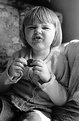
9/16/2002 2:40:20 PM
What a nice picture Sarah. Jenny is really cute and many parents will recognise that particular facial expression that says "do you want me to smile like this?"
Nice work and a great record of the days that sadly seem to pass all too quickly.
Cheers!
Jeff
|
| Photo By: Sarah Needham
(K:2482)
|
|
|
Critique By:
Jeff Cable (K:3599)
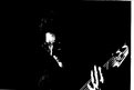
9/16/2002 2:24:32 PM
Hi Jim. Yup... works for me just like it is. Just superb! High contrast really suits the subject well. The tonal compression adds to a really graphic shot and reduces the chance to look at anything other than the musician and his intrument, which is so obviously a base guitar from the string count and size. Caught while playing in mid rif with intense concentration. Barely enough detail to discern in the face means no distracting thoughts about who is this. It is a great shot and I wish it were my work.
Cheers!
Jeff
|
| Photo By: Jim Gamble
(K:12164)
|
|
|
Critique By:
Jeff Cable (K:3599)
9/16/2002 2:08:12 PM
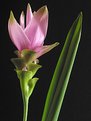
Nice work Danny. The delicate hue, the composition and the sharpness made this shot for me. You have a good eye.
Cheers!
Jeff
|
| Photo By: Danny Provost
(K:812)
|
|