|
|
Critique By:
Peter Caracappa (K:119)
2/4/2003 12:46:40 PM
It might just be the scan, but I don't like the way the top of her nose disappears into her face...
|
| Photo By: Greg Smereczynski
(K:2278)
|
|
|
Critique By:
Peter Caracappa (K:119)
12/18/2002 2:06:26 PM
I can't tell if the picture is blurry, or if it is just my screen... otherwise, I like the composition - if anything, the whole thing could be moved a tad to the left, revealing just a bit more of the helper and a bit less of the veil... but this works, too...
|
| Photo By: Sandra Engman
(K:1231)
|
|
|
Critique By:
Peter Caracappa (K:119)
12/17/2002 12:24:35 PM
I like it... You may have made it a bit more interesting by putting the subject off-center, but "full-auto" mode did a pretty good job in a tough lighting situation (that's a nice camera you have there...)
|
| Photo By: Kyle Blair
(K:1542)
|
|
|
Critique By:
Peter Caracappa (K:119)
12/17/2002 12:21:03 PM
I think maybe lose the stars... to me, they are a bit distracting...
|
| Photo By: Debbie Groff
(K:9569)
|
|
|
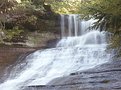
Critique By:
Peter Caracappa (K:119)
11/14/2002 7:28:19 AM
A little overexposed on the lower part of the water - the long exposures make such nice paterns, I'd like to be able to see them... otherwise, nice composition...
|
Photo By: Howard M. Parsons
(K:3496)

|
|
|
Critique By:
Peter Caracappa (K:119)
11/14/2002 7:19:48 AM
Great color... I think the dramatic impact would be a little greater if the grass was slightly out of focus (smaller depth of field) rather than from the motion blur, which seems somehow uneven to me...
|
| Photo By: Christian Gennert
(K:964)
|
|