|
|
Critique By:
RC. Dany (K:64104)
2/28/2004 8:19:20 PM
Excellen.
|
| Photo By: Michael Harp
(K:9)
|
|
|
Critique By:
farewell ...! (K:668)
2/10/2004 2:02:45 PM
Relaaax
|
| Photo By: Michael Harp
(K:9)
|
|
|
Critique By:
Sean Armenta (K:242)
9/1/2003 2:08:16 PM
great shot, along with the other one like this...though perhaps this one more successful if straightened out...
|
| Photo By: Michael Harp
(K:9)
|
|
|
Critique By:
Geraldo Monteiro (K:2546)
8/31/2003 4:16:46 PM
Pena que a modêlo não olhou para a câmera
|
| Photo By: Michael Harp
(K:9)
|
|
|
Critique By:
Geraldo Monteiro (K:2546)
8/31/2003 4:13:49 PM
Achei muito interessante. Gostei
|
| Photo By: Michael Harp
(K:9)
|
|
|
Critique By:
peter josvai (K:14)
5/8/2003 5:03:13 PM
why can't we see her other foot? the pose is great however ..
|
| Photo By: Michael Harp
(K:9)
|
|
|
Critique By:
Arturo Nahum (K:959)
4/28/2003 10:15:12 AM
nice honest expression
|
| Photo By: Michael Harp
(K:9)
|
|
|
Critique By:
G:)nter Hofstädter (K:854)
4/28/2003 2:43:08 AM
my eyes are confused by watching this pic, sometimes out of focus and unsharp or shaky pics are working, but just sometimes. Sorry not in this case !
|
| Photo By: Michael Harp
(K:9)
|
|
|
Critique By:
Mário Sousa (K:16985)
4/20/2003 5:15:04 AM
beautiful portrait
|
| Photo By: Michael Harp
(K:9)
|
|
|
Critique By:
Mário Sousa (K:16985)
4/19/2003 2:53:10 PM
beautiful
|
| Photo By: Michael Harp
(K:9)
|
|
|
Critique By:
Nick Gray (K:23)
4/1/2003 3:48:07 AM
I really like this shot great idea, simple but effective and excellent result - keep pushing the envelope
|
| Photo By: Michael Harp
(K:9)
|
|
|
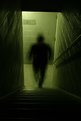
Critique By:
Lynn Moore (K:1059)
3/3/2003 11:41:44 AM
I think this is a great idea of yours. Looks interesting and ghostly. Very imaginative idea - seen it done before but I like the idea of the staircase and the colour hue. Very nice capture!
|
| Photo By: Michael Harp
(K:9)
|
|
|
Critique By:
Betsy Hern (K:12872)
2/19/2003 9:53:22 PM
I love the 2 pics in this series. They remind me of an old Alfred Hitchcock movie. The addition of the hat on the figure adds to the nostalgic look of the mysterious stranger in the stairwell. Creepy in a cool way. I wonder how the photos would look with a different color cast, not green.
|
| Photo By: Michael Harp
(K:9)
|
|
|
Critique By:
Todd Miller (K:16464)
2/19/2003 9:08:48 PM
damn, that's creepy looking. i love it!
|
| Photo By: Michael Harp
(K:9)
|
|
|
Critique By:
Elizabeth van Hulst (K:283)
2/19/2003 9:03:53 PM
nice lighting! good choice in background!
|
| Photo By: Michael Harp
(K:9)
|
|
|
Critique By:
Valeh B (K:890)
2/19/2003 8:28:04 PM
I like the lighting! Those classes you have been taking are paying off! 
|
| Photo By: Michael Harp
(K:9)
|
|
|
Critique By:
Elangovan S (K:10675)
2/19/2003 7:15:49 PM
Very spooky. and me likey. :-).
|
| Photo By: Michael Harp
(K:9)
|
|
|
Critique By:
Ayesha Berlind (K:13)
2/19/2003 5:50:16 PM
Yeah, I like this shot too. The background works well. It is simple in color so that you stand out, yet there is some dimension and other items of interest. Cool shot.
|
| Photo By: Michael Harp
(K:9)
|
|
|
Critique By:
Lisa Howeler (K:3706)
2/19/2003 5:33:46 PM
Who is putting all the low ratings? I don't think it is very nice without a comment and I know that it is their right, but it looks like they are just hitting every other one with a low rating to me. Anyhow...this photo is interesting and the lighting is interesting. I think it is a nice self-portrait and looks like it shows you how you really are. Nice shot.
|
| Photo By: Michael Harp
(K:9)
|
|
|
Critique By:
Oliver Indra (K:448)
2/10/2003 11:06:26 PM
I see the intention for this pic but the low-key areas do not reveal any details and therefore I think this one is a bit too dark.
|
| Photo By: Michael Harp
(K:9)
|
|
|
Critique By:
Oliver Indra (K:448)
2/10/2003 8:15:58 AM
Hi Michael!
Guess you cropped the rest of the ring out purposely. I like tha angle and perspective you chose for this pic but I would definitely brighten it up a bit and add some contrast, even if you risk to "burn out" her nose a bit.
And if this pic is really used for commercial or promotion I would go back to photoshop and work on the color of her fingers. There are at least 3 different types of red there looking a bit spoty.
Greetings, Oliver
|
| Photo By: Michael Harp
(K:9)
|
|
|
Critique By:
jason grover (K:90)
1/20/2003 7:02:50 PM
this is great, i love everything about it. broken hearted bathroom bliss!!!
|
| Photo By: Michael Harp
(K:9)
|
|
|
Critique By:
Andy Eulass (K:13435)
1/12/2003 4:53:43 AM
I, like Christopher, like the composition. However, I would have preferred you had pulled back a little bit so the left shoulder and right hand hadn't been slightly cut off. I'm not hot on the light and dark background either but I'm not sure how much control you had over that. I wish however some of the detail in the darker parts of the figure could be seen, especially in the hand which is the key, I think to this image.
|
| Photo By: Michael Harp
(K:9)
|
|
|
Critique By:
chris meyer (K:597)
1/12/2003 1:42:16 AM
[apologies to the moderators] Petros: Be careful drawing parallels between the holocaust and Iraq. There are arguments that WWII could have been avoided had action been taken against Hitler as he breached the Treaty of Versailles, which among other things, limited the military strength of Germany. In a similar sense, inaction on Iraq may lead to similar consequences if Hussein is building arms in breach of UN Resolution 687 and 1441. War is the last thing we want, but it might be unavoidable.
Michael: I like your composition, but I don't like the split background. Did you need to work this image in photoshop to compensate for any exposure errors?
|
| Photo By: Michael Harp
(K:9)
|
|
|
Critique By:
Petros Stamatakos (K:12101)
1/11/2003 10:24:39 PM
I hope the right people look at this and remember, before they bomb Iraq, where hundreds of thousands of people will die from the unnecessary and indiscriminate bombing...
|
| Photo By: Michael Harp
(K:9)
|
|
|
Critique By:
Michael Harp (K:9)
1/11/2003 10:07:32 PM
Thanks for your comments, Daniel & Alexander. Unfortunately, this image is a scan of a 5x7 print, so the quality does leave something to be desired. I'll have to get a hold of a neg scanner or scan an 8x10 print and repost. Thanks again, Fellas.
Michael
|
| Photo By: Michael Harp
(K:9)
|
|
|
Critique By:
Zarazka Zarazkovich (K:1510)
1/11/2003 9:36:58 PM
Make it more sharp and you got a great abstract!
|
| Photo By: Michael Harp
(K:9)
|
|
|
Critique By:
Daniel Jarrett (K:612)
1/11/2003 9:35:56 PM
Funny idea.
|
| Photo By: Michael Harp
(K:9)
|
|
|
Critique By:
Michael Harp (K:9)
1/10/2003 6:53:11 AM
Harvey -- Unfortunately, I cant adjust for everyone's platform and display settings, so I guess you'll have to give me the benefit of the doubt on this one. That's one frustrating thing about posting things on the Web, there are some variables that effect the image's appearance that are out of your control versus a physical print.
|
| Photo By: Michael Harp
(K:9)
|
|
|
Critique By:
Deleted User (K:4598)
1/10/2003 4:48:04 AM
Yup...you did (delete the comments). It seems about the same after the levels adjustment.
|
| Photo By: Michael Harp
(K:9)
|
|