|
|
Critique By:
Richard Thornton (K:26442)
8/7/2004 11:53:54 AM
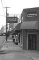
This is a good street scene. I like the vertical composition, something that many contemporaries forget to make. Your choice of b+w is good. Bald skies seem to be much more tolerated in b+w than in color. Of course, a person or two always adds additional interest to an image such as this one.
Best of luck in your career. I am a pilot, too, of sailplanes and taildraggers and, these days, mostly bicycles.
|
Photo By: Luke C
(K:2105)

|
|
|
Critique By:
Randal Dean (K:4004)
8/7/2004 7:19:48 AM
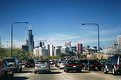
I just returned from my first trip to Chicago. I found it to be a beautiful, fascinating city, with unique charm and attraction. Unfortunately, your photo does not demonstrate any of the beauty I saw in the city. Stuck in traffic, in any large city in America, you could get this shot, and it looks like what? Legos buildings. Without Sears Tower, this could be freaking Hartford for all anyone could tell. Chicago has interesting and unique architecture, this is a photo of poor traffic flow. Sorry for the slam, but this is no way to sell a "great view of downtown." It's no better than a snapshot from a disposable camera.
|
| Photo By: Luke C
(K:2105)
|
|
|
Critique By:
tim park (K:165)
7/24/2004 5:55:38 AM
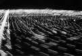
great composition, i think the fact that they are sillhouettes actually makes the photo better than if u could see the details of the planes
nice work
cheers,
tim
|
| Photo By: Luke C
(K:2105)
|
|
|
Critique By:
tim park (K:165)
7/24/2004 5:51:52 AM
turned out well
my kind of shot
|
| Photo By: Luke C
(K:2105)
|
|
|
Critique By:
Shyamal Addanki (K:1009)
7/20/2004 2:18:03 PM
Nice shot of the dog. I would have asked the nice Senior Master Sergeant to put the dog down though, the boundary of the red and green meeting on the head of the dog takes a little away from the subject.
|
| Photo By: Luke C
(K:2105)
|
|
|
Critique By:
Ashley Wallis (K:447)
7/16/2004 1:52:42 PM
So cute! I love it! The focus is a little blurry on the bottom, but given the subject, outstanding job! Color great!
|
| Photo By: Luke C
(K:2105)
|
|
|
Critique By:
Jose Ignacio (Nacho) Garcia Barcia (K:96391)
7/5/2004 3:26:39 AM
very cool 7
|
| Photo By: Luke C
(K:2105)
|
|
|
Critique By:
Daniel Silva (K:2512)
6/28/2004 11:46:09 PM
i really like this picture a lot...and yes i do think it has that old time feel
|
| Photo By: Luke C
(K:2105)
|
|
|
Critique By:
Daniel Silva (K:2512)
6/28/2004 5:44:39 PM
thats a great pic, i think made even better by the effort you put into getting that picture.
|
| Photo By: Luke C
(K:2105)
|
|
|
Critique By:
Bill Campbell (K:16)
6/15/2004 5:46:16 AM
Nice color and detail Lucas.
Photographing ducks isn't all it quacks up to be.
Bill
|
| Photo By: Luke C
(K:2105)
|
|
|
Critique By:
* James * (K:20200)
6/15/2004 5:12:38 AM
lucas.... if you have photoshop, zoom in on your photo and take out annoying spots with the clone tool. then brighten up your sky a bit using hue/saturation. good shot nonetheless.
|
| Photo By: Luke C
(K:2105)
|
|
|
Critique By:
* James * (K:20200)
6/15/2004 5:10:38 AM
you're quite lucky to be able to have access to such shots. you did quite well on the composition of this one, considering it's difficult to say "a little to the left." maybe a bit of work on photoshop with colours and contrast lucas.
i think a shot showing the front of the aircraft while flying would be interesting. we often see lateral views but rarely anyhing from in front or from above.
|
| Photo By: Luke C
(K:2105)
|
|
|
Critique By:
Deb Mayes (K:19605)
6/14/2004 11:30:57 PM
I think the only thing missing here is for the man in front of you to be wearing a cheese hat. 
This is a good environmental shot of the stadium; excellent use of the wide angle.
|
| Photo By: Luke C
(K:2105)
|
|
|
Critique By:
Deb Mayes (K:19605)
6/14/2004 11:24:50 PM
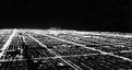
I really like this, blur and all. One thing about the midwest - the cities are laid out in grids, and that really shows here. Somehow with the blur you've managed to convey a "Star Wars" sense of speed -
|
| Photo By: Luke C
(K:2105)
|
|
|
Critique By:
Sam Andre (K:12484)
6/14/2004 7:28:46 PM
blurry indeed, but very nice in a naieve way... wysiwyg kind of stuff that i like very much
|
| Photo By: Luke C
(K:2105)
|
|
|
Critique By:
Lee Harris (K:14694)
6/14/2004 9:35:04 AM
The lighting and shadows are very good.
Well exposed as well and good focus.
Good Job
Lee
|
| Photo By: Luke C
(K:2105)
|
|
|
Critique By:
Stephen Bowden (K:64141)
5/6/2004 5:26:15 PM
It turned out great Lucas - excellent photo !
|
| Photo By: Luke C
(K:2105)
|
|
|
Critique By:
Steve LaBoon, Jr. (K:626)
4/26/2004 5:17:03 AM
Hey Lucas... let me first say, this is a good portrait of Jesse. I think the lighting is not so bad anda flash other than indirect fill would have been more damaging than good. i did however take Kelly's suggestion of the black and white with a lil adjustment in curves and this is what i came up with. I almost like her idea on this photo.
|
| Photo By: Luke C
(K:2105)
|
|
|
Critique By:
Mark Beltran (K:32612)
4/10/2004 7:17:42 PM
It does have an older time feel. Looks like there was a lot of atmospheric stuff going on with the clouds and some of the taller skyscrapers. Since it's more about light rather than colors, this b&w version is more effective than one that's in color.
|
| Photo By: Luke C
(K:2105)
|
|
|
Critique By:
Priyadarshi Sinha (K:7238)
3/30/2004 12:08:55 AM
i wouldn't have guessed it .. very intresting n thoughtful image ...
|
| Photo By: Luke C
(K:2105)
|
|
|
Critique By:
Silvia Festa (K:6008)
3/29/2004 11:56:42 PM
interesting view of a town! this photo may be everithing, I like it
|
| Photo By: Luke C
(K:2105)
|
|
|
Critique By:
Ashley Wallis (K:447)
3/29/2004 10:00:18 PM
Lucas, you've captivated me again. Absolutely amazing. Even though it is blurred, that makes it even more interesting. A steady shot would have made a sharper image, but this gives it a little more personality. I love it.
|
| Photo By: Luke C
(K:2105)
|
|
|
Critique By:
Rob Holschbach (K:2748)
3/4/2004 9:40:10 PM
I think it's funny Holmgren lost his first playoff game at Lambeau!
|
| Photo By: Luke C
(K:2105)
|
|
|
Critique By:
Steve LaBoon, Jr. (K:626)
1/30/2004 12:29:03 AM
Hey Lucas,
This is a good image. Maybe use a polarizing filter or UV filter to bring out the hues in the sky and reduce the blending of building and sky. Other wise a good composition.
Steve
|
| Photo By: Luke C
(K:2105)
|
|
|
Critique By:
Lucas B. (K:525)
1/27/2004 7:54:45 AM
Belo trabalho...parabens...
|
| Photo By: Luke C
(K:2105)
|
|
|
Critique By:
Luke C (K:2105)
1/24/2004 9:13:09 PM
Jason,
Thanks for the input. I played around with it a little more in PS as you suggested and I attached what I got. I lightened up the blue sky a bit, and I used the curves option to lighten the water just a little, but not much. What do you think? Thanks again for the input.
Regards,
~Luke
|
| Photo By: Luke C
(K:2105)
|
|
|
Critique By:
Jason Harris (K:392)
1/24/2004 8:51:30 PM
I probably would have also lightened the color of the water up a little bit. As is now, it definately looks a little fakeish because they just don't match up at all to what people are used to seeing in nature. However, maybe that is just me. It does have good composition though, with a very strong vertical theme carried foreground to back.
|
| Photo By: Luke C
(K:2105)
|
|
|
Critique By:
Luke C (K:2105)
1/24/2004 8:46:35 PM
Attached is the original photo.
|
| Photo By: Luke C
(K:2105)
|
|
|
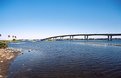
Critique By:
Steven Ashley (K:231)
1/23/2004 4:08:06 PM
Wow, really nice. Keep those Florida landscapes coming and I'll sure keep viewing them
That you can actually see the bottom of the waterway is awesome !
|
| Photo By: Luke C
(K:2105)
|
|
|
Critique By:
Steven Ashley (K:231)
1/23/2004 3:30:37 AM
Nice !!
|
| Photo By: Luke C
(K:2105)
|
|