|
|
Critique By:
Hubert Mackiewicz (K:661)
1/4/2004 5:31:57 AM
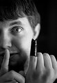
sweet 
|
| Photo By: martin david brown
(K:25)
|
|
|
Critique By:
Kaan AYDIN (K:1984)
12/13/2003 1:14:22 PM
this is a very nice outcome from an accident i think. excellent picture
|
| Photo By: martin david brown
(K:25)
|
|
|
Critique By:
pertti jukkara (K:1720)
10/31/2003 4:21:26 PM
5+2=7
but what is it right from number five?
|
| Photo By: martin david brown
(K:25)
|
|
|
Critique By:
Laurie J. Herndon (K:5338)

10/30/2003 4:44:06 PM
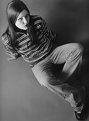
Love the skate stuff. Just for fun you should rent a "strobe light" sometime and try for multiple images with the "blur" thing. Bella
|
| Photo By: martin david brown
(K:25)
|
|
|
Critique By:
Daniel Lozano (K:1162)
8/14/2003 3:44:35 PM
This is a beautiful portrait, I really like the composition.
The shadows are very interesting.
|
| Photo By: martin david brown
(K:25)
|
|
|
Critique By:
det kl (K:143)
4/12/2003 8:52:32 AM
good balancing act! excellent perspective! using those two stools with this pose makes this original to me...add a bit more contrast and WOW!!!
|
| Photo By: martin david brown
(K:25)
|
|
|
Critique By:
May Kasahara (K:4)
3/11/2003 6:53:09 PM
nice harmony with the lights and shadows
|
| Photo By: martin david brown
(K:25)
|
|
|
Critique By:
Neil A (K:297)
3/9/2003 5:41:31 PM
I like the feeling this gives me. Nice work.
|
| Photo By: martin david brown
(K:25)
|
|
|
Critique By:
Todd Miller (K:16464)
3/9/2003 3:44:21 PM
nice image, i like the strong contrast. this belongs on a CD sleeve.
|
| Photo By: martin david brown
(K:25)
|
|
|
Critique By:
huskola (K:2948)
3/6/2003 9:53:53 AM
I like this. It makes you think and that is good art. I would put this on my wall. Good work!
|
| Photo By: martin david brown
(K:25)
|
|
|
Critique By:
Aaron Charlton Smith (K:625)
2/14/2003 2:31:09 PM
Lol, funny story. Now if only he had a Robin...
|
| Photo By: martin david brown
(K:25)
|
|
|
Critique By:
Leah Falkowski (K:83)
2/11/2003 11:10:29 AM
I agree...the grain brings more attention to the cat itself while the objects in the backround bring more character and reality to the photo.
|
| Photo By: martin david brown
(K:25)
|
|
|
Critique By:
Wayne Harridge (K:18292)
1/16/2003 3:30:23 AM
Quite an interesting shot, I find the catchlight in the model's right eye rather disturbing. Don't know if the catchlight should be removed or the right side of her face should be better lit.
|
| Photo By: martin david brown
(K:25)
|
|
|
Critique By:
Mike Scott (K:1817)
12/22/2002 6:41:28 AM
I like the high angle and the stools - too bad the right foot is cut off. Be careful though, or the next in the series might be: Morgan Falls on Her Ass. : )
|
| Photo By: martin david brown
(K:25)
|
|
|
Critique By:
Terrence Kent (K:7023)
12/19/2002 12:29:13 PM
crossed arms and a more direct expression could snap this up, otherwise melikes the lighting and so forth, good work
|
| Photo By: martin david brown
(K:25)
|
|
|
Critique By:
Kyle Blair (K:1542)
12/19/2002 10:36:10 AM
another good one. I'm glad the stools where there too, they have made for some very cool shots.
|
| Photo By: martin david brown
(K:25)
|
|
|
Critique By:
Autumn Ruhe (K:993)
12/18/2002 2:03:04 PM
cool shot, i like the birds eye view and the interesting pose. i think a little more contrast wouldn't hurt the picture, it's a little grey.
|
| Photo By: martin david brown
(K:25)
|
|
|
Critique By:
Morsi Hussein (K:1128)
12/18/2002 1:33:30 PM
I like it Just my only comment
|
| Photo By: martin david brown
(K:25)
|
|
|
Critique By:
martin david brown (K:25)
12/18/2002 12:39:18 PM
Thanks for the comments everyone. And yes, I thought the scratches added to the mood as well, obviously, a few others didn't think so. I made an 11 x 14 print of this in the darkroom, and it looks awesome with the scratches and all. Perhaps I should scan that in and show it....anyway, Mike, I scanned this particular frame by simply laying it on my flatbed scanner and closing the lid. It's the only way I have to scan things at home, so it works. peace out.
MDB
|
| Photo By: martin david brown
(K:25)
|
|
|
Critique By:
Anindya Maity (K:7880)
12/18/2002 11:04:11 AM
The tilted framing of the shot,the angle of view,the position of the model at the edge of the chair,the harsh lighting,all convey 'tension' to me.The scratches quite merge with the general mood of the pic imo.
|
| Photo By: martin david brown
(K:25)
|
|
|
Critique By:
Michael J. Noonan (K:-17)
12/18/2002 10:56:49 AM
I think the roughness matches the photo. How did you scan it? I've been trying to scan my negs and can't get decent results.
-mn
|
| Photo By: martin david brown
(K:25)
|
|
|
Critique By:
Kyle Blair (K:1542)
12/18/2002 8:53:18 AM
I hate it when that happens! anyway, it looks like a great picture. the lighting and pose are great, and the angle is really cool. I think the way you shown it to us with the sides of the negative is very cool. get her to pose for it again!
|
| Photo By: martin david brown
(K:25)
|
|
|
Critique By:
John Doe (K:170)
12/16/2002 2:24:44 PM
I agree with Kyle, the lighting is well done along with the pose. I'd like a little more room at the top as to not cut of any of her head.
|
| Photo By: martin david brown
(K:25)
|
|
|
Critique By:
Kyle Blair (K:1542)
12/16/2002 10:27:31 AM
I like it a lot. The lighting is good, the pose and perspective are great.
|
| Photo By: martin david brown
(K:25)
|
|
|
Critique By:
martin david brown (K:25)
12/4/2002 5:41:33 AM
Thanks for the comments. Ivan, the colors aren't supposed to be realistic. As I mentioned in the information I provided, I used a red filter. I wanted to get an eerie, sort of "horror in a sunset" feel. Thanks for the comments though.
|
| Photo By: martin david brown
(K:25)
|
|
|
Critique By:
meprivacynet@meprivacy.net meprivacynet@meprivacy.net (K:3974)
12/4/2002 5:03:12 AM
The crop is nice but colors are not realistic
|
| Photo By: martin david brown
(K:25)
|
|
|
Critique By:
Adam Kimmerly (K:382)
12/3/2002 9:17:09 PM
I'd have to agree with Chris. I think it's a great shot, but I do think it might be better with less of the background and more focus on the model in the spotlight. I'm impressed by the lack of lens flare from the light. The image seems very sharp too considering the long exposure except for the blur of her left hand. Cool shot - keep 'em coming.
~Adam
|
| Photo By: martin david brown
(K:25)
|
|
|
Critique By:
Chris Whaley (K:3847)
12/3/2002 8:40:47 PM
I like the scene and the model is well exposed...i think a vertical framing that would show her feet and some foreground would look good.
|
| Photo By: martin david brown
(K:25)
|
|
|
Critique By:
Dylan Davies (K:362)
12/3/2002 7:33:45 PM
nice. like the crop.
|
| Photo By: martin david brown
(K:25)
|
|
|
Critique By:
martin david brown (K:25)
12/3/2002 7:11:59 PM
Thanks for the comments Tony. But I disagree with the need for the detail in the hand. When your face is that close to your hand, your eyes can't focus on both the foreground and background. I wanted this to appear as though the viewer were realistically looking out of the window. I appreciate the comment, I just felt the need to explain.
|
| Photo By: martin david brown
(K:25)
|
|