|
|
Critique By:
Ruxandra Nastase (K:1501)
5/15/2007 11:54:21 AM
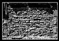
The details is interesting , but i miss something..a story...give me one element more..A cat, an animal, an object, a person ...something...an inedite perspective...
All the best!
Ruxa
P.S. I know it is architecture, but try another crop...
|
| Photo By: arian berisha
(K:13697)
|
|
|
Critique By:
Ruxandra Nastase (K:1501)
5/15/2007 11:50:43 AM
I would say this is a simple and balanced composition!
The diagonal of steps in the sand from left to right leads the eye directly to the subject! The lines in the sand destroys the monotony so that the picture shows an interesting texture in this part..The dark part of the sand on the left balances the sun...The silhouette is very good with one slight remark - i would have preferred it a little bit to the left - 1/3 -
best regards
Ruxa
|
| Photo By: Iman Fouad
(K:12295)
|
|
|
Critique By:
Ruxandra Nastase (K:1501)
5/15/2007 11:40:49 AM
I have discovered that a very difficult picture to shoot it the one with lot of people in it!I like the depth in this picture, the contrast between left and right....
I would have preferred 2 things:
1. the absence of the thing in the left bottom corner
2. that at least one of the 3 persons in the foreground have been entirely shot so that you can see the legs...I personaly would have liked the see the legs of the woman in the right..
Best regards!
Ruxa
|
| Photo By: Iman Fouad
(K:12295)
|
|
|
Critique By:
Ruxandra Nastase (K:1501)
5/14/2007 5:46:30 PM
Thank you Peter! I've almost belived you! :) Despite your words, i still think you could have worked with the red diagonal...:)
All the best!
Ruxa
|
Photo By: Peter De Rycke
(K:41212)

|
|
|
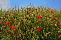
Critique By:
Ruxandra Nastase (K:1501)
5/14/2007 8:47:49 AM
Taie si lanul de jos, sa ramana numai verde cu galben..incearca si varianta asta....trimite-mi pe mail poza, sa incerc si eu diseara ceva...
Ruxa
|
| Photo By: E. Ioa
(K:102)
|
|
|
Critique By:
Ruxandra Nastase (K:1501)
5/14/2007 8:28:01 AM
I like the contrast between the colours...Pay a little bit attention to the horizon and also try not to have in the picture half earth - half sky..here for example the sky has nothing marvelous, so cut the sky till you have 1/3 of him...also the bush / try to have it more left or right!...
All the best!
Ruxa
|
| Photo By: E. Ioa
(K:102)
|
|
|
Critique By:
Ruxandra Nastase (K:1501)
5/14/2007 8:00:12 AM
Hello Fabio,
I don't think that B/W is a good choice! I see this picture in colour, but you can give it a try and see how it looks like!
Liebe Gruesse
Ruxa
|
| Photo By: Fabio Keiner
(K:81109)
|
|
|
Critique By:
Ruxandra Nastase (K:1501)
5/14/2007 7:34:07 AM
Very good composition, although i would pay a little attention to the red diagonal- in the upper right corner it should be a little bit higher so that you have the same distance as in the bottom left corner...very good balance between the colours, very good tonal range...
I like it!
All the best!
Ruxa
P.S. thank you for adding me as a friend - How do I have this honor? Thank you also for your comments!
|
| Photo By: Peter De Rycke
(K:41212)
|
|
|
Critique By:
Ruxandra Nastase (K:1501)
5/12/2007 8:08:20 PM
Ok! Good contrast! Good balance between the orange and blue! But i have problems with the composition - i would have let more sky in the left and i would have cut in right where the 3 windows start...
Ruxa
|
| Photo By: James Arendell
(K:604)
|
|
|
Critique By:
Ruxandra Nastase (K:1501)
5/11/2007 8:09:46 PM
Ich musste so lachen als ich dieses Bild gesehen habe! Es ist ein totaler Chaos! :)
Tja, james du hast dort eine schöne Diagonale gebildet von den 2 anderen Bilder und dem Mann! :)
Dann haben wir noch so eine versteckte Nachricht im Bild: die Sonne, die die Blumen zum Gedeien helfen und der Mann der froh ist, singt. Er hat bei Seite seinen Regenschirm gelassen!!!
Hugs, hugs and hugs!
Ruxa
|
| Photo By: James Arendell
(K:604)
|
|
|
Critique By:
Ruxandra Nastase (K:1501)
5/11/2007 10:50:51 AM
What I have forgotten...also the colours are in a relation of balance...
Warm regards and a lot of hugs! :)))))
Ruxa
|
| Photo By: James Arendell
(K:604)
|
|
|
Critique By:
Ruxandra Nastase (K:1501)
5/11/2007 10:33:05 AM
A very good night Photo! I like the composition a lot!
Best regards!
Ruxa
|
| Photo By: Lodovico Ludoni
(K:5210)
|
|
|
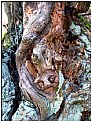
Critique By:
Ruxandra Nastase (K:1501)
5/11/2007 10:29:07 AM
As usual it is wonderful what you see!!!
I have problems with the upper left corner, the light there shouldn't be...regarding the right part- the structure of the tree implies curves.. i would have given more space on the right, it seems to be cut out, and gives me the feeling of unbalanced..I have the curve of thee and curve of the shadow on the left and it seems there was something similar on the right...
Best regards!
Ruxa
|
| Photo By: Fabio Keiner
(K:81109)
|
|
|
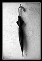
Critique By:
Ruxandra Nastase (K:1501)
5/11/2007 7:46:55 AM
The title suits the picture beautiful! You have a contrast on the umbrella, which i find very good. I personally need something - a person for example / so that i can discover a story in this picture!
Best regards!
Ruxa
|
| Photo By: arian berisha
(K:13697)
|
|
|
Critique By:
Ruxandra Nastase (K:1501)
5/11/2007 7:43:39 AM
Dear James,
Everybody has his own esthetics, so of course some like the picture, some not. The important is that the author accept his work thing is to be open and to accept it could be done better, if it is the case... Posting pictures in order to get comments or ratings as much as it gets is a wrong path to walk on..We show the picture to share and to improve..better one honest, hard comments instead of 100 without essence!!!
Warm regards!
Ruxa
|
| Photo By: James Arendell
(K:604)
|
|
|
Critique By:
Ruxandra Nastase (K:1501)
5/10/2007 9:43:23 PM
Thank also for the comment and that you took time to look into my portfolio...I uploaded the picture again, so i'm sorry that your comment isn't anymore
All the best!
Ruxa
P.S. As soon as i have some time i will look careful at your porfolio
|
| Photo By: txules .
(K:62768)
|
|
|
Critique By:
Ruxandra Nastase (K:1501)
5/10/2007 9:40:42 PM
I would say this is the first picture - for me - that brings someting new regarding the pylon!
All the best!
Ruxa
|
| Photo By: txules .
(K:62768)
|
|
|
Critique By:
Ruxandra Nastase (K:1501)
5/10/2007 8:58:29 PM
Oh dear james! :))))))
I like the composition it is balanced - the 2 flowers on the diagonal - and the little red in the upper corner helps this balance, i would date to say, it actually gives the balance to the hole picture...Very beautiful tones of green...
I like it..i love it...it is a favorite!
WARM regards! (you see i've learned :))))
|
| Photo By: James Arendell
(K:604)
|
|
|
Critique By:
Ruxandra Nastase (K:1501)
5/9/2007 8:41:42 PM
What a tension in the picture!!! It is a very daring crop, almost to the limit, but it supports the tension, the relations between the two a lot! Excellent! I like the light, the contrast, the DOF, everything!..It is a favorite!
All the best!
Ruxandra
|
| Photo By: Jarek Kasprowiak
(K:378)
|
|
|
Critique By:
Ruxandra Nastase (K:1501)
5/9/2007 8:35:37 PM
What have we here Paul?! :) You know my opinion!
Warmly regards!
Ruxa
|
| Photo By: Paul Schofield
(K:5970)
|
|
|
Critique By:
Ruxandra Nastase (K:1501)
5/9/2007 7:33:37 PM
Idea is very good! For me the frame is too tight, i personally would have chosen more space left and right! I think also more contrast would be appropriate , especially for the faces - half of the face you can see, the other no---> or this was your idea?!
Toate cel bune draga mea! :)
Ruxa
|
| Photo By: Dorina Köbele-Milas
(K:1355)
|
|
|
Critique By:
Ruxandra Nastase (K:1501)
5/9/2007 7:28:28 PM
My dear Pablo, if you allow me, i find the other one the best..With this one i personally have a problem regardinf the composition..i wouldn't have cut so much from the left part..the path doesn't come out from the left corner like the other one...it's tighter this frame...
Warmly regards!
Ruxa
|
| Photo By: Pablo Dylan
(K:63918)
|
|
|
Critique By:
Ruxandra Nastase (K:1501)
5/9/2007 7:15:55 PM
Debarshi I see it's comming! :) Wonderful mood!
Regards!
Ruxa
P.S. From my point of view, much, much better than the other one..:)
|
| Photo By: Debarshi Duttagupta
(K:26815)
|
|
|
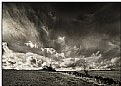
Critique By:
Ruxandra Nastase (K:1501)
5/9/2007 7:13:47 PM
Very good light in the clouds..and a beautiful relation between sky and earth so that the picture has a balanced composition!
All the best!
Ruxa
|
| Photo By: Debarshi Duttagupta
(K:26815)
|
|
|
Critique By:
Ruxandra Nastase (K:1501)
5/9/2007 7:10:56 PM
Very interesting composition James! I like it..From all the pictures with this theme, i like this most!
Warmly regards!
Ruxandra
|
| Photo By: James Arendell
(K:604)
|
|
|
Critique By:
Ruxandra Nastase (K:1501)
5/9/2007 9:11:28 AM
Ein sehr dramatisches Bild, eine sehr dramatische Stimmung..es gibt Spannung im Bild, eine Sache was mir sehr gefällt..Sehr gute Bildaufteilung und sehr gutes Licht!
Weiterhin Inspiration!
Ruxandra
|
| Photo By: Momento Eterno (Carmen Spitznagel)
(K:1177)
|
|
|
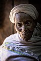
Critique By:
Ruxandra Nastase (K:1501)
5/9/2007 7:33:39 AM
Dear Robert
i want to pay you my respect regarding this beautiful reportage...You treat with great respect the people and this come out from your pictures so well...You reveal the beauty of life, nature, colours...
Congratulations!
Ruxandra
|
| Photo By: Robert Waddingham
(K:3389)
|
|
|
Critique By:
Ruxandra Nastase (K:1501)
5/9/2007 7:19:10 AM
Thank you James! :)
|
| Photo By: James Arendell
(K:604)
|
|
|
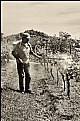
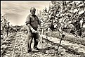
Critique By:
Ruxandra Nastase (K:1501)
5/9/2007 7:17:43 AM
The unsharpness of the hand shows that the man was working and not posing, so that the person has a natural atitude..The DOF not to large and not to shallow let us know what the man is doing and in the same time doesn't pull out the person from the "context" so that there is an interaction between person and the environment!!! A very good composition that gives the picture depth!
Sepia tones - a wonderful choice - that warm the picture...and all this together a wonderful Portrait!
All the best dear Pablo and a lot of inspiration!
Ruxandra
|
| Photo By: Pablo Dylan
(K:63918)
|
|
|
Critique By:
Ruxandra Nastase (K:1501)
5/9/2007 7:02:36 AM
The idea is very good...A little bit more contrast in order to give the details power!
Also a little bit attention regarding the composition - you have cut the padlock on the right!
All the best and a lot of inspiration!
Ruxa
P.S. Thank you that you "came in" :)
|
| Photo By: E. Ioa
(K:102)
|
|