| |
|
Critiques To
1
|
|
Critique By:
Chris Moore (K:5591)
12/31/2002 7:16:51 AM
Hi Liz,
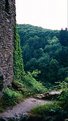
I think you got unlucky with the weather on this occasion - the sky is totally flat and it looks like mist hasn't helped the far trees, while not being thick enough to add interest.
It's often said that "green sucks" - there's not a lot of separation between the near green and the far green to make the chasm immediately obvious. For a decent landscape with lots of green, it's good to have a strong colour to contrast, eg blue sky.
It's difficult to say what you could have done about any of the above though, other than ask for different weather, and interesting blue sky with clouds etc.
I think you could have made the castle more interesting, perhaps by taking an angle more to the side, showing the gaping windows etc - at the moment its not very clear it's a castle. A higher angle might have revealed a bit of the drop into the chasm, but without being there, obviously I can't say with any confidence.
If there is any valuable advice though, it might be the "conventional wisdom" in an overcast situation like this, which is to go after details where there is interesting texture.
Perhaps a plant growing from that interesting wall, crumbling mortar etc. Overcast light is supposed to be good to enhance textures. Also perhaps using the sky for silhoutte might have been possible - say the sky through a castle porthole, barred window or some such.
Chris
|
| Photo By: Liz Ott
(K:18)
|
|
|
Critique By:
Chris Moore (K:5591)
12/31/2002 6:50:42 AM
Hi Liz,
I like the feel of this shot. It's a well seen shot, and has things to say.
I assume it's a "grab", when the motorcycle passed through the arch, and therefore there wasn't a whole lot of time for you to prepare.
For what it's worth, had you had time to play with, the following might improve the result:
Firstly, I think the elements that make up the shot need to be bigger in the frame - I've taken the liberty of attaching a crop for the area I'd have tried to fit into the frame. Of course, this is highly subjective.
The bike would be better a bit bigger - just as it passed into the light on the other side of the arch perhaps. As it is currently, the title is needed to draw attention to the bike.
The shot would probably have been more effective taken straight in front of the arch rather than off to the side a bit.
Of course, I doubt you had time to worry about any of this. If you were setting up a shot like this, the situation would be different.
Chris
|
| Photo By: Liz Ott
(K:18)
|
|
|
Critique By:
Chris Moore (K:5591)
12/31/2002 6:33:15 AM
Hi Liz,
Merry Christmas and welcome to Usefilm.
You've said in your bio that you would appreciate comments and help, so I will try to do this for each of your images so far.
I myself love straightforward criticism with little "windowdressing", so I tend to comment in this way, I hope you'll find them helpful and not discouraging! I'm no expert so all my comments are my opinion only.
Righto... on with the show... 
I like the idea behind this shot - the stark silhouette of the eiffel tower against the sky has a lot of potential, especially because it's such a well known shape.
The impact of the shot could be improved however if the tower was a straight vertical, here it is leaning enough to distract. If you have access to image editing software, (assuming you have no objections), you could straighten this image quite easily. It's tough to see a tilt like that when you take the picture, especially probably stretching your neck to look upwards.
The scan/print/negative is quite scratched/dirty - which is a distraction, and is again "fixable" with some digital editing work if you cared to do so.
I'm not sure why the shot has the darkened arc across the top third - is that something you did deliberately?
Finally I think you're to be commended for looking for a less common angle on the tower! The symetry of the buildings between the tower legs has potential to add additional "pattern" impact to the shot, but I think the best result would be gained by taking care to achieve a perfectly straight and central shot. The result would really sizzle if absolute perfect symmetry was achieved!
Chris
|
| Photo By: Liz Ott
(K:18)
|
|
|
Critique By:
william l. borch(jr.) (K:315)
12/26/2002 4:53:17 AM
Liz a like the concept but the poor lighting takes from the shot. The focus is a little soft. I think that with some light and focus and perhaps some kind of prop this could be a nice shot.
|
| Photo By: Liz Ott
(K:18)
|
|
1
|
|