|
|
Critique By:
Kevin H (K:22502)
7/7/2004 1:07:20 AM
Really love the loine but find the picture a little overexposed and because of it, you lose a little bit of details. Keep up the good work.
|
| Photo By: Timothy Sherburne
(K:599)
|
|
|
Critique By:
Tony Diana (K:13396)
7/6/2004 8:31:29 PM
Estupenda
|
| Photo By: Timothy Sherburne
(K:599)
|
|
|
Critique By:
Fabio Keiner (K:81109)
7/6/2004 7:42:22 PM
very fine abstract and spherically very correct

|
| Photo By: Timothy Sherburne
(K:599)
|
|
|
Critique By:
Gabriella Carta (K:22879)
1/10/2004 2:14:04 PM
wonderful shot, good
|
| Photo By: Timothy Sherburne
(K:599)
|
|
|
Critique By:
Stefan Rohner (K:4200)
1/9/2004 1:47:48 AM
I don?t think that you can make this shot better, you can get closer, but I like it like this, best regards
|
| Photo By: Timothy Sherburne
(K:599)
|
|
|
Critique By:
Diana Cornelissen (K:26437)
1/8/2004 5:25:43 PM
The lightning is really beautiful and I like the softness of the background a lot. Great capture Timothy! Regards,
Diana.
|
| Photo By: Timothy Sherburne
(K:599)
|
|
|
Critique By:
Chuck Freeman (K:13616)
1/7/2004 3:16:42 PM
Excellent shot and great film and Camera. Tri X 400-I love it mucho.
|
| Photo By: Timothy Sherburne
(K:599)
|
|
|
Critique By:
Stefan Rohner (K:4200)
1/7/2004 9:32:34 AM
moving him a little to the right would have avoid that the iron bat cuts his head,,, very good portrait,
|
| Photo By: Timothy Sherburne
(K:599)
|
|
|
Critique By:
t chamberlain (K:638)
1/6/2004 8:41:59 PM
I like it, but he seems to be too close to the middle. and there is alot of head room. Very well exposed and wonderful detail. tc
|
| Photo By: Timothy Sherburne
(K:599)
|
|
|
Critique By:
Sarah Underhill (K:235)
1/6/2004 5:33:32 PM
Great Portrait!
|
| Photo By: Timothy Sherburne
(K:599)
|
|
|
Critique By:
Carolyn Wiesbrock (K:14051)
1/6/2004 5:19:38 PM
And this is the best..excellent work!
|
| Photo By: Timothy Sherburne
(K:599)
|
|
|
Critique By:
Chuck Freeman (K:13616)
1/6/2004 4:12:55 PM
Very nice. I have a linar PRO, but can not get batteries for it.
|
| Photo By: Timothy Sherburne
(K:599)
|
|
|
Critique By:
- - (K:2997)
1/6/2004 4:12:52 PM
shadows look nice
|
| Photo By: Timothy Sherburne
(K:599)
|
|
|
Critique By:
Diana Cornelissen (K:26437)
1/6/2004 4:12:40 PM
Very good choice to do this in black & white! The portrait is good.... maybe the boy is a little too much in the middle. I like the background a lot! My best regards,
Diana.
|
| Photo By: Timothy Sherburne
(K:599)
|
|
|
Critique By:
Chuck Freeman (K:13616)
1/6/2004 4:11:47 PM
I see your "eye" for great photos. Keep it up my friend and always stick to film and keep learning about digital. Ironically, I am seeing more photographers that left DIGITAL and going back to film. I like both, but luv film...
very nice photo. Is this your son or Brother by chance?
|
| Photo By: Timothy Sherburne
(K:599)
|
|
|
Critique By:
G C (K:12204)
1/6/2004 4:10:56 PM
I looked at the last three images, and thought what a wonderful gift for your brother to do these elegant portraits. The last really caught my eye because I thought you could add a little grain to it and have a 'young Dylan' kind of look to this which would be super cool.
Cheers!
|
| Photo By: Timothy Sherburne
(K:599)
|
|
|
Critique By:
Dan Arthur (K:4280)
1/3/2004 9:33:13 PM
Wonderful shot! I like using a larger aperture on these to decrease the DOF, but I still like this one very much! Great work! Regards, Dan
|
| Photo By: Timothy Sherburne
(K:599)
|
|
|
Critique By:
Russell Love (K:7006)
3/12/2003 8:33:13 PM
Timothy,
Before I critique your photo, I will first have to tell you why I stopped to look at it. My son did a sculpture in college that looked very similar to this, only the truck was on blocks. He goes to college in a small Iowa town, and named the sculpture "Iowa Yard Art." Now to your shot, you have a lot of potential here with this scene, I would try from different angles, different focus points, and mainly try to do this when the sun is not so harsh. You loose a lot of detail and contrast with trying to balance out the tones. But keep it up and keep 'em coming!
Later my friend,
Russ
|
| Photo By: Timothy Sherburne
(K:599)
|
|
|
Critique By:
Timothy Sherburne (K:599)
3/12/2003 12:39:53 PM
Thanks all for the comments. I will be keeping my eye out for this kind of scene in the future!
|
| Photo By: Timothy Sherburne
(K:599)
|
|
|
Critique By:
Marco Grandi (K:16680)
3/11/2003 2:49:53 PM
Good composition!Splendid lighting.
Bye Marco.
|
| Photo By: Timothy Sherburne
(K:599)
|
|
|
Critique By:
Timothy Sherburne (K:599)
2/25/2003 1:18:52 PM
Thanks for the comments. I'm also pleased with the composition; the addition of some texture in the sky would be nice. Hopefully there will be some days this summer with some small fluffy clouds.
|
| Photo By: Timothy Sherburne
(K:599)
|
|
|
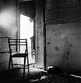
Critique By:
T M (K:-183)
2/21/2003 8:49:22 AM
Hi Timothy.
This one is really good. I don?t mind the softness and I think the composition is fine - It is good that you put the chair out of the center and left enough space for the stainy-texture on the right wall (I think it gives a good impression of how run-down this place is). Taking it away would have destroyed a lot of the feeling. However I would really like to see this one as the setting for a portrait with a person sitting on the chair staring out the door or - even better - looking at the camera, smoking a cigarette. I think that way you could make the mood even more intense. Keep up the good work.
Thomas
|
| Photo By: Timothy Sherburne
(K:599)
|
|
|
Critique By:
Hayri CALISKAN (K:16195)
2/21/2003 8:42:11 AM
Beautiful composed.I like the lighting and shadows also.
|
| Photo By: Timothy Sherburne
(K:599)
|
|
|
Critique By:
Timothy Sherburne (K:599)
2/20/2003 12:34:46 PM
Thanks for the comments. Yes, AJ, I agree: there could be more balance between the highlight and shadow.
|
| Photo By: Timothy Sherburne
(K:599)
|
|
|
Critique By:
Matt Hardy (K:474)
2/20/2003 9:11:55 AM
Very good comp timothy.
|
| Photo By: Timothy Sherburne
(K:599)
|
|
|
Critique By:
Todd Miller (K:16464)
2/19/2003 9:23:16 PM
nice composition, i really need to get to portland sometime. i think the sky needs something (clouds, darker tone??) to give it a little life. Otherwise it's a very nice photo. the lighting appears a bit harsh too-now I'm getting nitpicky.
|
| Photo By: Timothy Sherburne
(K:599)
|
|
|
Critique By:
sam clements (K:265)
2/16/2003 12:39:34 PM
One word...Fantastic!
|
| Photo By: Timothy Sherburne
(K:599)
|
|
|
Critique By:
AJ Haselwood (K:2148)
2/16/2003 7:24:18 AM
I agree with Jeremy about the nostaligia and texture. my only syggestion would be to darken the hotspots at the top of the ball. Very well done macro.
aj
|
| Photo By: Timothy Sherburne
(K:599)
|
|
|
Critique By:
j ruz (K:1043)
2/15/2003 10:31:39 PM
Wonderful contrast! Very sharp! I also think that the close crop works great. A fantastic photo! (c:,'
|
| Photo By: Timothy Sherburne
(K:599)
|
|
|
Critique By:
j ruz (K:1043)
2/15/2003 10:26:19 PM
The texture and nostalgia are definitely what make this image. Great work! (c:,'
|
| Photo By: Timothy Sherburne
(K:599)
|
|