|
|
Critique By:
Hasan Basri AKIRMAK (K:312)
5/22/2006 6:18:50 PM
Wow! What an angle to a simple traffic sign! I do respect your style! Congrats.!
|
Photo By: Matej Maceas
(K:24381)

|
|
|
Critique By:
Tobiah Deutsch (K:2432)
4/10/2006 6:38:18 PM
Matej,
I knew that you got the EC selection a while back, but I hadn't seen it up on the home page until now. Congrats!
Cheers,
Toby
|
| Photo By: Matej Maceas
(K:24381)
|
|
|
Critique By:
Roland Lacson (K:12214)
4/2/2006 2:11:48 PM
Interesting perspective & like the choice of tone which compliments what appears like a vintage image. The inclusion of the sproket holes in the frame is a nice touch. Thanks much Matej for the comment & suggestion to my image, best wishes.
|
| Photo By: Matej Maceas
(K:24381)
|
|
|
Critique By:
Matej Maceas (K:24381)
3/31/2006 8:45:22 PM
Thank you Hugo.
|
| Photo By: Matej Maceas
(K:24381)
|
|
|
Critique By:
Hugo de Wolf (K:185110)
3/30/2006 7:31:08 PM
Hi Matej, Hard to tell, I always think the tones change after uploading a photo to UF, compared to what I on my screen when processing them. Besides, I'm not too familiar with darkroom toneing of images, so I can't really help you there - you're way ahead of me.
But from what I see on screen and reading your question, I'd say it's a bit over toned. A subjective remark at that, as I usually don't care much for toned images, and if it's applicable to a photo (no doubt that applies here), I'd rather lean towards subtlety than towards bright and sunny.
Strong photo, though, creating the contrast with the old, faded building and the strong, proud and corporate looking bank in the rear.
Cheers,
Hugo
|
| Photo By: Matej Maceas
(K:24381)
|
|
|
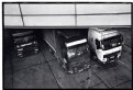
Critique By:
Matej Maceas (K:24381)
3/28/2006 6:44:20 AM
Thanks Audrey. The print is ok, considering the negative, which is not quite what is should be... rating Neopan 1600 at 1600 does not seem to work for me :-)
The overhang is burned in about 30% so that it doesn't tonally compete with the trucks too much. I'm glad that seems to have worked.
|
| Photo By: Matej Maceas
(K:24381)
|
|
|
Critique By:
Audrey Reid (K:5872)
3/27/2006 8:15:10 PM
Hi there,
I like this one  The placement of the trucks give the interesting angle, tones are milky smooth too. I had to think about the overhang....its a good addition to the composition. The placement of the trucks give the interesting angle, tones are milky smooth too. I had to think about the overhang....its a good addition to the composition.
The print must be pretty rich eh?
|
| Photo By: Matej Maceas
(K:24381)
|
|
|
Critique By:
Matej Maceas (K:24381)
2/16/2006 7:05:42 PM
Christian, you touch upon an interesting subject.
The first time I printed on this paper (more than a year ago?), I didn't like it at all - the texture was just way too strong, distracting and unrealistic for my taste. I could probably attribute it to bad subject/paper match rather than bad paper as such... but in fact when I look at that first print today, it's not so bad even with that subject. Apparently my taste has been changing.
Now when I was pondering which paper to use for this forest photo, I decided to give Chamois another try. I can say that I'm satisfied with the result - the paper texture is in line with the texture of the bark, and gives it an almost three-dimensional quality when viewed at an angle; and the creamy base combines well with the brown toning.
|
| Photo By: Matej Maceas
(K:24381)
|
|
|
Critique By:
Bryan Miller (K:3395)
2/16/2006 1:08:49 PM
splendid print Matej!
|
| Photo By: Matej Maceas
(K:24381)
|
|
|
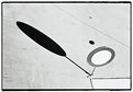
Critique By:
Steve Aronoff (K:18393)
2/16/2006 3:15:28 AM
Congratulations, Matej. It's a very nice photo. Reminiscent of a black and white Miró. Well done!
Steve
|
| Photo By: Matej Maceas
(K:24381)
|
|
|
Critique By:
Christian Barrette (K:21125)
2/15/2006 2:53:48 AM
Well executed in terms of composition with the main tree emerging as a very strong graphical line. It's hard to evaluate the impact of the print - my guess is that the appreciation comes by a combination of the hues and the paper texture.
|
| Photo By: Matej Maceas
(K:24381)
|
|
|
Critique By:
Roger Williams (K:86139)
2/13/2006 9:25:00 AM
Once again I stand in awe of your patience and your expertise. Even *I* can see that this is a beautiful result, well worth the effort. Congratulations!
|
| Photo By: Matej Maceas
(K:24381)
|
|
|
Critique By:
Salib Cross (K:1972)
2/12/2006 11:27:43 PM
just great shot
regards
|
| Photo By: Matej Maceas
(K:24381)
|
|
|
Critique By:
D A (K:9)
2/12/2006 6:40:20 PM
I like the tones and perspective.
|
| Photo By: Matej Maceas
(K:24381)
|
|
|
Critique By:
Kambiz K (K:37420)
2/12/2006 6:17:48 PM
not a bad one.
|
| Photo By: Matej Maceas
(K:24381)
|
|
|
Critique By:
JOya JOya (K:-763)
2/12/2006 4:39:32 PM
its good to see!
|
| Photo By: Matej Maceas
(K:24381)
|
|
|
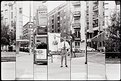
Critique By:
Pat Fruen (K:12076)
2/10/2006 8:05:21 PM
This is beautiful. The dof is very well controlled and the grain is lovely.
|
| Photo By: Matej Maceas
(K:24381)
|
|
|
Critique By:
Ralf Denguth (K:3353)
2/6/2006 7:53:40 PM
Great portrait of him/her Matej! Very well composed and the grain works in this picture! Like it! CHeers, Ralf
|
| Photo By: Matej Maceas
(K:24381)
|
|
|
Critique By:
Karina Brys (K:16541)
2/6/2006 7:31:36 PM
Nice portrait, good depth of field and especially, lovely grainy black and white.
|
| Photo By: Matej Maceas
(K:24381)
|
|
|
Critique By:
Matej Maceas (K:24381)
1/25/2006 11:10:59 AM
"Did you feel it was worth the effort?"
Yes, very much.
|
| Photo By: Matej Maceas
(K:24381)
|
|
|
Critique By:
Roger Williams (K:86139)
1/25/2006 9:29:09 AM
Now that's what I call doing it the hard way! Did you feel it was worth the effort? It's hard to judge from a small screen image. My Arsat 30mm is off to the Ukraine for repairs... After having great good luck with FSU 35mm lenses I seem to have run out of luck for MF lenses!
|
| Photo By: Matej Maceas
(K:24381)
|
|
|
Critique By:
Gonçalo Franco (K:1773)
1/23/2006 5:41:01 PM
interesting image
|
| Photo By: Matej Maceas
(K:24381)
|
|
|
Critique By:
John McCallum (K:1856)
1/10/2006 6:12:12 PM
Excellent. You have some interesting work going on here Matej!
|
| Photo By: Matej Maceas
(K:24381)
|
|
|
Critique By:
blah blah (K:-855)
11/17/2005 11:26:16 PM
loving composition Matej, the lighting and contrast look wonderful.
|
| Photo By: Matej Maceas
(K:24381)
|
|
|
Critique By:
Warren B (K:7272)
11/6/2005 5:19:51 AM
Nice work, I can appreciate the effort you've put in and it's produced quite an effective shot. Well done.
|
| Photo By: Matej Maceas
(K:24381)
|
|
|
Critique By:
Ivan Di Pietro (K:1229)
11/3/2005 12:56:19 PM
Really an outstanding work, my compliments.
ivan
|
| Photo By: Matej Maceas
(K:24381)
|
|
|
Critique By:
Roger Williams (K:86139)
11/2/2005 9:25:16 PM
I like the fact that the toning doesn't affect the unexposed areas of white, which remain "pure" and bright. You caught the lighting just right on that ladder... fascinating.
|
| Photo By: Matej Maceas
(K:24381)
|
|
|
Critique By:
abhra aich (K:8830)
9/30/2005 5:37:05 PM
well composed shot!!!!!!!!!!!!!!
|
| Photo By: Matej Maceas
(K:24381)
|
|
|
Critique By:
Warren B (K:7272)
9/28/2005 6:37:57 AM
I like this, the pattern of all the chairs works really well. B&W a nice choice too. Gives a whole new meaning to the phrase "Take a seat".
|
| Photo By: Matej Maceas
(K:24381)
|
|
|
Critique By:
Roger Williams (K:86139)
9/27/2005 10:32:38 PM
I think I'd have to see the print to really get the full impact of this shot. I'll visit your site, Matej. Since learning about Slovakia's many good local wines, I've wanted to visit... so I find you subject very interesting.
|
| Photo By: Matej Maceas
(K:24381)
|
|