|
|
Critique By:
Timothy R (K:3028)
3/10/2006 4:58:08 AM
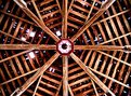
David,
You had mentioned on a comment you left on one of my photos about finding unusual things around Milwaukee. You and I found just about the same idea in two different areas.
http://www.usefilm.com/Image.asp?ID=475923
Is a church in Mequon.
I shot it by setting the camera on the floor in what I thought - correctly - was the middle of the building and bracketed several shots.
You have a great eye for unusual things. I like that!
|
| Photo By: David Morris
(K:1404)
|
|
|
Critique By:
Eleisa Martin (K:2569)
9/17/2005 3:51:10 PM
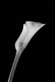
I like this picture a lot. I like the contrast of soft flowers and the hard piece of pottery.
Eleisa
|
| Photo By: David Morris
(K:1404)
|
|
|
Critique By:
Chuck Freeman (K:13616)
6/11/2005 6:43:48 PM
I am glad to see someone whom is stillinterested in our past and willing to photograph. I have seen various documentaries on PBS mostly about these death camps. This photo caught my eye. B And White is fine.
|
| Photo By: David Morris
(K:1404)
|
|
|
Critique By:
Chuck Freeman (K:13616)
5/21/2005 7:35:12 PM
Very interesting indeed...
|
| Photo By: David Morris
(K:1404)
|
|
|
Critique By:
arwa abdullah (K:34415)
5/20/2005 6:15:07 AM
great black and white image with a lot of potentials!
It would be interesting to see it in a square crop by removing the extra space on the top and cropping some of the bottom, added contrast or glow!
thank you so much for your comment on my b&w image I appreciate it! 
|
| Photo By: David Morris
(K:1404)
|
|
|
Critique By:
Stan Pustylnik (K:6768)
5/19/2005 6:11:17 PM
Came back to look at it again. David, I love this image so much! It shows how wonderfully can city and nature join and co-exist. I would add this image into my favorites list. Thanks for sharing.
|
| Photo By: David Morris
(K:1404)
|
|
|
Critique By:
Stan Pustylnik (K:6768)
5/19/2005 1:59:10 AM
Actually I like this way. simple reflection shot, or ducklings on wter surface will be a regular stuff. this one is awesome mix. ) made me smile. Thanks!
|
| Photo By: David Morris
(K:1404)
|
|
|
Critique By:
Jonathan Jones (K:320)
5/7/2005 4:09:28 PM
Thank you for your comment I will keep trying to improve.
Realy like this on it is very effective in b+W
|
| Photo By: David Morris
(K:1404)
|
|
|
Critique By:
Jose Fagundes (K:79)
1/21/2005 9:03:36 PM
Good photo!
|
| Photo By: David Morris
(K:1404)
|
|
|
Critique By:
Debashis Nag (K:501)
8/2/2004 11:23:16 PM
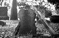
Nicely done, love the perspective, paints a very dark image and reminder ... like the move "The Grey Zone".
|
| Photo By: David Morris
(K:1404)
|
|
|
Critique By:
Daniel Walker (K:1699)
8/1/2004 12:15:07 PM
Behold the "Mater Plan" at work!!! It was a great idea to scan the picture into B&W, looks more fitting and makes you concentrate more on what you are seeing instead of just the colors in the picture.......supreme evil lived here.
|
| Photo By: David Morris
(K:1404)
|
|
|
Critique By:
* James * (K:20200)
7/31/2004 12:04:39 PM
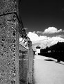
I'm assuming this is the area between two walls/fences. I think it might have been better to focus a bit more on the barbed wire to make it easier for people to know what they're looking at. my opinion only....
i do like the tones. good work.
|
| Photo By: David Morris
(K:1404)
|
|
|
Critique By:
Rebecca Raybon (K:26654)
7/31/2004 5:31:07 AM
Very appropriate in black and white. Beautiful image of a place full of sad memories.
|
| Photo By: David Morris
(K:1404)
|
|
|
Critique By:
G G (K:61359)

7/31/2004 4:04:15 AM
Nice shot. I like the grey tone which correspond well with the atmposphere of the place.... Congrats. Fabrice
|
| Photo By: David Morris
(K:1404)
|
|
|
Critique By:
Roger Williams (K:86139)
7/31/2004 3:46:53 AM
It does! Maybe it didn't need to be thrown quite so far out of focus, though, i.e., you could have chosen a slower shutter speed to allow a smaller aperture. If the OM-PC is an SLR (sorry, I don't know this camera), you can use the aperture preview button to get an idea of the amount of blurring due to the out-of-focus effect.
|
| Photo By: David Morris
(K:1404)
|
|
|
Critique By:
Roger Williams (K:86139)
7/31/2004 3:42:32 AM
Was the sky effect visible to the naked eye? If so, you could have walked around until you found an angle at which the effect was less prominent. You could also experiment with polarized filters. These can have a dramatic effect on sky coloration, and it is highly directional. Actually I think you made it difficult for yourself by taking against the light (although it may have been impossible to take it any other way, of course). This throws the unlighted sides of the stones into dark shadow with no detail. Stone textures come out nicely when the light is just grazing the surface. I understand that playing around in PhotoShop, if you are into that kind of thing, can help...
|
| Photo By: David Morris
(K:1404)
|
|
|
Critique By:
Roger Williams (K:86139)
7/31/2004 3:36:31 AM
Fascinating, and well taken. I've seen this same image or very similar in a number of places.
|
| Photo By: David Morris
(K:1404)
|
|
|
Critique By:
Dado (K:1190)
7/26/2004 3:54:17 AM
Very nice photo David. Heidelberg Castle is a beautiful place, i've been there once to. Sometimes, they have open-air Opera in that Castle
and thats amazing.
Greetings from Sydney
Daniel
|
| Photo By: David Morris
(K:1404)
|
|
|
Critique By:
Askari Asante (K:186)
7/9/2004 2:35:01 AM
Great shot! Bluer sky? Polarizing filter or PhotoShop :-) Nice work!
|
| Photo By: David Morris
(K:1404)
|
|
|
Critique By:
Tony Diana (K:13396)
7/2/2004 3:37:39 PM
Precioso enfoque
|
| Photo By: David Morris
(K:1404)
|
|
|
Critique By:
Chris Hunter (K:25634)
6/6/2004 5:15:53 PM
Nice, I like the worn texture of the urn, but I'm not 100% sure about the brightly colored flowers, maybe too distracting??
Chris
|
| Photo By: David Morris
(K:1404)
|
|
|
Critique By:
ARMANDO ALCÁZAR (K:42404)
4/17/2004 3:08:14 AM
EXCELENT PIC AND MESSAGE. CONGRATS
|
| Photo By: David Morris
(K:1404)
|
|
|
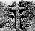
Critique By:
John Loreaux (K:86210)
4/4/2004 9:02:44 PM
HE is always watching!!Very well seen . My best,JOHN
|
| Photo By: David Morris
(K:1404)
|
|
|
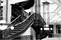
Critique By:
D W (K:2560)
3/25/2004 9:25:00 PM
Beautiful composition David. I like how you kept a lot of the steps in the shot. It keeps my eyes moving. Great work.
|
| Photo By: David Morris
(K:1404)
|
|
|
Critique By:
Jeanette Hägglund (K:59855)
3/10/2004 11:42:35 PM
The nature takes over, it dosent matter what we do....
Well done.
/Jeanette
|
| Photo By: David Morris
(K:1404)
|
|
|
Critique By:
None (K:3946)
3/7/2004 7:24:42 AM
david, the composition is just awesome. wonderful movement of the diagonal through your frame. this is very modern. the fact there's not a whole detail in the flower makes it very curious and i am one to realllllly like that. doing things ppl don't expect. some might say they have issues with the lilly not havinf texture and detal but i think that void makes it very modern. if you ever do want to bring detail out, i would light it from the side and try diff exposures using the zone system. well done!
meg
|
| Photo By: David Morris
(K:1404)
|
|
|
Critique By:
john amore (K:14015)
1/31/2004 1:59:09 PM
holds the eye well done
|
| Photo By: David Morris
(K:1404)
|
|
|
Critique By:
john amore (K:14015)
1/31/2004 1:58:06 PM
good shot nice work
|
| Photo By: David Morris
(K:1404)
|
|
|
Critique By:
Roger Williams (K:86139)
1/4/2004 1:16:51 AM
After responding to your request for advice on moving to MF, I visited your portfolio to see if you showed any signs of the kind of approach you need to make MF work. It's been a while since you uploaded anything, hasn't it? Are you finding 35mm photography less interesting/more limiting than you thought? There are lots of hassles and problems with MF, and it's only if you've been running constantly into the limitations of 35mm photography that the change will seem at all liberating. It can be quite the reverse: new limitations to get used to, new habits to form. I've made the move the other way, moving from 6 x 6 to 6 x 4,5cm and finally to 24 x 36mm. The exceptions are my panoramic cameras, which are sort of hybrid, taking 24mm x 58mm or 24 x 67mm images. This puts them mid-way between 35mm cameras and 120-format MF cameras, and this is where I feel pretty comfortable.
|
| Photo By: David Morris
(K:1404)
|
|
|
Critique By:
Becky V (K:9699)
11/16/2003 1:29:33 PM
In my humble opinion, I don't think this photo is overexposed because I can still see details in the skylights. Hmmm . . . .
I love the lines in this photo - I think I'm a sucker for shots where metal/architecture look particularly malleable. The ornate metalwork really draws one in to the photo, and I like the addition of the vertical lines of the light fixtures.
If it's possible to revisit this spot, I would like to see a reposition to the right, so the beam in the left hand corner isn't interrupting the stairs. My personal preference is to have lines interrupted "naturally" by the edge of the photo. The white beam seems more of an obstacle than a natural part of the scene. Other than that, I really like it!
What's a Rookery? 
|
| Photo By: David Morris
(K:1404)
|
|