|
|
Critique By:
l v (K:3830)
8/6/2003 12:58:44 AM
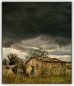
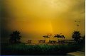
A differenza di tante altre tue foto, questa non mi ispira niente di particolare. La citta' sembra quasi nascosta, in basso, e in parte coperta dagli alberi. Il lampione sulla destra che si 'scontra' con un ramo non e' il massimo, anche. I colori della foto sono belli ma gli alberi, che prendono molta importanza, sono un po' troppo in ombra secondo me, specie quello piu' a sinistra. Forse con qualcuno sulla panchina avrebbe assunto tutto un altro significato ma, onestamente, cosi' com'e' mi meraviglio che abbia tutti 7: cosi' sembra di sminuire le altre tue bellissime foto con uguale punteggio. 
Ciao,Luca
|
| Photo By: luisa vassallo
(K:28230)
|
|
|
Critique By:
l v (K:3830)
8/6/2003 12:49:29 AM
Well executed, but I personally don't like this kind of pictures, usually. I much prefer to see the subject in focus and blurred background to convey the impression of motion. You couldn't have done it here with subjects moving in opposite directions, of course. The problem I have, for instance, is that you can't see the bike. Sure, it's a cyclist, but it gives a somehow "ghosty" impression.
Bye,Luca
|
| Photo By: Amancio Couto
(K:15720)
|
|
|
Critique By:
l v (K:3830)
7/23/2003 1:27:35 PM
Hi John, you are probably right. The monitor might have something to do with it as well. Thanks for taking the time to discuss the comments.
Luca
|
| Photo By: john morris
(K:30)
|
|
|
Critique By:
l v (K:3830)
7/23/2003 3:49:35 AM
See comment on 'stairs 2', I just wanted to add my ratings here.
Luca
|
| Photo By: Masahiko Shibata
(K:14107)
|
|
|
Critique By:
l v (K:3830)
7/23/2003 3:30:39 AM
It looks a little soft to me, but the main problem is the overexposed sky, which really spoils an otherwise beutiful picture. I like the composition a lot, for instance, expecially the line between the puddle, the gap in the grass and the distant part of the lake.
Bye,Luca
|
| Photo By: john morris
(K:30)
|
|
|
Critique By:
l v (K:3830)
7/23/2003 3:18:47 AM
Mi piace molto la luce della parte bassa della foto. La nuvola nera da' un'aria molto cupa che complementa bene la luce della casa, secondo me; l'effetto e' appena un po rovinato dalle nuvole centrali molto chiare. Il senso di profondita' e' reso ottimamente, credo grazie allo sharpening (che settings usi, per curiosita'?).
Ciao,Luca
|
| Photo By: Lorenzo Lessi
(K:6589)
|
|
|
Critique By:
l v (K:3830)
7/23/2003 3:08:51 AM
I like the composition, but the photo looks rather oversharpened. The top is rather washed out, too.
Bye,Luca
|
| Photo By: Al S
(K:5131)
|
|
|
Critique By:
l v (K:3830)
7/23/2003 2:52:48 AM
Bell'effetto, originale. Come l'hai ottenuto, in camera o con photoshop ?
Ciao,Luca
|
| Photo By: ileana barigelletti
(K:3571)
|
|
|
Critique By:
l v (K:3830)
7/23/2003 2:36:00 AM
I like the tonality and the overall mood of the picture, that reminds me of something like Blade Runner. The water reflected on the surface helps this feeling, at least for me, whereas the rightmost scooter spoils it a little.
Bye,Luca
|
| Photo By: Bikramadittya G. Roy
(K:7202)
|
|
|
Critique By:
l v (K:3830)
7/19/2003 1:01:50 AM
Light on the face seems fine to me; there might be some problems on the back and the paws don't seem well defined, but it's a minor thing at worst. The expression is wonderful and the black and white contributes to a very serene atmosphere. I am putting it in my favorites and giving it an almost perfect score (rare for me).
Bye,Luca
|
| Photo By: Susan Vasquez
(K:341)
|
|
|
Critique By:
l v (K:3830)
7/19/2003 12:54:16 AM
The light gives a very nice touch of difference to what might have been just another picture of a flower. Why cutting some of the petals away, though ?
Bye,Luca
|
| Photo By: Amancio Couto
(K:15720)
|
|
|
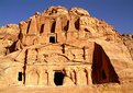
Critique By:
l v (K:3830)
7/19/2003 12:48:33 AM
The light is fantastic and the colors render the desert scene very well. The picture, however, looks a little compressed/tilted to my eye and doesn't really give an idea of the dimension of the place; maybe a vertical crop would have been better, I don't know.
Bye,Luca
|
| Photo By: Musabah Almarar
(K:866)
|
|
|
Critique By:
l v (K:3830)
7/19/2003 12:42:43 AM
Secondo me la luce del sole e' un pochino troppo forte e forse c'e' un po' troppo viola nella foto, ma forse e' solo il controluce che da' questa impressione I riflessi sulla neve sono stupendi e anche i raggi mi piacciono molto (hai usato un filtro?)
Ciao,Luca
|
| Photo By: cecilia tovini
(K:29423)
|
|
|
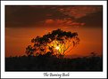
Critique By:
l v (K:3830)
7/18/2003 2:37:33 AM
A very moody picture, congratulations. I'd like to know where you shot it, if you could edit your description it would be great. It fits perfectly with my mental image of the african savanah, although I guess it might be Australia as well. The straight line in the middle of the sky looks a little weird, what is it?
Bye,Luca
|
Photo By: Gregory McLemore
(K:35129)

|
|
|
Critique By:
l v (K:3830)
7/18/2003 2:33:46 AM
Hi Steven. I must say that this is not one of your finest pictures. The sky is badly overexposed and the birds are lost in the middle of nothing. It also seems just a little noisy.
Bye,Luca
PS: you have some nice picture with very few comments, I'll come back to your portfolio in the next few days.
|
| Photo By: Steven Lilly
(K:302)
|
|
|
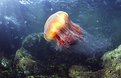
Critique By:
l v (K:3830)
7/18/2003 2:25:44 AM
Wonderful picture ! I am giving it a perfect score, which is not common for me, and putting it in my favorites. THe colors are superb and it is extremely sharp and well defined. I really like how the jelly fish is moving towards the light and how the 'tentacles' (missing the word) give a sense of motion. The only suggestion I have: change the category from 'wild life' to 'deep blue'.
Bye,Luca
|
| Photo By: David Cropp
(K:9)
|
|
|
Critique By:
l v (K:3830)
7/18/2003 2:21:15 AM
I colori sembrano un pochino spenti e piatti sul mio monitor. Il soggetto non e' troppo interessante per il mio gusto personale, ma lo hai reso bene, da cartolina.
Ciao,Luca
|
| Photo By: Emmanuele Coppola
(K:23)
|
|
|
Critique By:
l v (K:3830)
7/18/2003 2:08:09 AM
Ad essere sincero a me la nuvola non piace tanto, anche se non ti so spiegare bene il perche'. Mi da' un po' l'idea di essere attaccata sulla foto, invece di fare parte di essa; inoltre una 'macchia' di bianco cosi' grossa toglie attenzione al resto, a mio parere. Gia' che sono in vena di critiche , aggiungo anche che lo stacco fra il cielo e la collina e' un pochino forte per i miei gusti. Avendo scritto tutto questo, la foto rimane comunque molto bella !
Ciao,Luca
|
| Photo By: Lorenzo Lessi
(K:6589)
|
|
|
Critique By:
l v (K:3830)
7/18/2003 1:54:48 AM
Una foto davvero strana ... e attraente. L'inclinazione mi disturba un pochino, ma il colore davvero anomalo la fa passare decisamente in secondo piano. Continua a cadermi l'occhio sullo sprazzo di verde illuminato, che si complementa molto bene al giallo secondo me.
Ciao,Luca
|
| Photo By: Samvise Gamgee
(K:1999)
|
|
|
Critique By:
l v (K:3830)
7/18/2003 1:47:27 AM
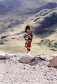
Nice subject ! I think, however, that the piper is a little lost in the frame, maybe it would have been better if it was more zoomed in. The picture also looks a little overexposed and washed out. I think you rendered the climb of the piper very well.
Bye,Luca
|
| Photo By: john morris
(K:30)
|
|
|
Critique By:
l v (K:3830)
7/18/2003 1:42:48 AM
I have a similar picture, but yours is much better! Why did you choose to desaturate the background ? Light, colors and details are very well executed.
Bye,Luca
|
| Photo By: Kacper Cie?la
(K:125)
|
|
|
Critique By:
l v (K:3830)
7/18/2003 1:41:28 AM
I must say I am a little disappointed to discover a face under a very interesting and attractive 'object'. The blue light looks like some ice sculpture, I think because of the color and the vertical reflections. The face in the background spoils the feeling, in my opinion.
Bye,Luca
|
| Photo By: heather martino
(K:3648)
|
|
|
Critique By:
l v (K:3830)
7/18/2003 12:17:09 AM
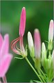
I like the geometry of the flower, infact I think that a crop to leave the flower exactly in the center would be even better. The colors are nice, although there seem to be some small patches slightly overexpsed. I think I would also have preferred a larger DOF, to have the top of the flower in focus.
There seem to be some dirt all around, maybe dust from the scanner, by the way.
Bye,Luca
|
| Photo By: Aidas Rygelis
(K:45)
|
|
|
Critique By:
l v (K:3830)
7/17/2003 12:55:09 PM
The sky attracts the most in this picture. The streak of clouds launching the subject out from the rock are nice, as well, but the blu sky looks superb.
Bye,Luca
|
| Photo By: Robert Stokes
(K:4509)
|
|
|
Critique By:
l v (K:3830)
7/15/2003 3:27:31 AM
Interesting composition, with the flame from the torch on the left (what is it, exactly?) pointing towards the fire. The fire itself looks well exposed and represented, whereas I find the overexposed part of the left flame a little distracting. All the black makes the picture look rather empty, I can't decide if it's a good or bad thing, though
Bye,Luca
|
| Photo By: Gatis Ozolins
(K:1502)
|
|
|
Critique By:
l v (K:3830)
7/15/2003 2:43:01 AM
I agree with the comment stating that the crop is a little tight on the right, whereas I wouldn't crop the sky at the top. I might also prefer some more space on the left, but not as much as the other picture of yours in landscape orientation. As I wrote in the other comment, wonderful colors and great position for the sun.
Bye,Luca
|
| Photo By: Mario Studer
(K:1821)
|
|
|
Critique By:
l v (K:3830)
7/15/2003 2:38:35 AM
A very clear, well defined picture. I like the depth plays, well rendered by the dof and the colors are amongst my favorites.
Bye,Luca
|
| Photo By: Hana Nishikawa
(K:168)
|
|
|
Critique By:
l v (K:3830)
7/15/2003 2:36:48 AM
I prefer the vertical crop, too. The color of the sky is just wonderful and the branches seem to have the same direction of the clouds, which is nice.
Bye,Luca
|
| Photo By: Mario Studer
(K:1821)
|
|
|
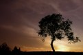
Critique By:
l v (K:3830)
7/15/2003 2:34:07 AM
I agree about the noisy/grainy sky, but it's not too evident. I love the colors, just as you say, and the lamppost on the right. I feel that there is a little too much black in the picture, though.
Ciao,Luca
|
| Photo By: Paolo Barthelemy
(K:25552)
|
|
|
Critique By:
l v (K:3830)
7/15/2003 2:32:38 AM
Bella foto, fa sembrare lo 'stagno' molto meglio di quanto sia in realta' Molto bello il riflesso, ma forse taglierei la parte in alto dove e' piu' 'blu' e foschiosa.
Ciao,Luca
PS: la foto che hai commentato e' dove lavoro, nessun viaggio
|
| Photo By: Roberto Arcari Farinetti
(K:209486)
|
|