|
|
Critique By:
robdeszan (K:-162)
8/27/2009 7:46:06 AM
Not much to be said here.... great tonality, light, model, expression, post-processing technique. congrats!
|
| Photo By: Gosia Barta
(K:87)
|
|
|
Critique By:
robdeszan (K:-162)
8/27/2009 7:39:44 AM
great photo, colors & saturation. Feels like you're running through the crossing at the last second.
|
Photo By: Avi
(K:70138)

|
|
|
Critique By:
robdeszan (K:-162)
7/6/2009 11:09:35 PM
They never fail to amaze me. Fantastic.
|
| Photo By: Luciano Caturegli
(K:6609)
|
|
|
Critique By:
robdeszan (K:-162)
7/6/2009 11:07:43 PM
Impressive! Great tonality.
|
| Photo By: txules .
(K:62768)
|
|
|
Critique By:
robdeszan (K:-162)
7/4/2009 8:58:54 AM
That's a very nice photo. It's sometimes hard to make harsh light work with portraits but given the make-up and styling of the model it works really well. The setting is also interesting. Beautiful model. Certainly more than just adequate and deserving a positive comment.
|
| Photo By: A. W. Osnafotos
(K:6373)
|
|
|
Critique By:
robdeszan (K:-162)
7/4/2009 8:54:27 AM
Lovely photo. I like the graphic background. Well spotted as well!
|
| Photo By: A. W. Osnafotos
(K:6373)
|
|
|
Critique By:
robdeszan (K:-162)
7/4/2009 7:50:35 AM
Girls got some talent! looks so natural and relaxed even though it's posed. Nice composition.
|
| Photo By: Gustavo Scheverin
(K:164501)
|
|
|
Critique By:
robdeszan (K:-162)
7/4/2009 7:39:16 AM
so simple and yet so impressive.
|
| Photo By: The Pilgrim
(K:65007)
|
|
|
Critique By:
robdeszan (K:-162)
7/3/2009 6:44:49 PM
Nothing new said but once again: great idea for the composition!
|
| Photo By: Subhranil Das
(K:6869)
|
|
|
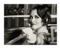
Critique By:
robdeszan (K:-162)
7/2/2009 11:05:51 PM
Fantastic make-up and expression. Well captured!
|
| Photo By: Gosia Barta
(K:87)
|
|
|
Critique By:
robdeszan (K:-162)
2/8/2009 4:55:03 PM
real nice wonderful natural smile. very relaxed, beautiful model. ;)
they are horrid, you're right.
|
| Photo By: jacques brisebois
(K:73883)
|
|
|
Critique By:
robdeszan (K:-162)
2/7/2009 9:59:36 AM
I know it's in "abstract" category but it's a pity it's out of focus that much, the colors are lovely and the clouds draw you in. Hand-held?
|
| Photo By: Hadi Al-Tammam
(K:99)
|
|
|
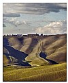
Critique By:
robdeszan (K:-162)
2/7/2009 9:50:11 AM
yet another wonderful landscape, congrats!
|
| Photo By: Luciano Caturegli
(K:6609)
|
|
|
Critique By:
robdeszan (K:-162)
2/7/2009 9:48:03 AM
Like an ominous movie scene. Nice.
|
| Photo By: John Bohner
(K:8368)
|
|
|
Critique By:
robdeszan (K:-162)
2/7/2009 9:42:29 AM
With such closeup, I think the photo would benefit if her eyes were more glowing as they look slightly underexposed but I like the shadow the lighting and the hairline create on her face.
|
| Photo By: Adrian Nojek
(K:1349)
|
|
|
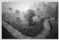
Critique By:
robdeszan (K:-162)
2/5/2009 9:46:11 PM
Excellent take on landscape photos in general, especially when everyone's obsessed with wide angles. beautiful
|
| Photo By: Luciano Caturegli
(K:6609)
|
|
|
Critique By:
robdeszan (K:-162)
1/23/2009 12:11:41 PM
Lovely model but the lighting is awful. I've had a look at the other photos from the series and increasing the contrast won't help. Change the light source (it's too harsh) or find a big window on an overcast day you'll be amazed at the sheer quality of natural light.
|
| Photo By: louise angus
(K:294)
|
|
|
Critique By:
robdeszan (K:-162)
1/23/2009 12:08:00 PM
I agree the hand looks numb. I'd also move her away from the wall (the shadow doesn't add anything) and maybe make the shadow a part of the composition? Lovely model, give it another go!
|
| Photo By: Katy Simmons Assi
(K:3009)
|
|
|
Critique By:
robdeszan (K:-162)
1/23/2009 12:03:06 PM
Well, you can tell she's Polish right away - beautiful face.
The only problem with center compositions is that one has to make everything perfect. The hairline is off. I hate when it happens. Even a tiny hair sticking out can ruin a photo.
|
| Photo By: rafal gdaniec
(K:9)
|
|
|
Critique By:
robdeszan (K:-162)
1/23/2009 11:46:54 AM
Sometimes it's easier said than done but I think the children in the background should be more in focus; the lens bokeh isn't too nice and is too overwhelming. Or (with the DOF this shallow)focusing on the second boy from the right would bring more balance in my view.
|
| Photo By: larry concepcion
(K:474)
|
|
|
Critique By:
robdeszan (K:-162)
1/23/2009 11:39:02 AM
Well spotted! (the reflection I mean). I guess you cropped the image? The roof structure looks interesting and would add more geometry if left uncropped on top to create a converging point for the real thing and the the reflection of the structure.
|
| Photo By: giovanni guido marchi
(K:27040)
|
|
|
Critique By:
robdeszan (K:-162)
1/23/2009 11:30:12 AM
The lighting makes the photo. The make up and processing is top notch. I am not sure about the framing though it seems random. Too much space above the head and I would place (by cropping maybe) the head a bit more to the left moving the stronger eye to the left as well to balance the composition.
|
| Photo By: Mikael Leijon
(K:2224)
|
|
|
Critique By:
robdeszan (K:-162)
9/15/2008 8:04:49 PM
It's a real pity about the ears, an as much as I hate comments like "oh no, you cut the hand/leg off@ I think the photo would have a more 3d effect. Imagine the tips of the ears and whiskers drowning in the out-of-focus. Oh, really nice model!
|
| Photo By: Robert Delgadillo
(K:3509)
|
|
|
Critique By:
robdeszan (K:-162)
2/20/2008 4:37:57 PM
I agree, perfect timing.
|
| Photo By: Mark Julian
(K:36866)
|
|
|
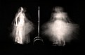
Critique By:
robdeszan (K:-162)
2/20/2008 4:32:50 PM
The image on the right is stronger. Two people I imagine? Square crop would work with the one on the right only.
|
| Photo By: Alp Arslan
(K:206)
|
|
|
Critique By:
robdeszan (K:-162)
2/20/2008 4:30:02 PM
The film-like frame is unnecessary in my opinion, it looks digital anyway. Apart from that, good portrait.
|
| Photo By: thomas malarky
(K:15)
|
|
|
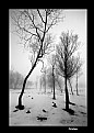
Critique By:
robdeszan (K:-162)
2/20/2008 4:26:39 PM
It's a real pity the top of the tree on the left is cropped out - a lower angle would probably work better.
|
| Photo By: ali shokri
(K:1611)
|
|
|
Critique By:
robdeszan (K:-162)
2/20/2008 4:23:46 PM
Nice background lighting and styling.
|
| Photo By: Johan Sorensen
(K:3449)
|
|
|
Critique By:
robdeszan (K:-162)
5/6/2007 2:54:25 PM
less is more. v nice
|
| Photo By: Momento Eterno (Carmen Spitznagel)
(K:1177)
|
|