|
|
Critique By:
Jose Ignacio (Nacho) Garcia Barcia (K:96391)
9/22/2003 12:03:19 PM
great mood.original.
|
| Photo By: Edward Seeto
(K:91)
|
|
|
Critique By:
Paul's Photos (K:35235)
9/4/2003 9:26:49 AM
Nice photo.. love looking up  too bad you could not get more of the reflection in the glass.. a little bit overexposed and a little busy.. but I love the perspective.. too bad you could not get more of the reflection in the glass.. a little bit overexposed and a little busy.. but I love the perspective..
|
| Photo By: Edward Seeto
(K:91)
|
|
|
Critique By:
Joe Smith (K:352)
9/4/2003 8:48:34 AM
I like this shot it might be a tad bit overexposed...the beams are a distraction but it can be looked past...
maybe something like this, just a idea to play with...
|
| Photo By: Edward Seeto
(K:91)
|
|
|
Critique By:
Runyuan Xu (K:-23)
9/4/2003 6:24:18 AM
I really like the symmetry of the photo, so I think the headland on the side makes the composition a little uneven. Other than that, great shot!
|
| Photo By: Edward Seeto
(K:91)
|
|
|
Critique By:
Kathy Obuchowicz (K:41)
9/4/2003 5:36:02 AM
great capture of a favourite city blg..good colours also..pity about the two beams on the left side of photo. otherwise not bad.
|
| Photo By: Edward Seeto
(K:91)
|
|
|
Critique By:
Ronny Van Eeckhoutte (K:12734)
9/3/2003 5:02:59 AM
Very nice composition, and beautiful contrasts...
|
| Photo By: Edward Seeto
(K:91)
|
|
|
Critique By:
Alfredo Castanheira (K:417)
9/3/2003 4:53:11 AM
HI! Very nice composition! I'd make the contrast stronger... it would lend some more personality!
|
| Photo By: Edward Seeto
(K:91)
|
|
|
Critique By:
ryan winton (K:3027)
9/1/2003 10:31:30 AM
this a grreat shot. did it hurt? i know that stuff stings when it cuts you.
regards
ryan
|
| Photo By: Edward Seeto
(K:91)
|
|
|
Critique By:
ryan winton (K:3027)
9/1/2003 10:30:16 AM
neat shot, its a little flary at the bottom right,
looks far down,
best regards
ryan
|
| Photo By: Edward Seeto
(K:91)
|
|
|
Critique By:
Michael Waterman (K:111)
8/31/2003 12:57:51 AM
This photo has alot of substance, i really like the composition. If i could make a suggestion, use the burn and dodge tools to add some sontrast to the shadowed areas.
|
| Photo By: Edward Seeto
(K:91)
|
|
|
Critique By:
sam x (K:234)
8/30/2003 10:11:52 PM
Great image ed very dynamic and complex shadow lines and composition. Well done
|
| Photo By: Edward Seeto
(K:91)
|
|
|
Critique By:
Runyuan Xu (K:-23)
8/30/2003 7:05:01 PM
Really nice photo! I actually like the blured wires in the foreground. I think they give a nice contrast to the tunnelling effects of the other wires spiralling into the distance.
|
| Photo By: Edward Seeto
(K:91)
|
|
|
Critique By:
Gregory Fiedler (K:15439)
8/29/2003 5:06:18 AM
Well seen, good depth. Nice shot!
|
| Photo By: Edward Seeto
(K:91)
|
|
|
Critique By:
Robin McAulay (K:8908)
8/29/2003 4:54:36 AM
great shot!
|
| Photo By: Edward Seeto
(K:91)
|
|
|
Critique By:
Urbano Canoas Neto (K:568)
8/29/2003 4:28:36 AM
Composição envolvente!
Urbano
|
| Photo By: Edward Seeto
(K:91)
|
|
|
Critique By:
sam x (K:234)
8/29/2003 4:20:55 AM
Nice image very strong subject matter captures mood beautifully. Agree with earlier comment regarding foreground wire
|
| Photo By: Edward Seeto
(K:91)
|
|
|
Critique By:
Ronny Van Eeckhoutte (K:12734)
8/29/2003 3:42:19 AM
Very nice composition, and beautiful contrasts ....
|
| Photo By: Edward Seeto
(K:91)
|
|
|
Critique By:
Michael Waterman (K:111)
8/29/2003 3:39:20 AM
Super image Ed, i like the composition and the choice to desaturate was a good one,it reminds me of my time at woomara
|
| Photo By: Edward Seeto
(K:91)
|
|
|
Critique By:
Darren Tunnicliff (K:543)
8/29/2003 3:38:35 AM
Good B&W from original angle. Not sure I like the blurred barbed wire in the foreground, but love the way the eye is drawn to the dot in the distance made by the razor wire.
Cheers,
Daz T.
|
| Photo By: Edward Seeto
(K:91)
|
|
|
Critique By:
Yvonne Wright (K:6)
8/28/2003 7:27:43 AM
good shot of a fullmoon...but otherwise should have used a longer shutter speed.
|
| Photo By: Edward Seeto
(K:91)
|
|
|
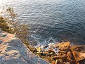
Critique By:
Daniel Guerin (K:7961)
8/27/2003 5:51:16 AM
It's a lovely scene in its individual parts. The water is a wonderful colour and it's 'texture' is great. The sky is a nice blue and has a good graduation. The minimal clouds are nice and soft and the distant land is a good divider. When it all comes together, though it all fits perfectly, I get the feeling there is something missing. I think perhaps it's the crop with the horizon near-centre, which rarely works. Don't get me wrong, the bits that are there are superb, I just think it could benefit from a little something extra. Great shot none-the-less, well done.
|
| Photo By: Edward Seeto
(K:91)
|
|
|
Critique By:
Marti Buckely (K:582)
8/27/2003 5:00:32 AM
Picture suggests tranquility. Horizon could be off-centered a little to keep from going through the center of the picture. Perhaps cropping a little of the dark section of water at the bottom?
|
| Photo By: Edward Seeto
(K:91)
|
|