|
|
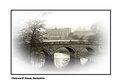
Critique By:
Don Aitken (K:-73)
2/25/2004 2:06:33 PM
Couldn't get better!
|
| Photo By: Bulent Ahiskal
(K:1251)
|
|
|
Critique By:
Don Aitken (K:-73)
1/22/2004 1:42:56 AM
lovely. all of the above.
perhaps a touch of CW rotation to straighten the window.
|
| Photo By: Daryl Walter
(K:399)
|
|
|
Critique By:
Don Aitken (K:-73)
10/27/2003 1:31:14 PM
Centre Parks?
|
| Photo By: david nicholson
(K:96)
|
|
|
Critique By:
Don Aitken (K:-73)
10/26/2003 1:47:11 PM
Hi
You might not agree but with a bit more contrast this image would be much more powerful.
Don
|
| Photo By: Ferran Lacruz
(K:5466)
|
|
|
Critique By:
Don Aitken (K:-73)
10/26/2003 1:40:20 PM
Pedro
I like this image but it's a bit washed out.
With a bit of tweaking I think you can make it much stronger.
Don
|
| Photo By: Pedro Silva
(K:33)
|
|
|
Critique By:
Don Aitken (K:-73)
10/26/2003 1:03:47 PM
Hi
I like this picture but couldn't help thinking it would be more powerful in the attached format. What do you think?
Don
|
| Photo By: Mário Sousa
(K:16985)
|
|
|
Critique By:
Don Aitken (K:-73)
9/28/2003 2:00:06 PM
It's a bike!
|
| Photo By: Andrea Luppichins
(K:6)
|
|
|
Critique By:
Don Aitken (K:-73)
9/28/2003 1:53:06 PM
Nice idea but poorly composed. Too much is burned out and the area top right is distracting.
|
| Photo By: Jimmy Anderson
(K:9)
|
|
|
Critique By:
Don Aitken (K:-73)
9/28/2003 1:50:52 PM
I think I can see what you were after with this shot but there is nothing of interest in the picture.
|
| Photo By: Aditya Mandrekar
(K:0)
|
|
|
Critique By:
Don Aitken (K:-73)
9/28/2003 1:48:44 PM
I like the colours but find the dark area to the right and the mark under the eye too distracting.
|
| Photo By: sandy c. hopkins
(K:17107)
|
|
|
Critique By:
Don Aitken (K:-73)
9/14/2003 2:14:38 PM
A classic Tom Jones pose. Brilliant shot. The man's a legend!
|
| Photo By: Albert Gacsádi
(K:244)
|
|
|
Critique By:
Don Aitken (K:-73)
9/10/2003 4:54:27 AM
This image stopped me in my tracks. Fantastic. The only part I don't like is the coloured frame - I find it distracting.
Don
|
| Photo By: Piotr Bozejewicz
(K:298)
|
|
|
Critique By:
Don Aitken (K:-73)
9/9/2003 2:12:00 PM
One small niggle. You've flipped the image.
|
| Photo By: Sylvia Jones
(K:652)
|
|