|
|
Critique By:
Marco Vredegoor (K:7301)
9/1/2006 11:09:26 AM
hey, i have posted my hot air balloon picture on my profile. I was lucky to visit a festival so i could catch multiple balloons into one frame. Take a look:
http://www.usefilm.com/Image.asp?ID=1173412
kind regards, Marco.
|
| Photo By: Michele Carlsen
(K:146013)
|
|
|
Critique By:
Marco Vredegoor (K:7301)
9/1/2006 10:37:20 AM
great action shot, with great details and colors. the sharpness is amazing.
|
| Photo By: Ed Krebs
(K:958)
|
|
|
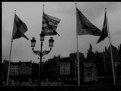
Critique By:
Marco Vredegoor (K:7301)
9/1/2006 10:34:44 AM
hij is ook erg donker, maar dat vind ik wel passen bij de dramatische sfeer. Bovendien waren de omstandigheden ook niet dusdanig om een lichte foto te krijgen. (bewolkt en regenachtig) Het gaat mij hier meer om de kracht van de vier vlaggen.
|
| Photo By: Marco Vredegoor
(K:7301)
|
|
|
Critique By:
Marco Vredegoor (K:7301)
8/31/2006 6:08:36 PM
 a black guy on a cycling bike is unusual... I always look at the tour de france and the vuelta now, but i never saw a black guy on a bike. So i thought was a bit unusual, but great anyhow. a black guy on a cycling bike is unusual... I always look at the tour de france and the vuelta now, but i never saw a black guy on a bike. So i thought was a bit unusual, but great anyhow.
|
| Photo By: Clyde Koa Wing
(K:-133)
|
|
|
Critique By:
Marco Vredegoor (K:7301)
8/31/2006 6:05:50 PM
astonishing bright blue eyes! a very good close up!
|
| Photo By: Robin W
(K:16308)
|
|
|
Critique By:
Marco Vredegoor (K:7301)
8/31/2006 5:58:08 PM
excellent shot, i like the depth of field here because it puts the attention on the front man. Allthough my eye is distracted by the black guy on the bike in the background, because that is unusual in the cycling sport. But great shot, i don't hope that you were standing in the middle of the road and hit any cyclists when they were heading your way. Kind regards, Marco.
|
| Photo By: Clyde Koa Wing
(K:-133)
|
|
|
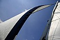
Critique By:
Marco Vredegoor (K:7301)
8/31/2006 5:55:10 PM
True, more clouds adds to the perspective, but in this shot i like the simple colors and the strong shapes. The nice white sails contrast with the clear blue sky and that adds to the powerful shapes, so i like it better without the clouds.
|
| Photo By: Claude Lussier
(K:4626)
|
|
|
Critique By:
Marco Vredegoor (K:7301)
8/30/2006 8:56:25 PM
excellent portrait, great outline and the black is really dark, so good contrast. Well done.
|
| Photo By: Michal Giedrojc
(K:277)
|
|
|
Critique By:
Marco Vredegoor (K:7301)
8/30/2006 12:50:01 PM
merci beaucoup aykaan, je veux ecrire en anglais maintenant, parce que je seulement parler francais un peut. I had to lower the density of the white in this picture, becuase the contrast was too hight when I desaturated the picture. Besides that i had to correct the iso value, which i put too high for an outdoor shot. But anyway thanks for your comment.
|
| Photo By: Marco Vredegoor
(K:7301)
|
|
|
Critique By:
Marco Vredegoor (K:7301)
8/29/2006 5:08:59 PM
excellent shot, great depth of field and very impressive portfolio!
|
Photo By: Tony Smallman
(K:23858)

|
|
|
Critique By:
Marco Vredegoor (K:7301)
8/28/2006 6:40:23 PM
absolutely excellent photograph! Great the way you capture the lighting and darkness while getting the picture so very sharp. It looks like a classic scene from a film noir. Crop and framing also are great. Nice work. Regards, Marco.
|
| Photo By: Aykaan K
(K:13601)
|
|
|
Critique By:
Marco Vredegoor (K:7301)
8/28/2006 6:35:00 PM
indeed an interesting place to sit, but an original way to photograph a portrait... Excellent contrast between background and the boy's clothes. A pity you cropped off his shoes. Or was that not in the original picture? Kind regards, Marco.
|
| Photo By: Ilir Bekteshi
(K:86)
|
|
|
Critique By:
Marco Vredegoor (K:7301)
8/28/2006 11:07:39 AM
great angle and great contrast. Excellent picture! The shapes make it a really powerful image and the colors look very bright.
|
| Photo By: Claude Lussier
(K:4626)
|
|
|
Critique By:
Marco Vredegoor (K:7301)
8/28/2006 10:56:48 AM
looks like a great picture, with a great look on the girl's face. But why this effect. I agree with rebecca that maybe a b/w filter would be better and adds to the dramatic portrait. Photoshop has some great features, and it is nice to design with that, but it has nothing to do with photography. I use it only to enhance the picture to get better light and contrast and to clean up pictures.
|
| Photo By: Michele Hawes
(K:272)
|
|
|
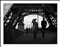
Critique By:
Marco Vredegoor (K:7301)
8/28/2006 10:49:15 AM
Nice picture, the eiffel tower is always a nice subject to photograph. And it is difficult to find an original view. In my opinion this picture is very nice because the eiffel tower is just a decor, not the main focus of the picture. I did a view of these myself and it works great. To put the persons in the foreground but not really eager to get on the photo is just great!
|
| Photo By: Jose Manuel Holguín
(K:318)
|
|
|
Critique By:
Marco Vredegoor (K:7301)
8/28/2006 10:45:50 AM
excellent shot, really colorful. It appears a bit off focus to me? intentional or not? If it was really sharp the colors would be even more vivid. But nice capture. All the best.
Marco.
|
| Photo By: Michele Carlsen
(K:146013)
|
|
|
Critique By:
Marco Vredegoor (K:7301)
8/27/2006 6:33:09 PM
good and clean picture, not a very good shot i think though. The best thing about this picture are the colors. The really nice blue sky contrasting with the colors of the 'rainbow' in the hot air balloon. But there are more orignal ways of photographing a balloon I think. But that also depends on where you take the shot. If you are at the ground where they start flying or when they fly really close above your head, that's when the nice angles occur. I had some shots taken on a festival recently which i will post within days on this site for you to see what i exactly mean. Kind regards, Marco.
|
| Photo By: Michele Carlsen
(K:146013)
|
|
|
Critique By:
Marco Vredegoor (K:7301)
8/27/2006 6:17:17 PM
erg goeie foto, heel mooi hoe je de zon precies achter de kop van de molen hebt gevangen. Om de een of andere reden is deze foto op mn laptop een stuk lichter dan op mn vaste computer, en dat doet de foto niet goed. Als het contrast iets hoger is en iets donkerder dan hebben de kleuren en de schaduwen veel meer kracht. De persoon voor de molen had er van mij niet op hoeven staan.
|
| Photo By: martijn wams
(K:6351)
|
|
|
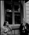
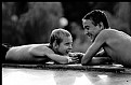
Critique By:
Marco Vredegoor (K:7301)
8/27/2006 6:13:21 PM
very nice shot, good use of the depth in field here. It works really good here. The smiles on their faces are nice. great moment. Also very nice portfolio. Some really good black and white pictures with nice contrast and lighting. Very nice. Kind regards, Marco.
|
| Photo By: ol an
(K:-248)
|
|
|
Critique By:
Marco Vredegoor (K:7301)
8/27/2006 6:03:57 PM
Excellent picture! I really like the sharpness of the focus object, the two hands and the blurry and simple background. That brings the attention very good to the hands. Also such a great moment to capture. No need to catch the rest of them on the photo, this says it all. Well done. Kind regards, Marco.
|
| Photo By: Sheila Carson
(K:5924)
|
|
|
Critique By:
Marco Vredegoor (K:7301)
8/27/2006 6:00:43 PM
Excellent shot, great poetic moment. Pity it has so much grain, but maybe that has to do with the high iso that you decided to take? I would prefer a lower value, so that the background behind the fence wouldn't be so bright either. The light reflections on their faces is excellent, so pity that the background is too light. But great moment!
|
| Photo By: Miladin Mare
(K:3384)
|
|
|
Critique By:
Marco Vredegoor (K:7301)
8/27/2006 5:57:46 PM
very well taken, i like the look on the guy's face and his pose. Excellent black and white, good choice. It's like a street shot from Cartier Bresson. I was in Gent last weekend but i didn't see this street artist though . Maybe it could use a crop, in order to put the guy even more in focus. For instance, a crop in the length would be nice i think.
|
| Photo By: Enrico Gori
(K:1645)
|
|
|
Critique By:
Marco Vredegoor (K:7301)
7/30/2006 1:48:11 PM
nice composition, shame it has so much grain.
|
| Photo By: Christian Franke
(K:197)
|
|
|
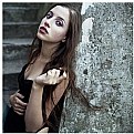
Critique By:
Marco Vredegoor (K:7301)
7/20/2006 11:09:41 AM
nice portrait but for the composition there could be some improvement i think. The left arm that is holding her hair maybe could better be hanging down or holding the wall. Now it is too present in the frame. Also the face is a little bit too white. Perhaps too much light on it? The whiteness brings a kind of spooky feeling to a lovely face. But I like the surrounding and the square frame.
|
| Photo By: Anna Lankau
(K:843)
|
|
|
Critique By:
Marco Vredegoor (K:7301)
7/20/2006 11:03:30 AM
very nice shot, almost surreal looking. I like the black and white tones and the bright light made by the sun. Great moment too. Well timed!
|
| Photo By: Andreas Hering
(K:1684)
|
|
|
Critique By:
Marco Vredegoor (K:7301)
7/19/2006 9:08:01 PM
great location for a shot. Nice contrast also between red and white. Well done!
|
| Photo By: Sinan Goksel
(K:1010)
|
|
|
Critique By:
Marco Vredegoor (K:7301)
7/19/2006 9:03:40 PM
nice combination of good pictures. really nice how you composed the different close ups of the face into one composition. the black and white adds to the mood and the close ups are nicely seperated by the black lines. The use of different hats brings a nice touch to it. Well done!
|
| Photo By: Carrie Fuit
(K:204)
|
|
|
Critique By:
Marco Vredegoor (K:7301)
7/17/2006 4:44:20 PM
thanks, it's me about ten years ago.
|
| Photo By: Marco Vredegoor
(K:7301)
|
|
|
Critique By:
Marco Vredegoor (K:7301)
7/16/2006 5:40:50 PM
hey, found the photo taken from me, and put it on my portfolio... there is a bit of resemblance, for example how the light drops in... see for yourself:
http://www.usefilm.com/Image.asp?ID=1146905
|
| Photo By: Suzanne Opitz
(K:91)
|
|
|
Critique By:
Marco Vredegoor (K:7301)
7/7/2006 9:21:03 AM
excellent shot, nice lighting and b/w tones. it reminds me of a picture from me when i was a kid. Also standing by the window and the light beautifully dropping in. I'm gonna look for that one now, thanks..!
|
| Photo By: Suzanne Opitz
(K:91)
|
|