|
|
Critique By:
Peter Witkop (K:3189)
6/23/2004 8:17:24 PM
This was an evening shot, maybe 6:30 or 7 in july IIRC, it was a couple of years ago.
Peter
|
| Photo By: Peter Witkop
(K:3189)
|
|
|
Critique By:
Peter Witkop (K:3189)
6/18/2004 9:56:34 PM
I'm assuming the camera you're using is a fixed lens camera, in which case if you've got an optical zoom, that should help, digial "zoom" (it's not really zooming, it's just croping and interpolating) wouldn't make a differance. I took a look at the other images from this pose in your porfolio, and as others have mentioned, I think this is the best of them; the framing is just right, there's enough room for the subject to 'breath' and not alot of unessicary space. Also in the others there's alot more bright specular light in the background that can be distracting. Your eye is always drawn to the bright areas of an image first, so you don't want to avoid those being in the background. The few little ones in this image aren't bothersome to me, and sometimes one or two small ones are inevitable.
Peter
|
| Photo By: Dale Ann Cubbage
(K:9755)
|
|
|
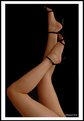
Critique By:
Peter Witkop (K:3189)
6/18/2004 9:00:49 PM
This is a good shot, the expresion is good, and it shows you worked well with the subject, and the head and shoulder postions are good. I'm not sure what lens you were using, but the depth of field is a little more than I'd want, it looks like alot for f/2.8, you might try shooting with this aperture on a longer lens from farther away, the background will go into softer focus. Also this is a hard position to pose without the subject's feet looking like they're growing out of their head. You might want to shoot from an angle that hides the legs and feet entirely, or more from the side so the one foot isn't coming out of her head.
Peter
|
| Photo By: Dale Ann Cubbage
(K:9755)
|
|
|
Critique By:
Peter Witkop (K:3189)
5/7/2004 10:07:09 PM
I really like the lighting and the expresion, but the hands feel very out of place to me, I think because I don't see the arms.
|
| Photo By: Aaron Griesdorn
(K:145)
|
|
|
Critique By:
Peter Witkop (K:3189)
4/21/2004 5:22:35 PM
Hugo-
Yup, emotionless it cernainly is, but you're right, that's part of the assignment, straight catalog photography. The point of the assignment was two fold, one to make us deal with the same object over and over to really understand how to light it well, and then to think about how backgrounds relate to and work with the subject. One shot had to be 'enviromental', two backgrounds had to be specular, and one shot had to be to a specific aspect ratio. I'll post the rest of the series as I get them scaned.
Peter
|
| Photo By: Peter Witkop
(K:3189)
|
|
|
Critique By:
Peter Witkop (K:3189)
3/14/2004 6:29:30 PM
Thanks for the comment John. I do my own 4x5 B&W developing and printing, this is acctually a scan of the neg though with just contrast/brightness adjustments. This is in the large stack of negs (that only seems to grow) that I want to make a descent fiber prints from.
Peter
|
| Photo By: Peter Witkop
(K:3189)
|
|
|
Critique By:
Peter Witkop (K:3189)
3/14/2004 5:50:08 PM
I really like the image, but for a corporate protait, that's quit a lot of leg (corporate stuff tends to be pretty conservative), and maybe a little bit informal of a pose. A very nice image, but I think not nessicarilly for the corporate niche. I think a hair light would be very usefull as well to sperate her dark hair from the black background too.
Peter
|
| Photo By: ppdix
(K:17069)
|
|
|
Critique By:
Peter Witkop (K:3189)
3/14/2004 5:39:14 PM
I like the idea, and the execution is great too; the tonality, the curving lines and the texture work really well together.
Peter
|
| Photo By: Shih Wei
(K:485)
|
|
|
Critique By:
Peter Witkop (K:3189)
3/14/2004 5:36:53 PM
That's a really neat idea, I don't think I've seen animals used in an abstract manner quite that way. I've seen (and done) similar ideas with people before, I like the idea of doing it with animals too.
Peter
|
| Photo By: Rachael S
(K:43)
|
|
|
Critique By:
Peter Witkop (K:3189)
12/18/2003 7:23:24 PM
I really like the symbolism of the business man in the sun, with the begger in the shade. Very nice image, and I agree about your cropping. I'd have personally come in closer and cut the top of the bushes off as well, which also leaves you with a diagonal line running across the image, given a little more contrast. This is just my opinion though, at that point things get pretty subjective.
|
| Photo By: Tim Bronkhorst
(K:9391)
|
|
|
Critique By:
Peter Witkop (K:3189)
12/16/2003 10:53:45 PM
Teena,
I think focus on the face being sharp will go a long way in giving you what you're looking for. With the focus soft, all the fine details of your makeup work are getting lost. Also having the person turn to a 2/3 head position as Barbara suggested will make it a little nicer, mug shots never really seem to look very pleasing. I would also use a more telephoto lens myself as well.
Peter
|
| Photo By: Teena Bacon
(K:35)
|
|
|
Critique By:
Peter Witkop (K:3189)
11/11/2003 7:37:09 PM
This is a cool image. The only thing I'd do myself would be to add an accent light so there is some definition in the shoes. Very nice idea.
|
| Photo By: Johnpaul Soto
(K:675)
|
|
|
Critique By:
Peter Witkop (K:3189)
11/5/2003 8:28:58 PM
I really like the fact that the sky is blown out, el cap. is a bit over exposed and the blue shifts, I think anyway, combine to make a cool kind of surreal image of a well photographed spot. I might crank up the saturation, and enhance the blue cast further myself, but that's getting into personal choice.
|
Photo By: Laurie J. Herndon
(K:5338)

|
|
|
Critique By:
Peter Witkop (K:3189)
10/26/2003 11:52:46 AM
Thanks for the comments! This is the upper penobscot bay in downeast maine, I believe it was in the town of Penobscot.
|
| Photo By: Peter Witkop
(K:3189)
|
|