|
|
Critique By:
charlie f. kohn (K:25919)
10/21/2003 2:40:57 AM
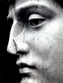
david, a strong portrait! the lack of sharpness is disturbing?
regards
charlie.f.kohn@sixpence-pictures.com // madrid
|
| Photo By: David Timms
(K:110)
|
|
|
Critique By:
Gunnar (K:107)
10/21/2003 12:52:22 AM
He is in need of a nose job!
A really good shot!
|
| Photo By: David Timms
(K:110)
|
|
|
Critique By:
Marcio Santos (K:1451)
10/20/2003 11:55:36 PM
i like that. great shot!!
|
| Photo By: David Timms
(K:110)
|
|
|
Critique By:
Kim Culbert (K:37070)
8/25/2003 1:39:50 PM
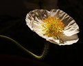
The lighting on the petals need a bit more separation to me... they are blending into each other, which is nice, but to have them all stand out on their own would be excellent. I like the use of the natural bg... a hint of green here and there is nice.
|
| Photo By: David Timms
(K:110)
|
|
|
Critique By:
Érico Salutti (K:884)
5/30/2003 10:42:57 AM
Bela foto, parabéns.
Érico Salutti, São Paulo - Brasil.
|
| Photo By: David Timms
(K:110)
|
|
|
Critique By:
Érico Salutti (K:884)
5/30/2003 10:41:57 AM
Bela foto, parabéns.
Érico Salutti, São Paulo - Brasil.
|
| Photo By: David Timms
(K:110)
|
|
|
Critique By:
Érico Salutti (K:884)
5/30/2003 10:41:15 AM
Bela foto, parabéns.
Érico Salutti, São Paulo - Brasil.
|
| Photo By: David Timms
(K:110)
|
|
|
Critique By:
Rob Patrick (K:2177)
4/27/2003 1:12:10 PM
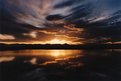
Terrific abstract. Great use of light and shadow.
|
| Photo By: David Timms
(K:110)
|
|
|
Critique By:
kita mcintosh (K:18594)
3/20/2003 1:31:43 AM
I find this one really interesting but I would have added more contrast to give it more punch
|
| Photo By: David Timms
(K:110)
|
|
|
Critique By:
Kim Culbert (K:37070)
2/2/2003 10:59:17 AM
I agree that this image has a lot of powerful lines and strong attractions, but the use of a Neutral Density Grad. filter would help you retain some detail in the sky as well as capture the awesome forground.
|
| Photo By: David Timms
(K:110)
|
|
|
Critique By:
Verna Absolutestockphoto (K:2836)
1/30/2003 8:43:34 AM
How in the world was this photo passed up???
Wonderful digital alteration....Very Cool Picture!
Great Job!
|
| Photo By: David Timms
(K:110)
|
|
|
Critique By:
Sue O'S (K:12878)
1/12/2003 8:53:22 PM
Praise be to the administrators who gave us Random Images, because I'm very glad to be exposed to this.
Beautifully done!
|
| Photo By: David Timms
(K:110)
|
|
|
Critique By:
Jake Sieg (K:673)
6/15/2002 10:57:41 PM
truly breathtaking
|
| Photo By: David Timms
(K:110)
|
|
|
Critique By:
Wayne Harridge (K:18292)

5/30/2002 6:09:13 PM
Beautiful simplicity
|
| Photo By: David Timms
(K:110)
|
|
|
Critique By:
Wayne Harridge (K:18292)
5/30/2002 6:05:53 PM
Beautiful simplicity
|
| Photo By: David Timms
(K:110)
|
|
|
Critique By:
Kim Culbert (K:37070)
5/10/2002 10:08:08 AM
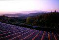
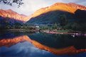
Nice cloud capture and beautiful golden light. I like the balance between top and bottom... both leave mystery to the shot.
|
| Photo By: David Timms
(K:110)
|
|
|
Critique By:
Scott Jones (K:1093)
3/26/2002 11:48:39 PM
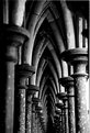
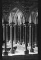
Saw this in randoms and like it as well. It does seem to lack life in the tones however and perhaps more local contrast would give it more life. Perhaps a shot for an unsharp mask or some reworking with dodging and burning. I really like the composition and the repeated columns and think this would make a great print with some tweaking...
Scott
|
| Photo By: David Timms
(K:110)
|
|
|
Critique By:
Catherine OCanna (K:29)
3/11/2002 2:10:19 PM
This I LIKE!The food of life. The bread stands out and is it's own statement. So much the type of travel photo I like to see. Like a poem, says much about the country you are visiting. 2 thumbs up!
|
| Photo By: David Timms
(K:110)
|
|
|
Critique By:
Kim Culbert (K:37070)
3/3/2002 8:05:39 PM
This is a very cool optical illusion. I like the textures and the subtle colours.
|
| Photo By: David Timms
(K:110)
|
|
|
Critique By:
Samuel Downs (K:7290)
2/6/2002 1:11:36 PM
David, I agree with Altif, the colors are stunning, but there is a sense of too much openness and lack of a focal point - besides the very beautiful in-focus flower. Perhaps even recropping the shot would help make a better composition? I love the colors.
|
| Photo By: David Timms
(K:110)
|
|
|
Critique By:
Phillip Cohen (K:10561)
12/20/2001 12:37:05 PM
Very Cool! Is it an inny or an outy?
|
| Photo By: David Timms
(K:110)
|
|
|
Critique By:
Erland Pillegaard (K:34147)
11/21/2001 7:19:58 AM
Hi
You have make a wonderful photo,like it
erland
|
| Photo By: David Timms
(K:110)
|
|
|
Critique By:
Debbie Groff (K:9569)
11/11/2001 3:39:15 PM
Very well framed. A bit "hot" at the bottom of the front columns but still very well seen and framed.
|
| Photo By: David Timms
(K:110)
|
|
|
Critique By:
Toni Martin (K:5092)
11/9/2001 10:39:07 AM
Good catch, David. I really wish you could have shot it on a very fine grain film, like Astia or Provia 100F. Velvia would have been excelllent, but I do understand you were shooting flowers. Velvia pushes to 100 ASA excellently.
|
| Photo By: David Timms
(K:110)
|
|
|
Critique By:
james mickelson (K:7344)
10/31/2001 11:26:39 PM
This is superb. Nice technique. Great colors. very muted while keeping the light hard. A great black and white image in color. Nice movement and I like the selective DoF. James
|
| Photo By: David Timms
(K:110)
|
|
|
Critique By:
Jeroen Wenting (K:25317)
10/3/2001 1:07:27 PM
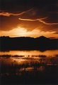
Indeed very dramatic. Might be even better if you crop a bit of the top, the featureless mass there is a slight distraction.
|
| Photo By: David Timms
(K:110)
|
|
|
Critique By:
Chris Whaley (K:3847)
9/23/2001 4:01:40 PM
Very pleasant and relaxing....Well done David.
|
| Photo By: David Timms
(K:110)
|
|
|
Critique By:
David Meiland (K:1820)
9/23/2001 3:05:47 PM
You have a killer eye for these... This one is slightly off center and I wonder if that was intentional or not. If it was I would have made it a hair more pronounced.
|
| Photo By: David Timms
(K:110)
|
|
|
Critique By:
Artie Colantuono (K:12275)
9/23/2001 1:14:38 AM
nice concept and execution Dave...
|
| Photo By: David Timms
(K:110)
|
|
|
Critique By:
David Meiland (K:1820)
9/22/2001 6:53:23 PM
Very fine image. On my screen it appears to have dark vertical bands at the edge--I would probably crop in a bit sides and bottom. The lighting is fine for me (it looks like it would look...) and I really like the quality of lighting on the carving at the top. The hedge outside is a bit out of place but I realize there is zero you an do about that. Again, a great shot!
|
| Photo By: David Timms
(K:110)
|
|