|
|
Critique By:
Artie Colantuono (K:12275)
6/1/2001 5:33:07 AM
frame is left weighted and pulling....lighting is a bit hard but is creating a nice effect and that was intentional..just about a spot light effect..nice job David
|
| Photo By: David Timms
(K:110)
|
|
|
Critique By:
Chris Whaley (K:3847)
5/21/2001 12:04:55 PM
Like the angles...very cool shots.
|
| Photo By: David Timms
(K:110)
|
|
|
Critique By:
Artie Colantuono (K:12275)
5/21/2001 2:06:36 AM
very good framing......good color and texture..space is used wisely.....very good lighting.....a tad more DOF....but all in all a very nice image David
|
| Photo By: David Timms
(K:110)
|
|
|
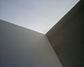
Critique By:
Artie Colantuono (K:12275)
5/21/2001 2:06:36 AM
this is the strongest of the three in the series David.....use of space is very good.....minimalistic.....sterile........cold.......yet the juxtiposition of the shape gives it a bit of rhythm.....nicely done
|
| Photo By: David Timms
(K:110)
|
|
|
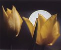
Critique By:
al shaikh (K:15790)

5/14/2001 1:07:50 PM
I like to see the other frames you shot from this series, i think there might be a much stronger frame than this one. the color is nice but it needs a bit more visual interest.
|
| Photo By: David Timms
(K:110)
|
|
|
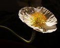
Critique By:
Deleted User (K:6775)
5/13/2001 6:11:41 AM
I like this Dave...the color and softness of the tulips in the back makes this image. Like Artie says...maybe the one in focus is a bit too tall, but you handled it very well...I like!...*Smile*...Maggie
|
| Photo By: David Timms
(K:110)
|
|
|
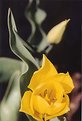
Critique By:
Artie Colantuono (K:12275)
5/13/2001 2:51:21 AM
nice background and again good use of space and color.......I would prefer not to see the point of focus so high in the frame, the long stem is a bit distracting ........overall nicely done
|
| Photo By: David Timms
(K:110)
|
|
|
Critique By:
Artie Colantuono (K:12275)
5/13/2001 2:51:21 AM
Another clever capture.....
|
| Photo By: David Timms
(K:110)
|
|
|
Critique By:
Artie Colantuono (K:12275)
5/13/2001 2:51:21 AM
Very clever capture David
|
| Photo By: David Timms
(K:110)
|
|
|
Critique By:
Robert McDonald (K:511)
5/13/2001 2:51:21 AM
Thats a far out shot.
|
| Photo By: David Timms
(K:110)
|
|
|
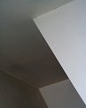
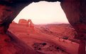
Critique By:
Artie Colantuono (K:12275)
5/10/2001 8:12:53 PM
David it's me again........The roof is a very clever addition to this image....dont mind the black or negative space at all....the blown out sky is the detriment to this image.....if it held tone it would be an exceptional image......
I actually like balance of spacial relations pos & neg
I'm not picking and I dont want to come off as cruel or hurtfull.....but anyone here will attest to the fact that if I didnt think you had it in you or the possibilities in the image I Wouldn't comment.....I'm just trying to help you be the best you can and obviously show you are....
|
| Photo By: David Timms
(K:110)
|
|
|
Critique By:
Artie Colantuono (K:12275)
5/10/2001 8:12:53 PM
David......The yellow flower is really good ...its the rest of the frame that is hurting this image.......Leaf next to flower is dominating and it shouldn't.......Like the black or soft black background effect........image than splits above the flower and your losing continuity in this image.....Your entire frame is your "Real Estate" you must use every MM of it to balance & generate your total image....you are just as responsible for the positive space as you are for the negatitive space.......look at your image carefully before you release the shutter and be absolutely certain that what you got is what you want......
All spaces whether positive (imagery) and negative (space) must play on each other........voids must compliment real space.........
Hold your final images upside down or on its side..a good composition will work in any orientation..a bad one needs affirmation of reality..........
Keep at it Dave, you got some good stuff to give obviously....show me your best........
|
| Photo By: David Timms
(K:110)
|
|
|
Critique By:
Artie Colantuono (K:12275)
5/10/2001 8:01:59 PM
Dave you made a creative approach but ran into some problems here..........The white disk I assume is the chrome is very distracting..........Like the flowers against the black and the use of space of such.......DOF killed this image......2.8 is toooooooooo open for this shot........please redo this would love to see this again.....good attempt and vision here..put them together to bring this image to reality.......
|
| Photo By: David Timms
(K:110)
|
|
|
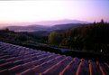
Critique By:
Chris Whaley (K:3847)
5/9/2001 2:53:18 PM
Wow..i dont know about the rest of you but i get a definate sense of motion from this..almost like falling or sliding off the side of the mountain...like the colors and the motion effect.
|
| Photo By: David Timms
(K:110)
|
|
|
Critique By:
Deleted User (K:6775)
5/9/2001 2:26:13 PM
Hey David!!...my displaced Canadian Buddy!! Glad to see you posting some pics *smile* .....Maggie
|
| Photo By: David Timms
(K:110)
|
|
|
Critique By:
Artie Colantuono (K:12275)
5/9/2001 9:53:56 AM
I can see you spent some time on this.....would love to have a little more light on this foreground however and the sky is to whited out.......nice concept and framing David.
|
| Photo By: David Timms
(K:110)
|
|
|
Critique By:
Artie Colantuono (K:12275)
5/9/2001 9:53:56 AM
great looking bunch
|
| Photo By: David Timms
(K:110)
|
|
|
Critique By:
Artie Colantuono (K:12275)
5/9/2001 9:53:56 AM
Hi David and welcome.........
|
| Photo By: David Timms
(K:110)
|
|
|
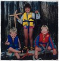
Critique By:
Joe Blow (K:1918)
5/9/2001 5:08:54 AM
It's nice to see all of your grandkids with genuine smiles. They look elated and make the shot grand.
|
| Photo By: David Timms
(K:110)
|
|