|
|
Critique By:
Ari O (K:990)
12/20/2003 7:27:07 AM
Wonderful impression of winter.
|
| Photo By: Mitchell Miller
(K:3009)
|
|
|
Critique By:
Ari O (K:990)
12/19/2003 7:15:14 PM
Exquisite DPOD. Glad I could share PODs with you this day. - regards, Gary
|
| Photo By: Barry Walthall
(K:5312)
|
|
|
Critique By:
Ari O (K:990)
12/19/2003 11:48:12 AM
Caprice, from one newest donor to Usefilm to another, bonsoir!
|
| Photo By: Caprice Duvent
(K:3998)
|
|
|
Critique By:
Ari O (K:990)
12/19/2003 11:37:47 AM
Framing the subject enriches its storytelling quality.
|
| Photo By: Antonio Trincone
(K:23167)
|
|
|
Critique By:
Ari O (K:990)
12/19/2003 10:47:03 AM
I like this contrast between tradition and modernity, and on the street!
|
| Photo By: Mário Sousa
(K:16985)
|
|
|
Critique By:
Ari O (K:990)
12/19/2003 7:53:21 AM
Chelsea, it's an honor to share Usefilm's main page space with your wonderful photo!
Regards - Gary
|
Photo By: Chelsea Burke
(K:5750)

|
|
|
Critique By:
Ari O (K:990)
12/19/2003 7:39:16 AM
Greetings Al.
I may post an image of similar composition (and subject!) in the next day or so. Mine was taken some years ago when rotted pilings dotted the Brooklyn shore from this vantage point. The starburst of the lights and color cast makes yours more pleasing than mine (small copy attached).
And, I want to thank you and your staff (donation just made!) for the POD honor today.
Regards from your neighbor - Gary
|
| Photo By: al shaikh
(K:15790)
|
|
|
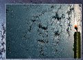
Critique By:
Ari O (K:990)
12/19/2003 7:24:36 AM
I really like the frame within frame motif, a well-considered presentation. Curious, does this window exhibit a very similar frost pattern each time in winter?
Congrats - Gary
|
| Photo By: Alexey Sapa
(K:27174)
|
|
|
Critique By:
Ari O (K:990)
12/19/2003 7:10:41 AM
This shows marvelous use of selective focus combined with the photographer's keen compositional observation to wed soft ambient lighting with a special moment in this color, yet effectively duotonal photograph.
Harry, I also wanted to thank you for your kind words about my POD photo. Regards - Gary
|
| Photo By: Harry Eggens
(K:14804)
|
|
|
Critique By:
Ari O (K:990)
12/19/2003 6:55:57 AM
I just logged in now to check what was going on with this photograph that I uploaded last night, started reading and wondered, "what does 'POD' mean?" And then,... "OH !!!" ;-)
The funny part is that I've been having problems with my dialup phone line the past two days (and am looking to switch over to DSL or cable), and I had considered uploading a different image, but so it goes... I suppose, among other things, this means that I had better subscribe to Usefilm.com today before my "Andy Warhol 15 minutes" expire, huh? Yet, to put something like this into perspective, Usefilm has over 30,000 members worldwide, so this has got to be a rather special honor.
As to the photograph, the image was taken at North Cove Harbor Plaza behind the World Financial Center and its Winter Garden (the dome), in lower Manhattan, one late afternoon some years ago. As most of you know, the Winter Garden was destroyed on September 11th, 2001 with the attack on New York City's World Trade Center. I work in lower Manhattan and witnessed the attack.
Just recently, I had this image (among 20 slides) professionally scanned. The image was enhanced digitally in PhotoImpact 8. Though the light was warm and reflected sky blue, I found the taken image, though pleasingly composed, to be rather dullish. I wanted to accentuate the lines by stretching the keystoning and the arc of the dome via perspective/lens distortion. I also wanted to bring out the tonal saturation in both the sunbathed grey structure and in the window reflections. This was done mostly via Tone Map channel blending (in PS this would be 'Curves'). For reference I've (hopefully?) attached the original.
As a photographer I was published just once in Summer, 1989 for a piece I did on the World Trade Center for a now defunct magazine called "Outdoor & Travel Photography", which included the image called "Evening Remembrance" that I posted in Usefilm when I joined one week ago. Also, from 1982-93 I was an active member of the Flushing Camera Club, a community in Queens, New York where I now reside (which means that Al, whom I've never met, and I are practically neighbors).
I sincerely thank those at Usefilm who are keen and kind to notice my work, and also I thank those of you kind enough to express your support here. Regards - Gary
|
| Photo By: Ari O
(K:990)
|
|
|
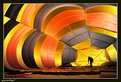
Critique By:
Ari O (K:990)
12/17/2003 2:07:38 PM
Thank you, Pablo. Actually when the balloon is being inflated you can get your camera and lens through the seams to shoot the inside view of silhouettes (usually crew) and shadows (usually other photographers!).
Question for all: Do you think I should crop nearly half of the foreground material (lying on the ground)?
|
| Photo By: Ari O
(K:990)
|
|
|
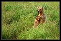
Critique By:
Ari O (K:990)
12/16/2003 8:35:13 PM
Your photo plucked me from my slumber!
|
| Photo By: Jamie Haggett
(K:694)
|
|
|
Critique By:
Ari O (K:990)
12/15/2003 12:56:58 PM
I usually don't care for big empty skies as breathing space in a photo, but this works well with your image. However, your silhouette park study improves once you crop the blank black void at bottom (yep, another pet pieve!). Cropping about 80% of the blank black space restores to your photo much needed tension and drama.
|
| Photo By: Eirik Holmøyvik
(K:58)
|
|
|
Critique By:
Ari O (K:990)
12/15/2003 10:28:02 AM
This is very good source material for photo art, Harlan. And, I have a suggestion. Flip this on its right edge and it begins to show "landscape" depth because the grain is larger and sharper on that side.
|
| Photo By: Harlan Heald
(K:15732)
|
|
|
Critique By:
Ari O (K:990)
12/15/2003 9:44:14 AM
Excellent work, Zbigniew! The image looks snappier, the middle area looks richer, and the little house stands out better!
|
| Photo By: Zbigniew Biejat
(K:243)
|
|
|
Critique By:
Ari O (K:990)
12/15/2003 9:26:28 AM
Diego, I like your 19th century style for this image!
And, if you love railroads and trains as much as I do, I highly recommend that you pick up the latest TRAINZ (by Auran, version 4) software simulator for the PC. But make sure that you have enough RAM to run it (at least 512mg?)!
|
| Photo By: Castillion .
(K:1570)
|
|
|
Critique By:
Ari O (K:990)
12/15/2003 9:10:22 AM
Pedro, welcome to Usefilm!
This is a powerful abstract image. I love that light and shadows, texture, and the powerful perspective depth of this is dramatically deepened by what appear to be solarized tones and colors.
Can you tell us more about how you made this image?
|
| Photo By: Pedro G.Casas
(K:23)
|
|
|
Critique By:
Ari O (K:990)
12/15/2003 8:55:21 AM
Ryan, you've done well to isolate the interesting detail, pattern, and texture.
I have two suggestions to improve your photo dramatically. First, try cropping about 25% from the top to remove some of the clutter. Second, if you use an image-editor, you might try some ways to heighten the contrast of the image, experiment with effects that support contrast, and perhaps play with some toning such as sepia to heighten the feeling of rust and age.
Enjoy!
|
| Photo By: Ryan Torres
(K:411)
|
|
|
Critique By:
Ari O (K:990)
12/15/2003 8:17:12 AM
Beautiful light, Marie! And, you can improve the look of your photo dramatically by cropping most of the blue sky and leaving just a bare minimum of it above ridge line.
|
| Photo By: Marie Craig
(K:535)
|
|
|
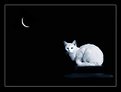
Critique By:
Ari O (K:990)
12/15/2003 7:47:05 AM
Yuri, this is a fascinating idea. Curious, what is the cat perched on? There's a faint hint of foreground to her right that is intriguing. I think your photo improves dramatically with foreground tone and texture because the subject is gazing in that direction. Could that be dodged in a bit more?
By the way, I had to reload the beluga whales photo because I uploaded the wrong version.
|
| Photo By: Yuri Bonder
(K:268)
|
|
|
Critique By:
Ari O (K:990)
12/14/2003 2:26:08 PM
This photo has wonderful potential to appeal. As is, the high and wide angle appears unflattering to your subject only because of all the excess space in the image. If you can use an image-editor to crop slant-crop in close to her face I think you'll find that this image's impact increases mightily. Then the "V" of her neckline takes on new visual "meaning", especially if you can "burn" in the tonality of that area so it doesn't compete for attention with her self-assured expression. I would also suggest that you brighten/dodge/sharper her eyes.
|
| Photo By: Ayse Telci
(K:4168)
|
|
|
Critique By:
Ari O (K:990)
12/14/2003 11:56:36 AM
When doing greenhouse photography it is difficult at times to isolate the best part of the specimen from background, in this case other parts of the same plant, even though the rear here is blackened. That's why moving in even closer to your floral subjects is part of the beauty and fun of macro photography. Small background cards are useful and easy to carry. So are small reflectors to fill in details in the shadow areas. That's why a tripod is essential. It allows you to control not only the camera, but frees your hands to control other tools to improve the image quality. Alternatively, if you use image-edit software to "paint/clone" out unwanted details and even fill in light to shadow areas. Happy shooting, photographically!
|
| Photo By: Zyle II
(K:1535)
|
|
|
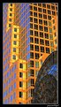
Critique By:
Ari O (K:990)
12/14/2003 9:12:30 AM
This has very good graphical impact. But I don't understand why the stairs only seem to lead up to a top floor landing and nowhere else. Perhaps it is the camera angle that masks the other floor entries, that a different angle would have revealed them?
|
| Photo By: Kai Aust
(K:330)
|
|
|
Critique By:
Ari O (K:990)
12/14/2003 8:29:53 AM
This is a very good start to an interesting concept that you've begun to freshly interpret. A suggestion: perhaps a set of 9 images, all manipulations, where the concept you now have at center-right placed at center and with your un-manipulated subject peeking over "her" shoulder?
|
| Photo By: tom randa
(K:852)
|
|
|
Critique By:
Ari O (K:990)
12/14/2003 6:30:37 AM
You did a good job to delightfully frame and separate the subjects from the background. If you can make use of good image edit software then you can further enhance this effect in one or more of a number of ways, with 'lighting', 'vignette', 'layer blur', 'spot filtering', etc.
|
| Photo By: Amy Kimmel
(K:4)
|
|
|
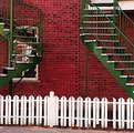
Critique By:
Ari O (K:990)
12/13/2003 8:02:11 PM
I suggest that you consider simplifying your photo. I suggest you try cropping this in half. Then your photograph begins to make a graphic statement, because then the white tops of the steps echo the white fence slats, especially if you also crop out the top landing details.
|
| Photo By: Sandro Monti
(K:1278)
|
|
|
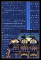
Critique By:
Ari O (K:990)
12/13/2003 6:48:39 AM
Thanks again to those who commented since 12/12. One commenter preferred to see the older, smaller building take up less of the frame. In fact I do have a version of just that composition with this light. In it the point of the mansard roof greets the space between the Twin Towers. That one is not yet scanned so my showing it will have to wait a while.
|
| Photo By: Ari O
(K:990)
|
|
|
Critique By:
Ari O (K:990)
12/12/2003 9:31:49 PM
I am new to Usefilm and don't know how to directly respond to each of the kind commenters since I turned off the email feature (don't want to clutter the inbox).
A print of this image is the first one people see when one opens my 9x12 photo art portfolio. It is followed by a short series of recently scanned slide images now enjoying a new public life at work, at home, and now on the internet. Perhaps I will post the others in this series in the subsequent days.
|
| Photo By: Ari O
(K:990)
|
|
|
Critique By:
Ari O (K:990)
12/12/2003 9:12:05 PM
Beautifully designed photo captured by one with an exceptional eye.
|
| Photo By: Graciela Pierre
(K:7318)
|
|