|
|
Critique By:
Mike George (K:3429)
11/29/2004 4:54:35 PM
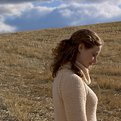
This is a very beautiful shot. Filled with atmosphere/emotion. Colors are wonderful! Well done.
|
| Photo By: ann!e
(K:2441)
|
|
|
Critique By:
Mike George (K:3429)
11/22/2004 4:10:40 PM
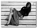
A very inviting and sexy shot. Nicely done.
|
| Photo By: Loic Pézarches
(K:3199)
|
|
|
Critique By:
Mike George (K:3429)
11/19/2004 4:48:08 PM
Nice shot John. Same thing is happening here in the USA. A local track that has been there 70 years has closed. They were there when the closest house was 5 miles away. Now subdivisons surround it. The have successfully fought closure many times. Unfortunately the owner, in his golden years has decided he doesn't want the grief of another fight and will sell to the developers and make a few buck. He'd rather have the track, but sometimes it just isn't worth it. It never ceases to confound me why someone will move in by a racetrack or airport then complain about the noise. Folks here in the US buy homes on golf courses then complain about the balls hitting the house and the loud voices/language of the golfers. I guess folks are just getting dumber with each passing year. Sorry I digressed there for a minute.
|
| Photo By: John Beavin
(K:4477)
|
|
|
Critique By:
Mike George (K:3429)
11/18/2004 1:47:42 PM
I think this is an exceptional shot. I find her expression natural and pensive. It makes you want to ask her "penny for your thoughts". Is she thinking of him or life or what. I also suspect that those who may know here well, might say I see her do that all the time. From a technical perspective, the composure and lighting all give this a nice mood, almost intimate. It's the kind of shot that allows many different interpretations.
|
| Photo By: Marko Hadjina
(K:298)
|
|
|
Critique By:
Mike George (K:3429)
11/5/2004 4:47:46 PM
I really like the composition and lighting. I am not proficient enought to say if the eyes are overprocessed. I like it the way it is. I generally like very sharp photos so my preference would have been a little sharper focus, but this is purely just my taste, nothing wrong with your shot. Good work.
|
| Photo By: g Difarnecio
(K:542)
|
|
|
Critique By:
Mike George (K:3429)
11/5/2004 4:40:55 PM
This is a captivating shot. I like it a lot. The detail in her dress, the subtle colors from the small flowers around her. She has a comfortable pose and expression. All of these combine to make you want to look at it. If I were to offer any suggestions at all, it would be to crop the dark area at the bottom off as well as just a tad closer to her all around--not much. It is a beautiful shot, but there is some background distraction trying to take your eye from her. A very beautiful idea and well executed.
|
Photo By: Antonia BauerleinSehnert
(K:30599)

|
|
|
Critique By:
Mike George (K:3429)
11/5/2004 1:58:28 PM
I kinda like the idea for this shot. A lovely lady alone with her thoughts. The sun striking her hair and face. I think I agree with Howie, I would like to see a crop behind her and a bit more space in front of her. I wonder what the shot would look like if she were higher on the hill (so that her face would be against the sky). I am trying to decide if I like the soft focus. I think that I do. I really do like the idea behind this shot though.
|
| Photo By: Mark Cornellison
(K:41)
|
|
|
Critique By:
Mike George (K:3429)
11/4/2004 4:12:00 PM
Interesting concept Inder. I like it. From a technical point of view, I wonder if a halo/rim light might have helped her pop out from the background. On the left of the shot, she seems to fade into the background. Pose and expression seem right for the shot. Just a bit of adjustment on the lights would help it. Just my 2cents worth.
|
| Photo By: Inder Gopal
(K:367)
|
|
|
Critique By:
Mike George (K:3429)
11/3/2004 6:08:35 PM
Absolutely stunning! A different type of shot. I like the color and concept.
|
| Photo By: ann!e
(K:2441)
|
|
|
Critique By:
Mike George (K:3429)
11/3/2004 6:06:35 PM
Very well done. The nice tight crop and tones give this shot a real intimate feel. The subject is erotic and subtle at the same time. I wouldn't change a thing.
|
| Photo By: ann!e
(K:2441)
|
|
|
Critique By:
Mike George (K:3429)
11/2/2004 3:29:28 PM
Very touching shot Jessica. Excellent use of soft focus and colors.
|
| Photo By: Jessica Hughes
(K:266)
|
|
|
Critique By:
Mike George (K:3429)
10/27/2004 1:58:51 PM
Nice shot Ryan. A suggestion is to make this a vertical shot by cropping at the tree and eliminating the unneeded stuff on the photo's right side.
|
| Photo By: Ryan Poirier
(K:182)
|
|
|
Critique By:
Mike George (K:3429)
10/26/2004 12:25:35 PM
You did a nice job of posing her and DOF. I would try a reflector to get a little more light on her face, her eyes kinda fade into shadow. The dark scarf and gloves I think should be gone or at least a lighter color. I think this a nice portrait as it is. A couple of minor tweaks might bring it up to REALLY good.
|
| Photo By: Timothy Tanguay
(K:1682)
|
|
|
Critique By:
Mike George (K:3429)
10/22/2004 7:40:10 PM
It's a neat idea but I think why it doesn't "pop" for me is that the models don't look happy or relaxed at all. 3 ladies and a convertible, generally caused a lot of fun where I come from. Perhaps a lighter mood, or facial expressions would help.
|
| Photo By: Bjorn Beheydt
(K:12096)
|
|
|
Critique By:
Mike George (K:3429)
10/22/2004 7:36:11 PM
Very nicely done. I especially like the expression on the model's face. Relaxed and smiling. So many shots I see, folks just don't look natural (more mechanical or fake). This has very nice lighting and colors. Very well done.
|
| Photo By: Mark Stein
(K:6210)
|
|
|
Critique By:
Mike George (K:3429)
10/20/2004 3:08:23 PM
A really different and interesting shot. Lots of geometry (curves and lines) as well as lots of color and light variations. Very interesting shot to just sit and absorb. Well done!
|
| Photo By: John H.
(K:2158)
|
|
|
Critique By:
Mike George (K:3429)
10/20/2004 12:53:25 PM
Beautifully composed shot. Overall well done. The only improvement I could suggest is the overexposed hair. Aside from that, a super shot.
|
| Photo By: R Pike
(K:1242)
|
|
|
Critique By:
Mike George (K:3429)
10/5/2004 1:39:42 PM
Very interesting idea. I think I agree with Paolo. If the she is sort of leaning into the center of the shot as opposed to the outer edge might be better. I find my eye running off the right to see what she'll fall on. If it looks like she is leaning into the picture it might not have that effect on me. I do like the tracks, the pose, the exposure. Really neat idea. Just a thought to help it be even better.
|
| Photo By: Donna Jordan
(K:477)
|
|
|
Critique By:
Mike George (K:3429)
10/4/2004 3:52:20 PM
I agree with Peta, it is a very elegant & classy portrait. Well done. I appreciate the lighting setup info as well.
|
| Photo By: Mark Stein
(K:6210)
|
|
|
Critique By:
Mike George (K:3429)
10/4/2004 2:08:17 PM
Johm, this is absolutely stunning. Exposure and colors are perfect. Her eyes and expression just keep inviting you in. Not to mention she is lovely. The choice of a black background was excellent, it really makes her stand out. I love the catchlights in her eyes. A truely great shot.
|
| Photo By: John Fiore
(K:1077)
|
|
|
Critique By:
Mike George (K:3429)
10/4/2004 12:50:58 PM
Excellent shot (but I'm used to that from your!!!). It has that hollywood starlet look. Very well done. I am not sure, but it borders on too light, maybe. Then again, if it didn't have just about that much light, it probably wouldn't have that hollywood look I like. Hey, what do I know?
|
| Photo By: Mark Stein
(K:6210)
|
|
|
Critique By:
Mike George (K:3429)
10/4/2004 12:46:54 PM
Very well done, I do like the soft focus and lighting. Very, what't the word I'm looking for.... intimate (guess)...her expression just invites you to look deeper at her. Excellent. I need you to give me lessions 
|
| Photo By: Mark Stein
(K:6210)
|
|
|
Critique By:
Mike George (K:3429)
10/4/2004 12:38:32 PM
Mark, you did an excellent job of balancing the exposure. He skin tones, hair and swimsuit all are well lit. Dark background is another great idea for this shot, it compliments her well. The only idea I have is, I wonder what the same exact shot except her looking directly into the camera would have done. Another outstanding shot by the way.
|
| Photo By: Mark Stein
(K:6210)
|
|
|
Critique By:
Mike George (K:3429)
10/1/2004 5:08:41 PM
A very beautiful shot!!!! Well done! I really like it. The only suggestion I have (and it is really trivial) is perhaps a lighter background or a halo light to seperate her from the background (her hair mixes into the background). Expression, colors, facial lighting are outstanding. I would be delighted to have taken this shot.
|
| Photo By: Traci A. Quinn
(K:-83)
|
|
|
Critique By:
Mike George (K:3429)
10/1/2004 2:51:39 PM
Very well done indeed! I REALLY appreciate the lighting notes. I'm like you, I normally cover the ear, the curves from the hair look better (just my 2cents) that way. In this case I think it could go either way.
|
| Photo By: Jamie Ferguson
(K:6284)
|
|
|
Critique By:
Mike George (K:3429)
10/1/2004 2:45:48 PM
Nicely done, very nicely done. Thank you for including the lighting for your shot. I am a tad curious what the unsmoothed shot looked like.
|
| Photo By: Mark Stein
(K:6210)
|
|
|
Critique By:
Mike George (K:3429)
9/29/2004 12:25:14 PM
A very intriguing shot. I think I agree with Roger though, her fingers on her right hand just don't seem right. Perhaps resting them across her abdomen would have the impression of holding something/someone. I really do like the shot, the lighting/use of shadows for mood. Very well done.
|
| Photo By: ppdix
(K:17069)
|
|
|
Critique By:
Mike George (K:3429)
9/27/2004 6:09:05 PM
Breathtakingly beautiful shot. The composition, crop and colors are absolutely spectacular. I am curious how you lit this shot (light locations and angles).
|
| Photo By: Per Johansson
(K:339)
|
|
|
Critique By:
Mike George (K:3429)
9/27/2004 6:04:35 PM
It does look much better in B/W. I think it would look good in color. Something in the color is off, white balance maybe? At any rate, it is beautifully composed and is a stiking photo.
|
| Photo By: Massimo Di Maggio
(K:36342)
|
|
|
Critique By:
Mike George (K:3429)
9/27/2004 1:46:07 PM
Beautifully done Robert. I like the use of depth of field, & tone. The expression, raised shoulder and lines of the bricks all bring your eyes to hers. It is an beautiful photo to look at and keeps you there.
|
| Photo By: Robert Lixandru
(K:15)
|
|