|
|
Critique By:
Beth Herbert (K:420)
10/15/2005 11:23:41 PM
Great composition! There is something about cows. They always seem to pose just right for the camera. :-)
Well done!
|
| Photo By: Carsten Ranke
(K:14476)
|
|
|
Critique By:
Beth Herbert (K:420)
10/15/2005 11:19:32 PM
Although the subject matter, coloring, and mood are very interesting, I think that the composition could have been a bit better. The bushes and right tree sort of encroach on the center of the image...the house. A different vantage point may have helped. Maybe not.
Nice job!
|
| Photo By: Chuck Freeman
(K:13616)
|
|
|
Critique By:
Beth Herbert (K:420)
10/15/2005 11:16:10 PM
This looks like a painting. I can see where you lightened sections of the photo in PhotoShop, but that's okay. It's a very strong image.
Well done!
|
| Photo By: Roberto Carli
(K:13689)
|
|
|
Critique By:
Beth Herbert (K:420)
10/15/2005 11:14:36 PM
Beautiful image! It's hard to tell whether or not this is B&W or color. Either way, well done!
|
Photo By: Mirek Netusil
(K:572)

|
|
|
Critique By:
Beth Herbert (K:420)
10/15/2005 11:08:42 PM
How incredibly incredible!!! I'm a bit speechless actually. This has to be one of the most unusual animal portraits I've seen. Very well done!!
|
| Photo By: al lapkovsky
(K:239)
|
|
|
Critique By:
Beth Herbert (K:420)
10/5/2005 1:32:20 AM
No comments? Unbelievable. I love the vibrant colors of this image, but I agree that the tree is a bit too centralized. Still a nice image though.
|
| Photo By: Anthony Lound
(K:6661)
|
|
|
Critique By:
Beth Herbert (K:420)
10/5/2005 1:28:28 AM
This has the potential to be a pretty good photo. The composition is nice and I love the subject matter (love Lancaster), but the quality of the image is pretty poor. There are visible pixels and no true blacks. The image seems pretty washed out.
BTW, nice portfolio!
|
| Photo By: Anthony Lound
(K:6661)
|
|
|
Critique By:
Beth Herbert (K:420)
10/5/2005 1:20:41 AM
What a beautiful portrait and little girl!! Well done.
|
| Photo By: Joyce Meffert
(K:2)
|
|
|
Critique By:
Beth Herbert (K:420)
10/2/2005 2:00:13 AM
Striking image! Such beautiful markings on the cat. I love how the torn paper matches the color of the cat's eyes. Is that natural or photoshopped?
|
| Photo By: lisa rose
(K:567)
|
|
|
Critique By:
Beth Herbert (K:420)
10/2/2005 1:57:32 AM
Oh how I miss MN lakes. Really beautiful image. How did the boat get in the middle of the water anyway? :-)
|
| Photo By: Larry Donnelly
(K:644)
|
|
|
Critique By:
Beth Herbert (K:420)
9/28/2005 1:16:13 AM
What an incredible portrait!!! Love this shot...just don't love the quality of the scan.
Great job!
|
| Photo By: João F * Photography
(K:41945)
|
|
|
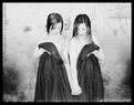
Critique By:
Beth Herbert (K:420)
9/27/2005 2:06:41 AM
Reminds me of a series that Joyce Tenneson did. As you may know, she has this fascination with twins (since her mother and aunt were identical twins and her mother passed away at an early age). Everything from the pose to the accessories remind me of her style. Was this intentional?
I like the shot, but it seems very bleached out. There is no black black in this shot (just shades of gray).
|
| Photo By: Carol Cefalu
(K:8388)
|
|
|
Critique By:
Beth Herbert (K:420)
9/26/2005 6:09:40 PM
Great composition!
|
| Photo By: Bradley Prue
(K:30678)
|
|
|
Critique By:
Beth Herbert (K:420)
9/26/2005 5:43:16 PM
Oh no! The animals at this farm serve as pets only. :-)
|
| Photo By: Beth Herbert
(K:420)
|
|
|
Critique By:
Beth Herbert (K:420)
9/25/2005 5:12:14 PM
Thanks, Chris. They definitely knew that I was there. The whole field of cattle was staring at me. It was pretty eery 
|
| Photo By: Beth Herbert
(K:420)
|
|
|
Critique By:
Beth Herbert (K:420)
9/25/2005 5:10:20 PM
Love the sepia tones. There's something about the combination of the morning light and mist that create such an ethereal feel. You've really captured that. The only thing that slightly bothers me is that the image doesn't seem very crisp. The detail in the trees is a bit soft.
Otherwise, great job!
|
| Photo By: Dennis Båvenmark
(K:370)
|
|
|
Critique By:
Beth Herbert (K:420)
9/25/2005 5:07:04 PM
Great capture! Love the colors. Nicely done.
|
| Photo By: Tjaart van Staden
(K:979)
|
|
|
Critique By:
Beth Herbert (K:420)
9/25/2005 5:05:32 PM
I agree! Great composition and unique subject. The texture of the ground is amazing.
Well done!
|
| Photo By: Tjaart van Staden
(K:979)
|
|
|
Critique By:
Beth Herbert (K:420)
9/25/2005 4:58:35 PM
I don't know about the dead man walking part. More like a guy on his cellphone ignoring his beautiful surroundings. :-)
Nice capture!
|
| Photo By: luis pereira
(K:26013)
|
|
|
Critique By:
Beth Herbert (K:420)
9/25/2005 4:56:44 PM
I do think that the bottom is a bit dark...only because you can't see the guy's legs. Would have been an incredible silhouette shot if he had been standing at the top of the hill...on the horizon. This would have made an interesting infrared shot as well.
Great capture though!
|
| Photo By: Nelson Moore [Kes] -
(K:20241)
|
|
|
Critique By:
Beth Herbert (K:420)
9/25/2005 4:52:57 PM
Really love this shot! Seems like it was taken with an old large format or diana camera. The look on the girl's face is so indifferent. I almost feel like I'm infringing on her privacy.
Very well done!
|
| Photo By: Jeff Michalek
(K:139)
|
|
|
Critique By:
Beth Herbert (K:420)
9/25/2005 4:50:25 PM
Very interesting perspective and tones. Great abstract shot!
Well done!
|
| Photo By: Abdul Kadir Audah
(K:-21)
|
|
|
Critique By:
Beth Herbert (K:420)
9/25/2005 4:48:49 PM
Really sweet portrait. I think that I would have preferred it as a vertical shot, but still very good.
Well done!
|
| Photo By: Larry Fosse
(K:66493)
|
|
|
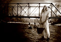
Critique By:
Beth Herbert (K:420)
9/24/2005 3:47:28 PM
I'm not sure if anyone else has noticed, but your skill as a photographer has improved ten-fold over the years. Well done! I must confess that I haven't viewed your work in quite some time...or even visited this site. I'm glad to see that your presence is still here. I hope to see more of your imagery in the near future!
Great shot. B&W adds to the ambiance. I wonder what they were discussing...
|
| Photo By: In Transit
(K:29432)
|
|
|
Critique By:
Beth Herbert (K:420)
9/24/2005 3:18:23 PM
No no. I don't find this image dull. Just safe (like a lot of my photos as well).
Okay, I was wrong about the PS. It looks sepia-toned, but it must have been the lighting. :-)
|
| Photo By: MightyHot Traveller
(K:812)
|
|
|
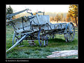
Critique By:
Beth Herbert (K:420)
9/24/2005 3:01:49 PM
The image of the wagon seems almost like photo documentation. Not very compelling (in my opinion). What I like the most is the forest in the background with the mist on the ground. I would have loved to see a landscape of that!
Nice lighting and composition!
|
| Photo By: Andries Kleynhans
(K:666)
|
|
|
Critique By:
Beth Herbert (K:420)
9/24/2005 2:59:36 PM
Nice portrait! The storyline is unnecessary since the image should and can speak for itself.
Well done!
|
| Photo By: Efisio Mureddu
(K:13104)
|
|
|
Critique By:
Beth Herbert (K:420)
9/24/2005 2:58:01 PM
Nice shot! Beautiful tones and composition with a comical twist. I'm guessing that this is photoshopped (no footprints). The dune's perspective seems off compared to the man though. Compared to the size of the shadows and the sun...the man is too large. Despite this, I'm very impressed.
Well done!
|
| Photo By: Mitchell Miller
(K:3009)
|
|
|
Critique By:
Beth Herbert (K:420)
9/24/2005 2:54:58 PM
Nice shot. It is obviously photoshopped, but I think that it works (although a simple B&W would have looked just as sharp). This strikes me as the kind of image that you would find in a picture frame at a store. Not mindblowing, but sellable and nice to look at.
|
| Photo By: MightyHot Traveller
(K:812)
|
|
|
Critique By:
Beth Herbert (K:420)
9/24/2005 2:50:30 PM
Excellent shot/composition. Sunsets are always captivating. The only thing that I would change (if this were my image) is the border. It looks like a scanned in poster because of it. That's just my preference though.
Well done!
|
| Photo By: cameny
(K:5880)
|
|