|
|
Critique By:
Beth Herbert (K:420)
9/24/2005 3:01:49 PM
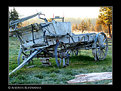
The image of the wagon seems almost like photo documentation. Not very compelling (in my opinion). What I like the most is the forest in the background with the mist on the ground. I would have loved to see a landscape of that!
Nice lighting and composition!
|
| Photo By: Andries Kleynhans
(K:666)
|
|
|
Critique By:
Beth Herbert (K:420)
9/24/2005 2:59:36 PM
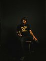
Nice portrait! The storyline is unnecessary since the image should and can speak for itself.
Well done!
|
Photo By: Efisio Mureddu
(K:13104)

|
|
|
Critique By:
Beth Herbert (K:420)
9/24/2005 2:58:01 PM
Nice shot! Beautiful tones and composition with a comical twist. I'm guessing that this is photoshopped (no footprints). The dune's perspective seems off compared to the man though. Compared to the size of the shadows and the sun...the man is too large. Despite this, I'm very impressed.
Well done!
|
| Photo By: Mitchell Miller
(K:3009)
|
|
|
Critique By:
Beth Herbert (K:420)
9/24/2005 2:54:58 PM
Nice shot. It is obviously photoshopped, but I think that it works (although a simple B&W would have looked just as sharp). This strikes me as the kind of image that you would find in a picture frame at a store. Not mindblowing, but sellable and nice to look at.
|
| Photo By: MightyHot Traveller
(K:812)
|
|
|
Critique By:
Beth Herbert (K:420)
9/24/2005 2:50:30 PM
Excellent shot/composition. Sunsets are always captivating. The only thing that I would change (if this were my image) is the border. It looks like a scanned in poster because of it. That's just my preference though.
Well done!
|
| Photo By: cameny
(K:5880)
|
|
|
Critique By:
Beth Herbert (K:420)
4/19/2004 1:04:17 AM
What an amazing capture! Vivid colors, great composition...almost surreal. Well done!
|
| Photo By: marta boro
(K:3245)
|
|
|
Critique By:
Beth Herbert (K:420)
3/24/2004 2:32:50 PM
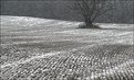
This could have been a poster worthy image had the tree not been cropped so tightly. I would have composed the shot so that you could see just above the tree. Your eye immediately goes to it and the cropping makes me uncomfortable and takes away from the serenity of the scene.
Despite that it's a great capture. Lots of texture. The snow makes the shot seem grainy which I like. Well done!
|
| Photo By: Tim Long
(K:9228)
|
|
|
Critique By:
Beth Herbert (K:420)
3/11/2004 2:36:40 PM
Hey Jorg- I was kicking myself after I got the results back. Not all of the images are so tight on the bottom, but I like the added negative space on top. It wouldn't look right to me without it.
|
| Photo By: Beth Herbert
(K:420)
|
|
|
Critique By:
Beth Herbert (K:420)
2/26/2004 7:52:26 PM
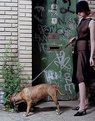
Thanks  Yeah, I loved the padlock. Shot in Brooklyn and the dog belonged to some neighborhood kids. Yeah, I loved the padlock. Shot in Brooklyn and the dog belonged to some neighborhood kids.
|
| Photo By: Beth Herbert
(K:420)
|
|
|
Critique By:
Beth Herbert (K:420)
2/25/2004 2:40:22 PM
I agree that the background came out too light. I generally like overly saturated colors. The problem may have been the computer that I was using...it's darker than normal and I lightened the image too much to compensate. The actual print had a much deeper ultra blue sky. I purposely did shoot into the sun though to get a bit of glare.
Thank you for the critiques!
|
| Photo By: Beth Herbert
(K:420)
|
|
|
Critique By:
Beth Herbert (K:420)
2/25/2004 8:18:44 AM
Such emotion in her eyes. Well done!
|
| Photo By: dino dino
(K:14)
|
|
|
Critique By:
Beth Herbert (K:420)
2/25/2004 7:49:38 AM
Beautiful image. I'm not a fur kind of girl, but it adds such amazing texture around her face. The lighting is incredible. The only thing that slightly bothers me is where the light goes from blue to yellow on her thigh. Looks like a different light source. Well done!
|
| Photo By: magdalena krajewska
(K:129)
|
|
|
Critique By:
Beth Herbert (K:420)
2/24/2004 4:13:38 PM
Searching for a needle in a haystack it seems. I think that the 'top heavy' composition works. It adds a feeling of height. Well done!
|
| Photo By: Syrie Kovitz
(K:1349)
|
|
|
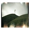
Critique By:
Beth Herbert (K:420)
2/24/2004 3:45:30 PM
I love this image! It reminds me of some recent photos I saw of small-scale model scenes shot with a macro to look life-size. This image is very surreal looking...the classic Holga edges only add to that. Well done!
|
| Photo By: Andreas Wolkerstorfer
(K:5090)
|
|
|
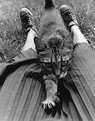
Critique By:
Beth Herbert (K:420)
2/24/2004 3:37:08 PM
I absolutely love this shot Such a unique composition...just wish that the cat's face was in focus. The extended claws really add to the shot. Well done!
|
| Photo By: marissa hkubhjkl
(K:157)
|
|