|
|
Critique By:
Dan Andu (K:98)
11/14/2009 11:03:20 AM
very good portrait indeed....congratulations!
a favorite!
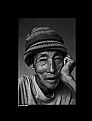
7
|
| Photo By: Gurmeet Sapal
(K:691)
|
|
|
Critique By:
Dan Andu (K:98)
11/14/2009 10:53:52 AM
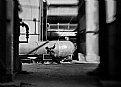
classic :)
|
| Photo By: Bousca Bogdan
(K:549)
|
|
|
Critique By:
Dan Andu (K:98)
11/14/2009 10:52:14 AM
good capture
|
| Photo By: rami rami
(K:2201)
|
|
|
Critique By:
Dan Andu (K:98)
11/5/2009 9:01:24 PM
thank you all for your time and impressions!
|
| Photo By: Dan Andu
(K:98)
|
|
|
Critique By:
Dan Andu (K:98)
11/5/2009 8:59:45 PM
a true 7 rank image
|
| Photo By: Gabriella M.
(K:33863)
|
|
|
Critique By:
Dan Andu (K:98)
11/5/2009 8:59:17 PM
i am not a fan of this type of editing,nor of creative editing nor image blending...but this one is something different i must say! and i truly like it!
i don't know and i really don't want to know what your means of producing this color-drama grafic image were!
i can only give you a seven! u deserve it!
|
| Photo By: Gabriella M.
(K:33863)
|
|
|
Critique By:
Dan Andu (K:98)
11/5/2009 1:59:24 PM
she looks like a statue!
well done!
|
| Photo By: Bousca Bogdan
(K:549)
|
|
|
Critique By:
Dan Andu (K:98)
11/4/2009 11:16:12 PM
bai ti'am zis mai ca ii tare compozitia!
all the best!
|
| Photo By: Bousca Bogdan
(K:549)
|
|
|
Critique By:
Dan Andu (K:98)
11/4/2009 11:13:30 PM
thanks..it's only a stupid editing!
and i will even tell you the name of the filter used: it's called 'newspaper' and the second filter is called 'wind distortion' :)
|
| Photo By: Dan Andu
(K:98)
|
|
|
Critique By:
Dan Andu (K:98)
11/4/2009 2:18:49 PM
i think i like it!
but just a bit! :))
kidding.....you have a 7 from me!
|
| Photo By: Bousca Bogdan
(K:549)
|
|
|
Critique By:
Dan Andu (K:98)
11/4/2009 2:16:31 PM
i really enjoy it!
really do!
|
| Photo By: Vojtech Tryhuk
(K:900)
|
|
|
Critique By:
Dan Andu (K:98)
11/3/2009 6:48:09 PM
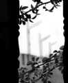
i don;t know if one can say to this simple image that it is simply fantastic!
it is a kind of abstract composition with simple elements!
the laterals look disturbing to me,honestly!
i would have cropped more from the left!
i don't quite get the presence of the leaves..especially the cut leaves from the lower part!
and all of your regions are out of focus!
|
Photo By: Saad Salem
(K:89003)

|
|
|
Critique By:
Dan Andu (K:98)
11/3/2009 12:56:23 PM
i think that you exagerated with that back-light effect....and i am supposing that this backlight effect was applied from a highlights tool!
and also by applying this sort of effect ,you remove the duck from its environement,from the background....it seems like it wants to get out of the frame of your picture!i am saying this because you have emphasized this brutal foreground tone of it and neglected the bluish background-the water!
also i think you've added too much noise reduction on its wing:( and thus there are no textures to recognise there anymore!
next time i would suggest taking it easy with this backlight tool,believe me...because in the begining i was using it too and my pics resulted like this and then i began realising that this unaesthetic 3d-highlight effect didn't quite work!
i would also ssuggest taking the original image and working with the colours and contrasts more! lighten just a bit those areas which u consider a bit darkened!
good luck to you!
cheers,
Andu
|
| Photo By: The Pilgrim
(K:64989)
|
|
|
Critique By:
Dan Andu (K:98)
11/3/2009 12:46:19 PM
interesant tratata...
|
| Photo By: Gabriella M.
(K:33863)
|
|
|
Critique By:
Dan Andu (K:98)
11/2/2009 9:33:09 PM
pretty good
|
| Photo By: Nick Karagiaouroglou
(K:127263)
|
|
|
Critique By:
Dan Andu (K:98)
11/2/2009 9:31:45 PM
you have applied the sharpening tool with some amount of abuse!
the perspective is good,though!
|
| Photo By: Ygal Shalhevet
(K:410)
|
|
|
Critique By:
Dan Andu (K:98)
11/2/2009 9:28:05 PM
thank you
|
| Photo By: Dan Andu
(K:98)
|
|
|
Critique By:
Dan Andu (K:98)
11/2/2009 9:26:27 PM
very nice colour....fresh colors!
|
| Photo By: Terry Ohmart
(K:186)
|
|
|
Critique By:
Dan Andu (K:98)
11/2/2009 8:38:25 PM
i think that u underexposed a great deal here...also hiding that burnt area from the upper center region!
i cannot find this picture an aesthetic one,really...due to this brutal underexposure and the appliance of your dark bluish hue!
|
| Photo By: Fabio Keiner
(K:81109)
|
|
|
Critique By:
Dan Andu (K:98)
11/2/2009 7:23:59 PM
thank you very much for your time
|
| Photo By: Dan Andu
(K:98)
|
|